

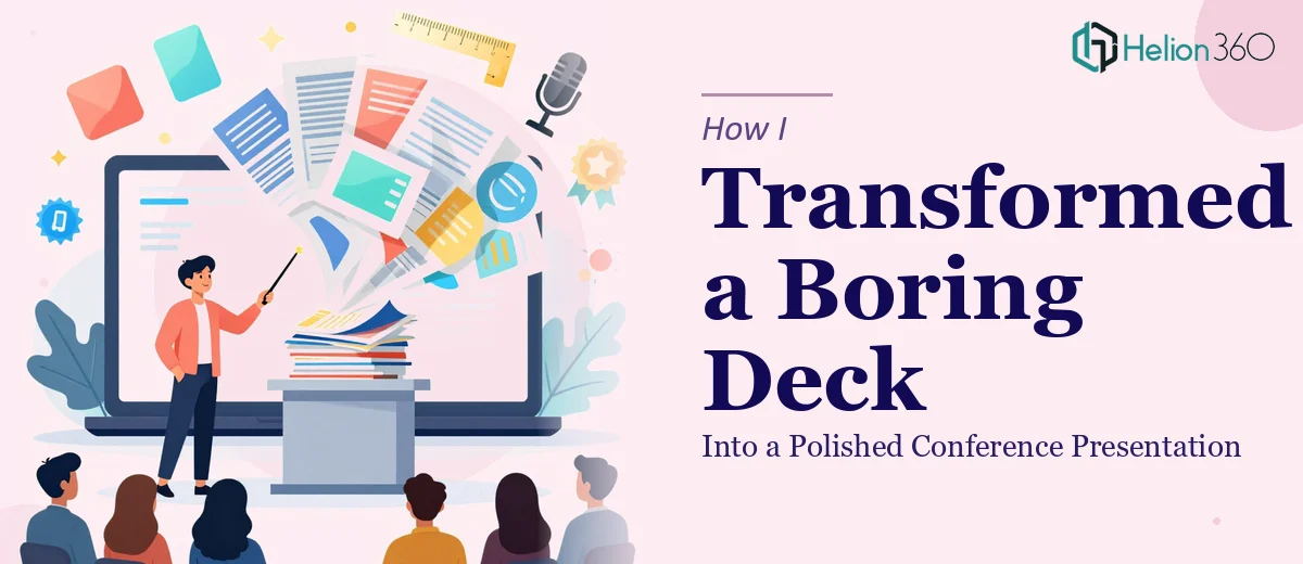
The Presentation Was Done — But It Wasn't Ready
I had a conference coming up in less than two weeks, and the slides were technically finished. All 14 of them. The content was solid — the research was done, the talking points were clear, and the structure made sense. But every time I opened the file, I felt that quiet dread of knowing something was off.
The slides looked like they had been built in pieces over several months. Fonts were inconsistent. Some slides were too text-heavy, others had visuals that felt out of place. The color scheme had drifted from our brand somewhere along the way. It was the kind of PowerPoint that works fine as a working document but falls flat in front of an audience.
For a conference, that's not good enough.
What I Tried First
I spent a few evenings trying to fix it myself. I started with the fonts — standardizing them across all 14 slides — then moved to the layout, trying to introduce more visual breathing room. I pulled in some new icons, adjusted some of the color blocks, and rearranged a few slides that felt out of sequence.
But every time I fixed one thing, something else looked wrong. The spacing felt arbitrary. The data slides still looked like plain tables with no visual hierarchy. And I had no real sense of whether it reflected current presentation design trends or just looked like a tidied-up version of what I already had.
I knew the content. I didn't have the design skills to make it look genuinely sharp — not at the level a conference audience expects.
Handing It Off to Someone Who Could Actually Fix It
A colleague had mentioned Helion360 after getting a sales deck redesigned, so I decided to reach out. I explained the situation — 14 slides, a specific conference deadline, existing brand assets I wanted to keep, and a goal of making the deck visually compelling without changing the content structure.
They asked a few focused questions about the audience, the tone we wanted, and whether there were any design references I liked. Then they got to work.
What the Redesign Actually Involved
What came back wasn't just a cleaned-up version of what I had sent. The Helion360 team had rebuilt the visual layer of the presentation from the ground up while keeping all the content exactly where it needed to be.
The typography was now consistent and intentional — a clear hierarchy between headings, subheadings, and body text. The data slides had been transformed from cluttered tables into clean charts with visual emphasis on the key figures. Slides that had been text-heavy were restructured with supporting visuals that actually reinforced the point rather than competing with it.
They had also brought in subtle design elements that reflected current trends — clean geometric layouts, considered use of white space, and a restrained color palette that felt modern without being distracting. The branding was consistent throughout, which is something I had completely lost control of in my DIY attempts.
The whole deck felt cohesive. Like it had been built with a single purpose in mind rather than assembled over time.
What the Presentation Did at the Conference
The feedback after my session was noticeably different from what I was used to. A few people specifically mentioned the slides — how clear they were, how easy it was to follow along. One attendee asked what tool I had used to build them, assuming it was something more sophisticated than PowerPoint.
That's the thing about a well-executed PowerPoint redesign — the audience doesn't see the work that went into it. They just find it easy to follow and visually engaging. That's exactly what happened.
What I Took Away From This
The content in a presentation can be strong, but if the visual design doesn't match the quality of what you're saying, it creates friction for the audience. Fixing that yourself is possible to a point, but there's a ceiling — especially if you don't have a background in presentation design.
Knowing when to hand something off is its own skill. In this case, it made a real difference to how the work landed.
If you have a presentation that's content-ready but visually unfinished, Business Presentation Design Services is worth a conversation — they handle exactly this kind of work, and they do it without overcomplicating the process.
For more examples of presentation transformation, see how I transformed bland PowerPoint slides into engaging visual presentations and how I designed a cohesive 5-slide PowerPoint presentation that aligned with brand guidelines.