

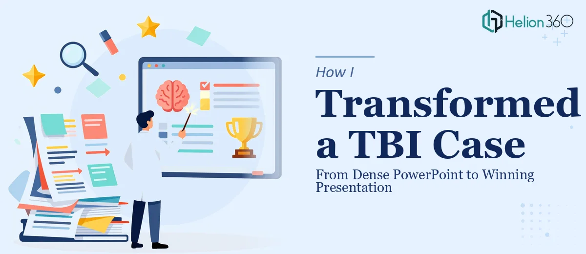
The Problem With the Original Presentation
I had a PowerPoint that was technically complete — every fact was there, every argument laid out. But when I sat down to actually review it before the presentation, I realized it looked more like a legal brief than a slide deck. Walls of text on every slide. Inconsistent colors. No visual hierarchy. And somewhere north of forty slides for what should have been a focused, digestible case narrative.
The presentation was meant to support a traumatic brain injury (TBI) case, and the audience needed to follow a complex medical and legal story in a short window of time. Dense text was not going to work. I needed fewer slides, more impact, and a design that actually helped guide attention rather than exhaust it.
Why Fixing It Myself Was Not Going to Cut It
I am comfortable putting together functional PowerPoints. I know how to format text, drop in a chart, and keep things generally consistent. But this was a different challenge. The content needed more than formatting — it needed restructuring, visual storytelling, and a deliberate color system that reinforced the seriousness and credibility of the case.
Every time I tried to cut slides, I second-guessed myself on what was truly essential. Every time I tried to improve the visuals, the design looked patched together rather than intentional. I spent a full afternoon on it and ended up with something that was marginally better but still not presentation-ready.
That is when I reached out to Helion360. I explained what the presentation was for, what the current version looked like, and what I needed it to become. Their team asked the right questions upfront — about the audience, the tone, and the key points that absolutely could not be cut — and then took it from there.
What the Redesign Actually Involved
The scope of the work was clear from the brief: fewer words per slide, powerful visuals, a reduced slide count, dynamic color, and anything else that would make the deck work harder for its purpose.
Helion360 approached the redesign methodically. They distilled the existing content down to the core arguments, replacing long paragraphs with sharp headlines and supporting visuals. Medical concepts that had previously been described in dense text were translated into clean diagrams and visual sequences that made the information immediately scannable.
The slide count came down significantly. Instead of forty-plus slides that repeated ideas or padded transitions, the final deck was lean and purposeful — every slide earning its place. The color palette shifted from flat and inconsistent to a considered system that felt authoritative without being clinical. Contrast was used deliberately to draw attention to the most critical points in the TBI narrative.
The new title, Winning Your TBI Case, was reflected not just in the cover slide but in the overall tone of the redesign. The deck felt confident and organized — exactly the impression needed when presenting a complex injury case.
What the Final Result Looked Like
The difference between the original and the redesigned version was significant. The before looked like something assembled in pieces over time by someone under deadline pressure. The after looked like it had been built from a single, clear intention.
Text that used to take up three-quarters of a slide was distilled into one or two lines. Visuals that used to be clip art placeholders were replaced with purposeful imagery and iconography. The color system made the deck feel cohesive from start to finish. And the reduced slide count made the presentation feel more confident — like the person presenting it knew exactly what mattered.
For a TBI case presentation specifically, that confidence matters. Juries and stakeholders read design signals whether they realize it or not. A cluttered, inconsistent deck can undermine the credibility of the argument before a single word is spoken.
What I Took Away From This Process
The real lesson was about knowing where the complexity lies. I could handle the content side — I knew the case, the facts, the arguments. But the visual communication side, the part where design decisions directly influence how an audience receives information, required a different level of skill and objectivity.
Presentation redesign is not just about making things look better. It is about making the message land. That distinction became very clear once I saw what a structured, intentional redesign actually looked like in practice.
If you are sitting on a presentation that is technically complete but visually overwhelming, Helion360 is worth reaching out to — they handled exactly that kind of transformation and delivered a deck that was ready to do its job.