

The Brief Sounded Simple — Until It Wasn't
When a relationship coaching startup approached me about building a set of PowerPoint templates, I thought the scope was manageable. The concept was clear enough: design gear diagram templates that would help coaches visually explain how different elements of a relationship — communication, trust, boundaries, shared goals — interlock and influence one another.
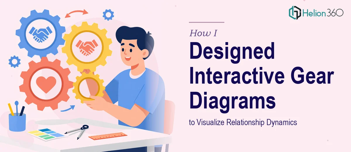
Gear diagrams are a natural fit for that kind of content. Gears are interdependent by nature. When one turns, the others respond. It is a compelling visual metaphor for how relationships actually work. I understood the concept immediately and felt confident going in.
The problem started when I sat down to actually build it.
Where the Complexity Kicked In
Designing a static gear diagram is one thing. But this project required something much more functional — templates that could be used across workshops, seminars, and online courses, with editable labels, adjustable gear sizes, and layouts flexible enough to represent anywhere from two to six interlocking relationship components.
I started by sketching out a few layouts in PowerPoint using basic shapes. The first version looked rough but directionally correct. Then came the real challenge: making the gears feel visually credible while remaining fully editable by coaches who had no design background. Every element needed to be clearly labeled, color-coded to the client's brand, and adaptable without breaking the layout.
I also needed to maintain visual consistency across multiple slide variations — two-gear, three-gear, and multi-gear configurations — while keeping the design language aligned with the coaching brand's tone. Soft, warm, and approachable, but professional enough for corporate wellness programs.
The more I worked on it, the more I realized that what this project needed was not just design skill — it needed experience with complex diagram-based presentation templates specifically built for repeated real-world use.
Bringing in the Right Help
After a few days of iteration that were not going where I needed them to, I reached out to Helion360. I shared the project brief, the brand guidelines, and the rough drafts I had put together. Their team understood the challenge immediately — not just the visual side, but the functional requirement that these templates had to work for non-designers in live training environments.
They took over the design work from that point. What came back were polished, interlocking gear diagram slides that felt genuinely purpose-built for the relationship coaching space. Each gear was a clean, editable shape. Labels sat clearly inside or adjacent to each component. The color system followed the brand palette without feeling rigid. And every layout — from the simple two-gear dynamic to the more complex five-element relational model — maintained visual coherence.
What the Final Templates Covered
The completed template set included several slide configurations built around the gear diagram concept. The two-gear layout was used to explain foundational relationship dynamics like give and take, or individual needs versus shared goals. The three and four-gear versions mapped out more layered frameworks — things like the communication-trust-respect triangle or the four pillars of relational health used in the coaching curriculum.
Helion360 also built in a title slide, a section divider, and a blank canvas variant so the templates could serve an entire workshop deck rather than just one or two illustrative slides. Everything was delivered as a native PowerPoint file with grouped, unlocked elements — ready to use without requiring any design software beyond PowerPoint itself.
What I Took Away From This
Building a diagram template that genuinely works in practice is harder than it looks. The concept can be solid, the visual direction can be clear, and you can still end up with something that falls apart the moment a real user opens it and tries to customize a label or swap a color.
The discipline required — naming layers properly, grouping elements logically, testing across different screen sizes, keeping every shape truly editable — is a specific kind of expertise. It sits at the intersection of PowerPoint design and instructional tool design, and it is not something you stumble into on a tight deadline.
If you are working on a similar project — custom diagram templates, relationship frameworks, or any presentation built around complex visual metaphors — Helion360 is worth contacting. They handled the parts of this project that were beyond what I could deliver alone, and the final output was exactly what the client needed.