

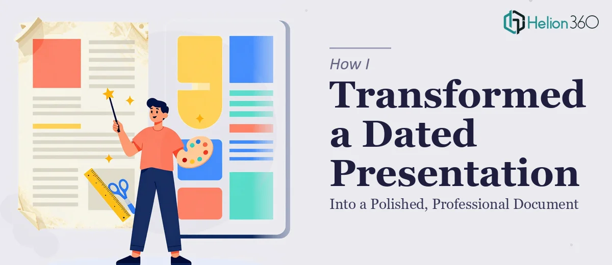
The Presentation Was Doing Us No Favors
I had a deck that had been through too many hands over too many months. Slides built in different versions, fonts that didn't match, charts copied from spreadsheets with no visual consistency, and a narrative that wandered. It was going in front of a professional audience — people who make decisions based not just on what you say, but on how credibly you present it.
The stakes were real. A presentation that looks cobbled together signals that the thinking behind it might be too. I knew the content was strong. The problem was that nothing about the visual execution reflected that. The deck needed a full redesign — not a touch-up, not a quick font swap, but a proper transformation from a dated, inconsistent document into something that looked and felt like it belonged in the room.
I also knew I didn't have the two or three weeks it would realistically take to figure this out myself.
What I Found a Real Redesign Actually Requires
Before doing anything, I spent time understanding what a proper presentation redesign actually involves. What I found was that this is not a cosmetic exercise — it's a structural and visual discipline with real mechanics underneath it.
The first thing that surprised me was how much of the work is narrative before it's visual. A redesign done properly starts with an audit of the existing content — what's there, what order it's in, where the logic breaks down, and where slides are doing the wrong job. Getting that story arc right is foundational. Without it, visual polish just makes a confused deck look prettier.
The second thing that struck me was the precision involved in visual execution. Professional presentation design operates on grids, type hierarchies, and color systems — not intuition. A slide that looks clean follows rules. One that looks amateur usually violates several of them without the author realizing it.
The third signal of real complexity was brand consistency at scale. Applying a design system coherently across 30 or 40 slides — with different content types, different data densities, different visual needs — is genuinely hard to do without the right master slide architecture in place.
What the Work Actually Involves
The right approach to a presentation redesign starts with a structural audit of the source material. This means mapping the existing slides against the story the deck is supposed to tell — identifying where the narrative loses its thread, where two slides are doing the job of one, and where a key point is buried three-quarters of the way through. A well-structured deck typically follows a clear arc: context, problem, solution, evidence, call to action. Rebuilding that arc before touching a single design element is what separates a proper redesign from a reskin. This phase is time-consuming precisely because it requires judgment, not just execution.
Visual mechanics come next, and they operate on rules that aren't immediately obvious to someone who hasn't spent time in professional design. A 12-column layout grid keeps every element anchored and proportional across slides. Type hierarchies — typically a 36pt title, 24pt subhead, and 16pt body — establish a reading order the eye follows naturally. Color palettes are constrained deliberately: no more than four brand colors in active use, with one dominant, one secondary, and one or two accent tones. Charts brought in from spreadsheets almost always need to be rebuilt natively rather than pasted, because embedded images can't be controlled for weight, color, or label sizing. Each of these decisions has a downstream effect on every other slide in the deck, which is why making changes ad hoc produces inconsistency.
Polish and consistency across the full slide set is where most attempts at self-service fall apart. Applying a design system coherently means every slide — regardless of how much content it carries — adheres to the same spatial logic, the same type treatment, and the same color usage. Master slide architecture is the mechanism that enforces this: layouts built at the template level that propagate correctly when content is swapped in or out. Setting this up properly can take several hours even for someone experienced. For someone new to it, the time investment compounds quickly, and small deviations that look fine on one slide create visual noise across the full deck when it's scrolled through as a whole.
Why I Brought Helion360 In to Handle the Full Project
I recognized early on that this wasn't a project I could run on the side of everything else I had going. The work required structural thinking, design expertise, and the kind of tooling that produces consistent results — none of which I had readily available.
I engaged Helion360 to handle the full redesign end-to-end. That meant the narrative audit, the master slide architecture, the visual system, and the final production across the complete deck. They handled it in a fraction of the time it would have taken me to learn and execute it myself — delivered fast, without the back-and-forth that comes from working with someone who needs to be briefed from scratch.
What made the difference was that this is the work they do every day. The expertise and tooling were already in place. I didn't have to explain what a type hierarchy is or why an embedded chart creates problems. I handed over the source material and the brief, and what came back was a professional presentation that actually looked like the content deserved.
What the Deck Became — and What I'd Tell Anyone in the Same Spot
The final deck was something I was confident putting in front of a discerning audience. The story was clear, the visual execution was consistent, and the design reinforced the credibility of the content rather than working against it. The difference between the before and after wasn't subtle — it was the difference between a document that looked like internal work and one that looked like it had been built with intention.
If you're looking at a PowerPoint deck with the same problems I had — inconsistency, a weak narrative structure, visuals that undercut your message — and you want it handled properly without spending weeks figuring out how, Helion360 is the team to engage. They do this work fast, end-to-end, and at a level of execution that's hard to replicate without the same depth of experience.