

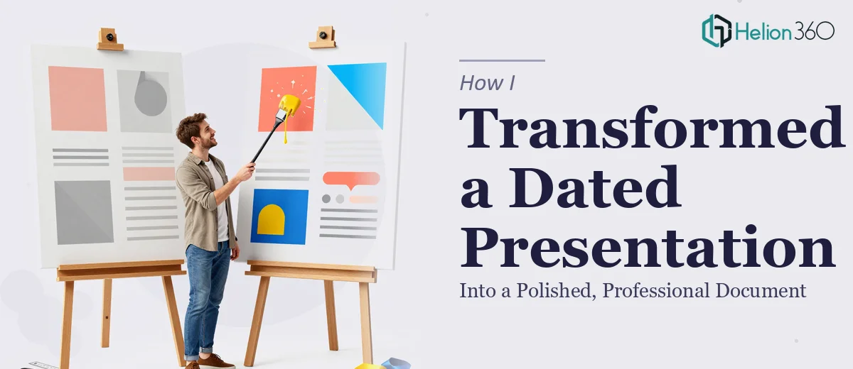
The Presentation Had Been Around Too Long
I had a presentation that had been in rotation for a while. It started as a working document, got updated a few times over the months, and somehow became the version we kept sending out — both internally to our team and occasionally to external contacts.
The content was solid. The information was accurate. But every time I opened it, something felt off. Slides were inconsistent in layout, fonts varied from section to section, some text blocks were far too dense, and the overall look felt dated. It did not reflect where we actually were as a team.
I knew it needed a professional presentation redesign. What I did not fully appreciate yet was how much work that would involve.
I Tried to Fix It Myself First
My first instinct was to handle it in-house. I went through the deck and started making adjustments — tightening up the spacing, swapping out a few colors to make things more consistent, and cutting down some of the longer text blocks.
But every time I fixed one thing, something else looked wrong. Fixing the font on one slide made the header on the next slide look mismatched. Adjusting a layout broke the alignment on another. I was essentially patching a visual system that did not have a consistent foundation to begin with.
After a couple of rounds of this, I realized the problem was structural. The slides needed a coherent design language — consistent typography, a clear visual hierarchy, proper use of whitespace, and a layout that guided the reader through the content naturally. That was beyond what a quick cleanup could achieve.
Bringing In the Right Team
After hitting that wall, I came across Helion360. I explained the situation — an existing presentation that needed a full cleanup and professionalization, not just cosmetic changes. Their team understood exactly what I was describing.
What I appreciated was that they did not just ask for the file and start redesigning blindly. They wanted to understand who the audience was, how the document would be used, and what tone it needed to carry. Since the presentation would be shared both internally and potentially with outside stakeholders, it had to feel polished at both levels — clear enough for a quick internal review and refined enough to hold up in a more formal external setting.
I sent over the original file and we aligned on the direction. Then their team took it from there.
What the Redesign Actually Addressed
When I saw the revised version, the difference was immediately clear. It was not just about aesthetics — the structure had been rethought. Each slide had a clear purpose and the visual hierarchy made it obvious where to look first. The layout was consistent from slide to slide, which made the whole document feel intentional rather than assembled over time.
Typography was cleaned up and standardized. The color usage was purposeful — not decorative — which helped the key information stand out without the slides feeling cluttered. The text blocks that had been too heavy were broken up and rewritten for scannability, while keeping the core message intact.
The presentation now looked like something we had built with care from the start, not something that had accumulated edits over two years.
What This Experience Taught Me
A presentation cleanup sounds like a small task until you actually sit down to do it properly. Cleaning up a document that was built without a consistent visual system is not just design work — it requires making decisions about hierarchy, structure, readability, and brand consistency all at once.
The version Helion360 delivered was one I could confidently share externally. It communicated the same content, but in a way that was easier to follow and more credible to look at. That combination — clarity and professionalism — is what makes a presentation actually work.
If your presentation has been around for a while and you know it needs more than a quick polish, it is worth getting the right support. Helion360 is the team I would point you toward — they handled the complexity of this redesign without any back-and-forth confusion, and the result spoke for itself.