

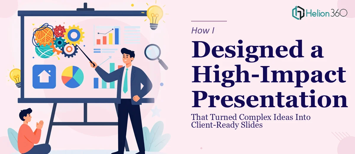
The Brief Was Clear — The Execution Was Not
I had a client meeting scheduled for the following week. The key points were already outlined, the message was reasonably clear in my head, and I knew what I wanted to communicate. What I did not have was a presentation that could carry all of that in a way that felt polished, structured, and visually convincing.
Turning a set of bullet points and rough notes into a professional slide deck is one of those tasks that sounds straightforward until you are actually sitting in front of a blank slide trying to make it work.
Where the Process Started to Break Down
I started building the presentation myself. I had a general idea of the flow — problem, solution, differentiators, next steps. The structure made sense on paper. But once I began translating it into slides, I kept running into the same wall.
The text was too dense. The slides looked like documents rather than visuals. I tried adjusting the layout, switching fonts, pulling in some icons, but nothing came together in a way that felt presentation-ready. The design did not match the weight of the message, and I could feel it every time I previewed the deck.
The issue was not the content — it was the visual execution. Designing a presentation that captures attention while keeping complex ideas clear and easy to follow is genuinely a different skill from writing or structuring content. I had underestimated that gap.
Bringing In a Team That Knew What They Were Doing
After a couple of days of reworking the same slides without making real progress, I reached out to Helion360. I explained what I had — a rough outline, some draft slides, and a tight deadline — and their team took it from there.
What I appreciated was that they did not just apply a template over my existing content. They worked through the structure, identified where the narrative needed to breathe, and made deliberate choices about how each idea should be presented visually. Complex concepts got simplified into clean visuals. Data was turned into something the eye could process quickly. The slide design felt consistent from start to finish.
What the Final Deck Actually Looked Like
The delivered presentation was a significant step up from what I had started with. Each slide had a clear focal point. The typography was controlled, the spacing was intentional, and the visual hierarchy made it easy to follow the story without the presenter needing to over-explain every point.
What stood out most was how the team handled the sections where my ideas were densest. Instead of cramming information onto one slide, they broke it into a logical sequence that let the audience absorb each idea before moving to the next. That pacing is something I had completely missed in my own attempt.
What This Experience Taught Me
Presentation design is not just about making things look good. It is about deciding what to show, how to show it, and in what order — so that the person sitting across the table can follow along without effort. Getting that right under time pressure, while also managing everything else that comes with a client pitch, is genuinely difficult.
I came into this thinking the hard part was the content. The content was fine. The hard part was the design — and specifically, the kind of design thinking that makes a business presentation feel client-ready rather than just functional.
If you are in the same position — good content, tight deadline, and slides that are not quite landing — Helion360 is worth reaching out to. They handled the part I could not get right and delivered a deck I was confident walking into the meeting with.