

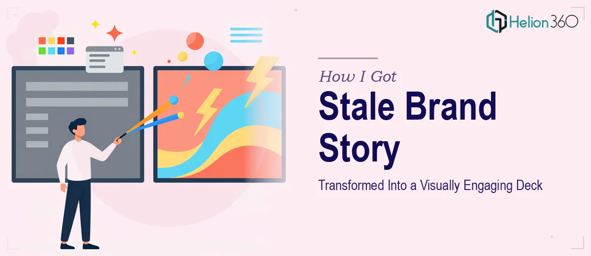
The Deck Was Outdated and a Product Launch Was Coming
We had a brand story presentation that had done its job once. The product visuals were from an earlier era, the logo had since been refreshed, and the overall look no longer matched who we were as a company. A beverage startup moving into a new market phase can't walk into a room — or open a pitch call — with slides that tell the wrong story visually.
The stakes were real. We had an upcoming round of conversations with retail buyers and prospective partners, and the first thing they'd see was this deck. A mismatched presentation doesn't just look unpolished — it signals that the brand itself lacks coherence. That's a credibility problem before a single word is spoken.
I knew straight away this needed to be handled properly. Not patched. Not touched up with a few find-and-replace logo swaps. Done right, from the ground up, with the new brand identity fully integrated across every slide.
What Doing This Well Actually Requires
I started looking into what a proper brand story presentation refresh actually involves, and it's more layered than most people assume.
The first thing that stood out: this isn't just a visual swap. The new product visuals — updated bottle designs with different proportions, materials, and color language — don't simply drop into the old layout. Every slide that featured product imagery had been composed around the old assets. The spatial relationships, the contrast logic, the way text sat relative to imagery — all of it was calibrated for visuals that no longer exist in the deck.
The second signal of real complexity was the brand identity layer. A new logo isn't just a new image file. It carries updated color values, revised spacing rules, and often a different visual weight. Applying it consistently across a multi-slide presentation means understanding how it interacts with backgrounds, typography, and layout — not just placing it in a corner.
The third thing I noticed: presentation design at this level involves visual storytelling decisions, not just aesthetics. Which slides carry which part of the brand narrative? Where does the product hero moment land? How does the deck build momentum? These are structural questions, and getting them wrong undermines the whole point of the refresh.
What the Work Actually Involves
The right approach to a brand story presentation refresh starts with a structural audit. The practitioner needs to map which slides carry narrative weight — the origin story, the product proposition, the market context — and identify where the old visual assets created compositional dependencies. In a well-built deck, product imagery isn't just decorative; it's load-bearing. Removing and replacing it without re-examining the layout grid means the new visuals will sit awkwardly in frames built for different proportions. Doing this audit properly, slide by slide, takes hours of careful work before a single design decision is made.
Visual mechanics come next, and this is where the execution gets genuinely technical. Proper brand application across a presentation means working within a defined palette — typically no more than four brand colors — and enforcing a consistent type hierarchy throughout: headline sizes in the 36–40pt range, subheads around 24pt, body at 16–18pt. Every product visual needs to be color-matched against the updated palette, not just dropped in. If the new bottle design introduces a warm amber that didn't exist in the old brand palette, that color now appears on multiple slides and has to be managed deliberately so it doesn't fight with the background system. This is the kind of detail work that trips up anyone who isn't doing it daily.
Polish and consistency across the full deck is the final layer — and it's the one that separates a professional result from a serviceable one. Brand consistency means every divider slide, every data slide, every product close-up follows the same visual logic. Spacing rules need to be uniform: consistent margins, aligned text boxes, identical padding around imagery. In a presentation with 20 or more slides, one misaligned element on slide 14 erodes the cumulative impression of quality. Applying this level of finish requires both an eye for detail and a systematic approach — checking master slides, verifying style propagation, and doing a final pass against the brand guidelines as a single document.
Why I Brought in Helion360 to Handle It
Once I understood what this project actually required, I didn't spend time experimenting. The work involved structural redesign, full brand identity integration, and product visual replacement across an entire presentation — not a quick cleanup job. The skill set required was specific, and the timeline wasn't forgiving.
Helion360 handled the full project end-to-end. That meant auditing the existing deck structure, integrating the updated product visuals and new logo correctly into the layout system, and rebuilding the slide compositions so the new brand identity landed with the right visual weight. They also ensured the brand story arc — the narrative sequence of the presentation — remained coherent and purposeful throughout.
What I appreciated most was the speed. The full deck was turned around quickly, in a fraction of the time it would have taken me to work through the learning curve alone. They came to it with the tooling, the process, and the design judgment already in place. The result didn't feel like a patched version of the old deck. It felt like a new presentation built for the brand we actually are now.
The Result and What I'd Tell Anyone in This Situation
What came back was a presentation that finally matched the company. The updated bottle designs were integrated cleanly into each product slide, the new logo carried through the full deck with proper spacing and color treatment, and the brand story read as a single coherent narrative from first slide to last. Walking into buyer conversations with that deck felt different — the presentation was doing its job before we said a word.
The broader lesson: a brand story presentation refresh looks manageable until you're actually inside it. The visual dependencies, the brand identity mechanics, the consistency work across 20-plus slides — it's a real project with real execution depth.
If you're looking at a similar situation and want it handled end-to-end without the weeks of learning curve, Helion360 is the team to engage — they delivered fast and brought exactly the kind of execution depth this work requires.