

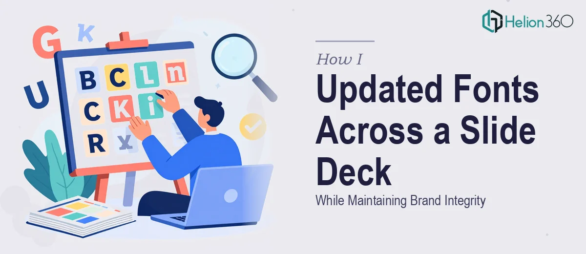
The Deck Needed a Typography Overhaul — and the Clock Was Already Ticking
I had a slide deck that needed its font types updated before a client-facing presentation. The brief was clear enough on the surface: swap out the existing typefaces for ones that better matched our current brand guidelines, keep the layout intact, and make sure nothing looked broken in the process. Simple, right?
Except nothing about our deck was simple. It had been built in layers over time — different people had touched different slides, and the typography was a mess underneath a surface that looked reasonably held together. Body text sizes varied between slides. Heading weights weren't consistent. And our brand guidelines specified exact font pairings, size hierarchies, and minimum readability thresholds that had to be honored.
The deadline was tight. This deck was going out to a client audience that would judge us on how polished and professional we looked. I knew immediately that typography changes done carelessly would ripple through every slide and undermine exactly the credibility we were trying to project. This needed to be done right.
What I Found Out When I Looked Closely at What This Actually Required
I assumed font replacement was a find-and-replace job. It is not. Once I started looking at what doing this well actually involves, the complexity surfaced quickly.
First, brand guidelines don't just name a font — they specify weights, sizes, and pairing rules. Our primary typeface had four weights in active use, and each weight corresponded to a specific role: display headings, subheadings, body copy, and captions. Swapping fonts without mapping those roles first would destroy the visual hierarchy the deck depended on.
Second, the deck's slide master had been partially overridden on individual slides. That meant a global font change applied through the master wouldn't fully propagate — some slides had manually formatted text boxes that would resist the update entirely.
Third, readability checks aren't optional. Certain font families render at different visual sizes even at identical point values. A body font set at 18pt in one typeface might feel cramped and unreadable at 18pt in another. Every slide would need a pass to confirm that legibility hadn't been traded away in the process of achieving brand alignment.
That combination of variables — brand rules, master slide fragmentation, and readability verification — told me this wasn't a weekend project.
What Proper Typography Work on a Slide Deck Actually Involves
The work starts with a structural audit of the existing deck. A practitioner doing this correctly maps every text element — display headings, slide titles, subheadings, body copy, callouts, footnotes, and labels — to a defined role before a single font is changed. In a brand-compliant deck, the type hierarchy typically follows a 3-level scale: primary headings at roughly 36–40pt, supporting text at 20–24pt, and body or caption copy at 14–16pt. Establishing that map upfront is what prevents the new fonts from landing inconsistently across slides. This phase alone takes careful attention because decks built collaboratively tend to have silent overrides hiding in text boxes that don't inherit from the master.
Visual mechanics are where the execution gets technical. Replacing fonts isn't just a style substitution — it involves reviewing tracking, line height, and text box padding for each font family introduced, because different typefaces occupy different amounts of horizontal and vertical space at the same point size. A condensed sans-serif at 20pt and a geometric sans-serif at 20pt will not sit in their containers the same way. Text overflow, orphaned words, and broken two-column layouts are the common casualties. Doing this well means checking every slide individually after the global change, not just running a bulk replacement and hoping the containers hold. For a deck of any real length, this is hours of methodical work.
Polish and consistency across the full deck is the final pass that separates a professional result from an adequate one. Maximum 4 brand colors should appear in the typography palette — primary text, secondary text, accent, and reversed — and every instance must be checked against brand hex values, not approximated. Paragraph spacing, text alignment, and baseline consistency all need to hold across slides that may have been built in different PowerPoint versions or imported from other files. This is also where a complete deck presentation mockup review matters: presenting a sample of representative slides before finalizing allows the client to confirm the typeface choices read correctly in context and on screen, not just in isolation.
Why I Brought in Helion360 to Handle It
I recognized quickly that the combination of a tight deadline and the level of precision this work required was not a match for doing it in-house. The audit alone — mapping every text role and identifying every manual override across the deck — was going to consume more time than I had before the presentation date.
Helion360 handled the full project end-to-end and delivered fast. They ran the structural audit, mapped the type hierarchy to our brand guidelines, executed the font replacement across both master slides and manually formatted text boxes, and completed the slide-by-slide readability and consistency pass. They also provided a mockup of key slides before finalizing, so we could confirm alignment with the brand before the full deck was locked.
What would have taken me days of learning and careful trial-and-error was turned around quickly — handled by a team that does exactly this kind of work every day, with the process and tooling already built in.
The Outcome, and What I'd Tell Anyone Looking at the Same Problem
The deck came back clean. Every slide reflected the correct typeface, at the right weight and size for its role. The layout held — no overflowing text boxes, no inconsistent spacing, no slides that looked like they'd been touched by a different designer. The client audience saw a presentation deck that read as cohesive and professional from the first slide to the last.
The project also gave me a much clearer picture of what brand-consistent typography work actually involves — and confirmed that the right call was engaging a team with the depth to do it properly rather than attempting a shortcut that would have shown.
If you're looking at a similar project — a deck that needs its fonts updated while keeping the design intact and the brand honored — Helion360 is the team I'd engage. They handled the full execution quickly, and the result reflected that depth.