

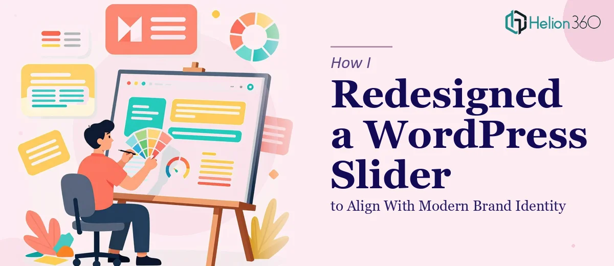
The Slider Was the First Thing Visitors Saw — and It Was Letting Us Down
We had an upcoming event and our website needed to show up. Not just function — actually show up. The hero slider was the first thing any visitor saw, and it was carrying outdated fonts, low-energy imagery, and a layout that belonged to a different era of the brand entirely. The visual identity we'd spent time building — clean lines, bold colors, a modern and dynamic feel — simply wasn't reflected there.
For a growing startup with real momentum, that gap matters. First impressions on a website are formed in seconds, and a slider that reads as stale signals something you don't want it to signal. I knew this wasn't a quick CSS tweak. Getting it right meant rethinking the design from the ground up while making sure the new version lived cleanly inside our WordPress environment and loaded fast. It needed to be done properly, and it needed to be done before the event.
What Doing This Well Actually Requires
I started looking into what a proper WordPress slider redesign involves, and it became clear quickly that this wasn't a single-skill task. There are at least three layers to get right simultaneously.
First, the visual design layer — deciding on layout structure, image treatment, typography hierarchy, and how bold color use gets balanced without overwhelming the composition. This is where brand identity design thinking has to actually show up in the execution, not just as a reference doc sitting on the side.
Second, the WordPress integration layer — choosing the right slider plugin or custom build approach, configuring slide transitions and timing without introducing jank, and making sure the component behaves correctly across screen sizes. Responsive behavior on sliders is notoriously tricky; what looks clean on desktop often breaks on tablet or collapses awkwardly on mobile.
Third, performance. High-quality images in a slider can quietly tank page load speed if they aren't properly sized, compressed, and lazy-loaded. That's not just a developer concern — it directly affects how the redesign feels to a real user. All three layers have to work together, and pulling any one of them off well takes focused expertise.
What the Actual Work Involves
The structural and narrative work starts with auditing what the slider is actually supposed to communicate. A slider isn't just decoration — each slide carries a message, and the sequence needs to follow a logical arc: attention, context, action. The right approach maps out slide count (typically three to five slides maximum before engagement drops), defines what each slide's headline and supporting copy must accomplish, and establishes image-to-text ratios so neither element is fighting for dominance. Getting this architecture wrong means even a beautifully designed slider fails to convert attention into engagement. Reworking it once the visual layer is already built costs significantly more time than planning it properly upfront.
The visual mechanics layer is where brand identity design principles translate into real production decisions. A properly executed modern slider uses a defined type hierarchy — typically a display headline at 48pt or above, a subheading at 24–28pt, and a CTA label at 14–16pt — with no more than two typefaces in play. Color application follows a strict palette discipline: one dominant brand color per slide, one accent for the CTA, and a neutral for backgrounds or overlay treatments. Setting up these rules consistently across multiple slides inside a WordPress slider plugin, while also managing image overlay opacity so text remains legible at all viewport widths, takes precision and testing across real devices. It's the kind of work where an hour of iteration in design turns into several more hours of implementation and QA.
Performance optimization is the layer most people underestimate until the slider is live and slow. High-quality slider images need to be exported at the correct dimensions for each breakpoint — desktop, tablet, and mobile — rather than relying on the browser to scale a single large file down. Images should be compressed to stay under 150–200KB per slide without visible quality loss, and the slider plugin or custom build needs to implement lazy loading so off-screen slides don't block initial page render. A slider that adds more than 1–2 seconds to load time is a liability regardless of how good it looks. Tuning this correctly requires both design judgment and technical implementation working in sync.
Why I Brought in Helion360 to Handle It
I didn't try to piece this together myself. The combination of brand-aligned visual design, WordPress integration, and performance tuning made it clear that this needed a team with the full toolkit already in place — not someone learning on the job with our event deadline sitting in the background.
Helion360 handled the project end-to-end: the visual design concept and mockups, the full WordPress implementation, and the performance layer. They turned it around quickly — what would have taken me weeks of learning curve and trial-and-error across three different disciplines was done in days. The mockups came first, so I could see exactly what the slider would look like before a single line of code was touched. Then implementation followed, with responsive behavior and load performance already baked in. There was no back-and-forth debugging phase, no "it looks fine on my screen" moments. They had the process and the tooling already built in, which meant the work moved at a pace I couldn't have matched on my own.
The Result and What I'd Tell Anyone Facing the Same Situation
What came back was a slider that actually looks like the brand. Bold, clean, fast-loading, and properly responsive across every device we tested. It was ready before the event, which was the whole point. Visitors landing on the site now get the right first impression — energy, clarity, and a visual identity that feels current and intentional.
The event came and went, and the website held up exactly as it needed to. More importantly, the slider is no longer something we're embarrassed to send people to.
If you're looking at a cohesive brand identity situation — an outdated slider that isn't reflecting where your brand actually is — and you need it handled end-to-end without the weeks of learning curve, consider how a full visual brand identity overhaul could solve the problem. Helion360 is the team I'd engage for work like this. They delivered fast, covered every layer of the work, and the result showed.