

The Problem With Having Everything Scattered Across Separate Sites
I was managing a growing set of web properties — distinct sites covering different product lines, research outputs, and internal tools — that were technically live but functionally siloed. Users landing on any one of them had no clear path to the others. Navigation was inconsistent. The visual language was all over the place. And every time something needed updating, the same change had to be made in four different places.
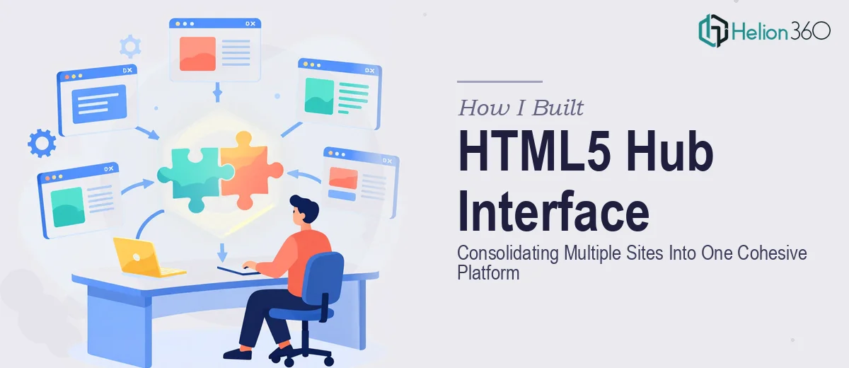
The business impact was real. A partner coming in to evaluate our platform would land on one URL, find no coherent story, and leave without understanding what else existed. We needed a unified HTML5 hub interface that would consolidate everything into a single cohesive entry point — one that felt intentional, navigated cleanly, and reflected a consistent brand experience across the entire ecosystem. This needed to be done properly, not patched together over a weekend.
What I Found a Proper Hub Interface Actually Requires
When I started researching what a well-built HTML5 hub interface actually involves, the scope became clear fast. This wasn't a matter of dropping links onto a landing page. A properly architected hub has to handle information architecture across multiple content domains, establish a unified navigation system that works across different screen sizes, and maintain visual consistency while still letting each sub-section retain its own identity.
Three things stood out immediately as signals of real complexity. First, the content taxonomy — mapping what lives where and how it relates to everything else — has to be resolved before a single line of markup is written. Second, the HTML5 semantic structure has to be deliberately planned so that the hub behaves correctly across browsers and assistive technologies, not just looks good in one viewport. Third, any interface pulling from multiple source sites has to account for load performance and state management, especially if the hub is aggregating live content or dynamic data rather than static links. This clearly wasn't a weekend project.
What the Work Actually Involves
The structural and narrative work is where a hub interface project either gets built on solid ground or falls apart later. The right approach starts with a full content audit — cataloguing every existing URL, categorizing the content it holds, and mapping how it relates to adjacent sections. From that audit, a proper information architecture emerges: a hierarchy of primary, secondary, and tertiary navigation nodes that a user can move through intuitively. Getting this right requires resolving ambiguities in how the source content was originally organized, which often means making editorial decisions about what gets surfaced, what gets buried, and what gets consolidated. That kind of structural thinking takes time and informed judgment — it's not something that can be templated.
The visual mechanics of a hub interface carry a specific set of rules. A consistent 12-column grid applied across all breakpoints — desktop, tablet, and mobile — is the baseline. Typography needs a deliberate hierarchy: typically a 36pt display level for section identifiers, 24pt for navigation labels, and 16pt for body and descriptive copy. Color usage should be constrained to a maximum of four brand-anchored values to avoid visual noise when multiple content domains are competing for attention on the same screen. Applying these rules cleanly across a multi-section hub, where each section may have arrived with its own inconsistent styling, is technically precise work. One misaligned master style rule cascades into dozens of visible inconsistencies.
Polish and cross-section consistency is the layer that separates a functional hub from one that actually builds confidence with the people using it. Every interactive element — hover states, active states, transitions between sections — needs to behave identically regardless of which content domain it belongs to. Icon sets need to be from a single family. Spacing tokens need to be applied uniformly rather than eyeballed per section. In practice, achieving this level of consistency across a hub that was assembled from previously independent sites means systematically overriding legacy styles and rebuilding component behavior from a shared design system. That process surfaces edge cases constantly, and each one adds time.
Why I Brought in Helion360 to Handle It
I looked at the scope of this project and recognized immediately that attempting it myself — or piecing it together internally without dedicated execution capacity — wasn't a realistic path given the timeline. The structural decisions alone required a level of information architecture thinking that doesn't come from a few hours of research. The visual execution required someone with real HTML5 and design system experience already in place.
Helion360 handled the full project end-to-end. That meant the content audit and architecture mapping, the grid and typography system, the visual consistency pass across all sections, and the final QA across breakpoints. What would have taken me weeks to learn and execute was turned around quickly — done in days, not weeks — because the team already had the tooling, the process, and the pattern recognition to move fast without cutting corners. There was no ramp-up time. They came in with the full execution capability already built.
The Outcome and What I'd Tell Anyone in My Spot
What came out the other side was a single, navigable HTML5 hub interface where every section felt like it belonged to the same platform. Users landing anywhere in the ecosystem now had a clear path to everything else. The visual language was consistent. The navigation worked across devices. And because the structure was built on a proper component system, future updates could be made in one place rather than four.
The business result was immediate — partners and evaluators engaging with the platform for the first time now got the full picture, not a fragment of it. The hub communicated intentionality in a way that the scattered individual sites never could.
If you're looking at a similar consolidation problem and want it handled end-to-end without the weeks of learning curve, Helion360 is the team I'd engage — they delivered fast and brought exactly the depth of execution this kind of work requires.