

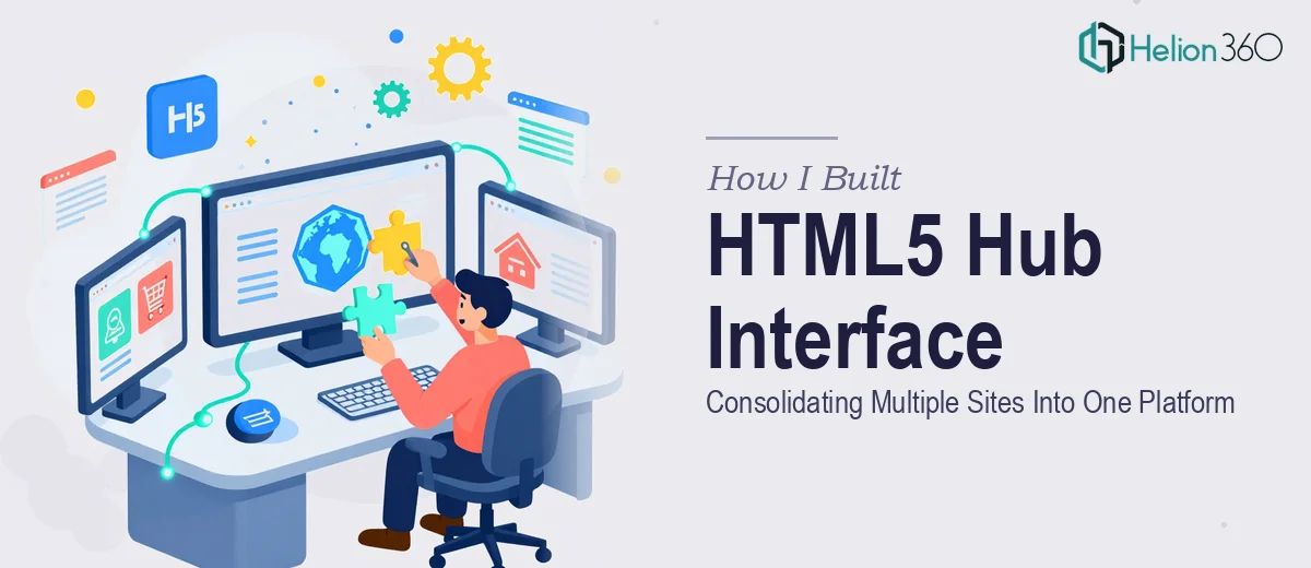
The Problem: Too Many Sites, No Single Entry Point
I was managing a project where several standalone sites needed to funnel users into a single, unified experience. Each site had its own structure, its own navigation logic, and its own visual language. The goal was to build an HTML5 hub interface that would serve as a central platform — clean, user-friendly, and capable of representing all these properties without making users feel like they were jumping between disconnected pages.
On paper, it sounded manageable. In practice, it was a different story.
Where the Complexity Crept In
I started by mapping out the site structures and sketching how the hub would visually connect each one. The concept was straightforward enough — a central dashboard that used HTML5 to create a cohesive interface linking out to each site while maintaining a consistent design layer across all of them.
But as I got deeper into the build, I kept running into friction. The existing sites had varying URL structures, inconsistent naming conventions, and different visual hierarchies. Getting all of them to feel unified under one HTML5 representation required more than just linking pages together. It meant rethinking the entire information architecture and translating each site's core purpose into a single navigable platform.
I also underestimated how much work the visual design side would take. A central hub interface needs to communicate clarity at a glance. Too much visual noise and users lose their way. Too little structure and the whole thing looks like a placeholder. Finding that balance while also handling the technical integration was pulling the project in two directions at once.
Bringing In the Right Help
After a week of building and rebuilding, I knew I needed support that combined both design thinking and strong HTML5 web development experience. A colleague mentioned Helion360, so I reached out and walked them through the project — the sites, the hub concept, the deadline, and where I was stuck.
What I appreciated was that they did not treat it as a purely technical problem. They asked about the user flow, what actions the hub needed to support, and how each site related to the others. That framing helped clarify things I had not fully worked through myself.
What the Build Actually Looked Like
Helion360 took the existing site structures and translated them into a clean HTML5 format with a hub-and-spoke layout. Each site was represented as a clear node pointing back to the central platform, with consistent visual cues that made the interface feel like one product rather than a collection of separate pages.
The design prioritized simplicity. The navigation was intuitive, the hierarchy was clear, and the whole thing held together visually without requiring users to mentally switch contexts as they moved between sections. The HTML5 implementation was also structured in a way that made future updates straightforward — something I had not thought to plan for in my original approach.
We hit the two-week deadline with time to spare for review.
What I Took Away From This
Consolidating multiple sites into a single HTML5 hub interface is not just a development task. It is a design problem as much as a technical one. The architecture of how information flows, how users orient themselves, and how each site's identity fits within a larger platform all need to work together. Trying to handle both sides of that simultaneously, under a tight deadline, was where I ran into trouble.
The experience also reinforced that having a clear plan for the information architecture before writing a single line of code saves significant rework later. I had jumped into building before fully resolving how the sites related to each other at a structural level.
If you are working on something similar — integrating multiple sites into one cohesive HTML5 platform — and the scope keeps expanding on you, Helion360 is worth a conversation. They handled the technical and design complexity cleanly and delivered exactly what the project needed.