

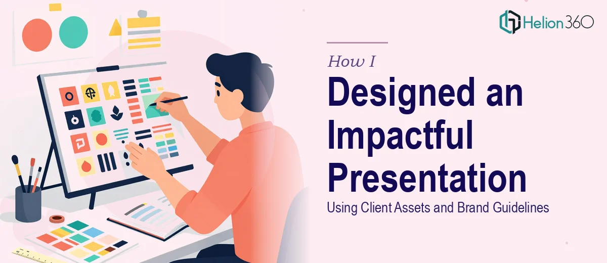
When a Template Is Just the Starting Point
I was handed what looked like a straightforward task: take a client-provided template and a folder of assets — images, charts, icons, brand colors — and turn them into a finished Google Slides presentation. It sounded simple enough. The structure was already there. The content was already written. All I had to do was put it together.
Except it was not that simple.
The moment I opened the template, I realized that what I was working with was more of a skeleton than a finished design system. The slides had placeholder boxes, rough font choices, and a color palette that had been partially applied but not consistently enforced. The client assets were good — high-quality images, clean icons — but making them all work together visually, across every slide, while staying true to the brand guidelines, was a different challenge entirely.
The Problem With "Just Filling It In"
I spent a couple of hours trying to arrange the slides myself. I applied the brand colors, dropped in the images, and tried to match the font hierarchy specified in the guidelines. But every time I fixed one slide, something on another slide broke the visual rhythm. The charts did not scale properly. The icon sizes were inconsistent. The animations I added looked clunky rather than smooth.
I also started noticing that some of the content-heavy slides needed a layout rethink. The client had a lot to say on certain topics, and squeezing that information into the original template's slide structure made the deck feel crowded. At the same time, the more visual slides felt too sparse — they needed something to anchor the design without distracting from the message.
This is the point where I had to be honest with myself. The work was not beyond understanding — I could see what needed to happen. But executing it well, at the level the client expected, required a skill set and speed that I did not have at that moment.
Bringing in the Right Team
That is when I reached out to Helion360. I shared the client template, the asset folder, the brand guidelines document, and a brief explaining what each section of the presentation needed to accomplish. Their team came back quickly with clarifying questions — about slide count, animation preferences, and whether the deck needed to be presenter-ready or self-running. That level of detail told me they were actually reading the brief, not just skimming it.
They took the project from there. I did not have to manage individual slides or chase alignment issues. They handled the full Google Slides design — layouts, typography, color application, asset integration, and transitions — as a cohesive whole.
What the Final Deck Looked Like
When I reviewed the delivered presentation, the difference was immediately clear. Every slide followed a consistent visual logic. The brand guidelines were applied precisely — not just the colors and fonts, but the spacing, icon sizing, and image treatment. The charts had been reformatted to feel like part of the design rather than dropped-in afterthoughts. The animations were subtle and purposeful, supporting the narrative flow rather than competing with it.
The content-heavy slides had been restructured with a cleaner layout that made the information easier to read without losing any of the detail the client needed. The sparser slides had been anchored with well-placed visuals that gave them weight without visual clutter.
What I had been struggling to do in hours, Helion360's team resolved with a level of design consistency I could not have matched on my own in that timeframe.
What I Took Away From This
Working with client-provided assets and brand guidelines sounds easier than building something from scratch, but it is often just as demanding. Staying faithful to someone else's design system while also making the presentation visually impactful takes both technical skill and design judgment. The two do not always go together.
I also learned that a Google Slides presentation built to a real brand standard is a very different thing from a deck that just uses the right colors and fonts. True brand alignment goes deeper — into layout consistency, visual hierarchy, and how every element on every slide relates to everything around it.
If you are working on a similar project — a client template that needs to become a polished, on-brand presentation — and you are finding that the execution is more demanding than expected, Helion360 is worth reaching out to. They stepped in at exactly the right moment for me and delivered a deck that held up in front of the client.