

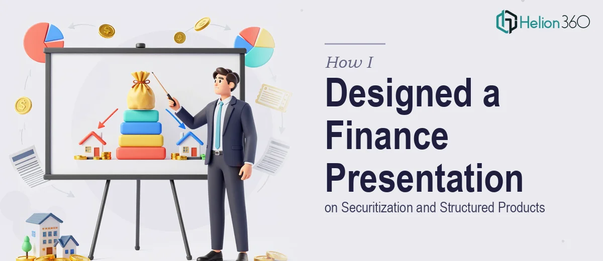
When the Content Is Technically Sound but Visually Lost
I was handed a dense set of research notes and asked to build a PowerPoint presentation on securitization and structured products. The audience included both internal stakeholders and external finance professionals, so the bar was high. The content needed to be accurate, but it also had to be clear and engaging enough for people who weren't deep specialists in structured finance.
I understood the material well enough. Asset-backed securities, collateralized debt obligations, tranching structures, credit enhancement mechanisms — I had spent enough time with the source documents to feel confident in the substance. The problem was translating all of that into a financial presentation that didn't just look like a wall of text with a few mismatched charts.
Where the Design Challenge Actually Started
The first few slides came together reasonably well. A title slide, an agenda, a high-level overview of what securitization is and why it exists. But once I got into the mechanics — the waterfall structures, risk distribution across tranches, the role of special purpose vehicles — the slides started feeling cluttered and hard to follow.
I tried simplifying the diagrams, using SmartArt, rearranging content into two-column layouts. Nothing quite landed. The issue wasn't just aesthetic. It was structural. These concepts have layers of dependency — one idea builds on the next — and the slide sequence needed to reflect that logic visually, not just verbally.
Financial presentations like this one live or die on how well the visuals carry the explanation. A poorly designed flow chart on tranching can confuse more than it clarify. I was spending more time fiddling with alignment and color schemes than actually thinking about whether the narrative was working.
Bringing in a Team That Understood Both Finance and Design
After a couple of days of incremental progress and mounting frustration, I reached out to Helion360. I explained the project — a structured finance presentation covering securitization principles, types of structured products, and their applications in capital markets — and shared what I had built so far.
Their team asked the right questions upfront. What was the audience's baseline knowledge? Was this meant to educate, persuade, or both? How much detail did the tranche structures need? Those questions told me they weren't just going to make things look pretty — they were thinking about the presentation as a communication tool.
They took over the design from there. I stayed involved on the content side, reviewing drafts and providing clarifications where needed, but the visual structure and layout decisions were theirs.
What the Finished Presentation Actually Looked Like
The final deck was a significant step up from what I had been building. The securitization process was laid out as a clean, step-by-step flow — origination, pooling, the SPV structure, issuance, and investor distribution — with each stage visually distinct but connected. It was the kind of diagram that a non-specialist could follow without needing someone to walk them through it.
The section on structured product types — including mortgage-backed securities, CDOs, and CLOs — used a consistent visual language across slides, which made comparisons easier to absorb. The data visualization work was particularly strong. Rather than dropping raw numbers into tables, the team built charts that showed risk-return tradeoffs and tranche hierarchy in a way that actually supported the narrative.
The color scheme and typography stayed conservative enough for a financial context while still feeling modern and intentional. Nothing looked generic. The slides communicated credibility without being stiff.
What I Took Away from This Project
Designing a financial presentation on structured products isn't just a matter of knowing the subject matter. The design itself has to do cognitive work — guiding the audience through complexity in a sequence that feels natural rather than overwhelming. That's a specific skill, and it's separate from financial knowledge.
I came away with a presentation I was confident putting in front of a professional audience, and a clearer understanding of where my own limits were in terms of translating technical content into visual storytelling.
If you're working on a similar financial presentation — one where the content is solid but the design keeps getting in the way — Helion360 is worth a conversation. They handled the parts of this project I couldn't, and the result reflected that.