

The Presentation Was Packed With Content, But It Wasn't Landing
I had a slide deck on Egypt — covering its ancient history, living culture, and the country's present-day identity — that was dense with good information and completely flat to look at. The audience for this presentation expected to be transported, at least a little. When your subject is the pyramids, the Nile, and thousands of years of civilization, a deck full of text blocks and stock photos doesn't cut it.
The deadline was tight — about a week out — and the stakes were real. A presentation on a subject this rich either earns the room or loses it fast. I knew the illustrated Egypt presentation I needed wasn't something that could be thrown together with a few clip-art downloads. It required a considered visual approach, original illustration work that felt cohesive, and execution that matched the depth of the content. I recognized immediately that this needed to be handled by people who do this work every day.
What I Found the Solution Actually Required
Before I made any decisions, I did enough research to understand what doing this well actually involves. Illustrating a presentation on Egypt isn't just dropping in pretty pictures. The visual language has to carry real meaning — and that means the illustrative style has to be chosen deliberately.
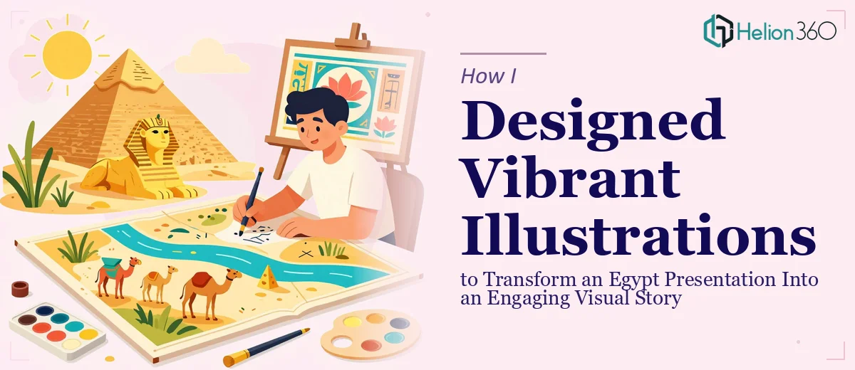
Ancient Egyptian motifs, for instance, have established visual conventions: hieroglyphic borders, papyrus textures, the specific color palette of tomb art (ochre, lapis, terracotta). Applying those carelessly results in something that looks like a tourist brochure rather than a credible, engaging piece. On the other hand, a more contemporary flat-illustration style works beautifully for modern Egypt content but clashes badly if applied uniformly across historical sections.
What I also discovered is that illustration-forward slides require a completely different layout discipline than text-heavy decks. The visual elements need room to breathe, which means the existing content structure often needs to be re-examined slide by slide. And then there's the consistency problem: a deck with custom illustrations only works if every slide feels like it belongs to the same visual world. That kind of cohesion doesn't happen by accident.
What Doing This Well Actually Looks Like
The right approach to an illustrated presentation on Egypt starts with structural and narrative work. Each section of the deck — history, culture, contemporary Egypt — needs its own visual identity while still belonging to a unified story. That means auditing every slide for its narrative role before a single illustration is placed. Is this slide establishing context, delivering a key fact, or creating an emotional beat? The answer determines whether the illustration should be the focal point or a supporting element. Getting this mapping wrong early means rebuilding the visual hierarchy later, which is where most amateur attempts fall apart.
The visual mechanics of illustration-integrated slides are where the real technical depth lives. A well-designed illustrated deck uses a consistent layout grid — typically a 12-column structure — so that illustrations, text blocks, and white space align with discipline across every slide. Typography hierarchy matters too: title sizes around 36pt, supporting text at 24pt, and captions or labels at 16pt keep the visual system readable alongside rich imagery. For an Egypt deck, the illustrative palette needs to be anchored: a base of no more than four primary colors drawn from the subject matter (sand gold, deep blue, burnt sienna, ivory), with accent colors used sparingly. Drifting outside that palette — even on one slide — breaks the visual contract with the audience.
Polish and consistency across a multi-section deck is the final and most time-consuming layer. Every illustration needs to be sized, cropped, and positioned so it interacts correctly with text — no overflow, no awkward white gaps, no competing focal points. When different sections of the deck carry different tonal registers (reverent for ancient history, vibrant for culture, clean for contemporary context), the transition between those registers has to feel intentional, not accidental. Maintaining that discipline across 20 or 30 slides, while keeping the master slide templates intact and the brand application consistent, is work that takes experienced hands and significant focused time.
Why I Brought in Helion360 to Handle It
Once I understood the actual scope of what a properly illustrated Egypt presentation required, the decision was straightforward. I wasn't going to spend a week developing an illustration style, rebuilding slide layouts, and debugging visual consistency issues on a deadline. That's not my skill set, and more importantly, it's not the best use of my time when a team with all of that already built in exists.
Helion360 handled the full project end-to-end — the narrative structure review, the illustration style selection and execution, and the polish pass that made every slide feel part of the same cohesive visual story. They turned the work around quickly, well within the week I needed, and what came back wasn't a template with assets dropped in. It was a deck designed from the ground up to carry the weight of the subject. The execution depth this project required — matching illustration tone to historical era, maintaining a locked four-color palette across sections, ensuring layout grid discipline throughout — was handled without me needing to manage any of it.
The Result and What I'd Tell Anyone Facing the Same Project
What came back was a presentation that genuinely earned its subject. The historical section carried the gravitas of ancient Egypt through considered illustration choices and a warm, structured palette. The cultural section was vibrant without being chaotic. The contemporary content was clean and credible. Audiences that had sat through flat, text-heavy decks on the same topic commented immediately on the difference — the illustrations weren't decorative, they were doing narrative work.
The business outcome was simple: the presentation landed. It held the room, it communicated clearly across all three content sections, and it looked like something that had been built with intention rather than assembled in a hurry.
If you're looking at a similar project — a subject-rich presentation that needs illustration work, visual storytelling depth, and tight turnaround — Helion360 is the team I'd engage. They handled the full execution fast, and the quality showed in every slide.