

The Stakes Were Higher Than I Expected
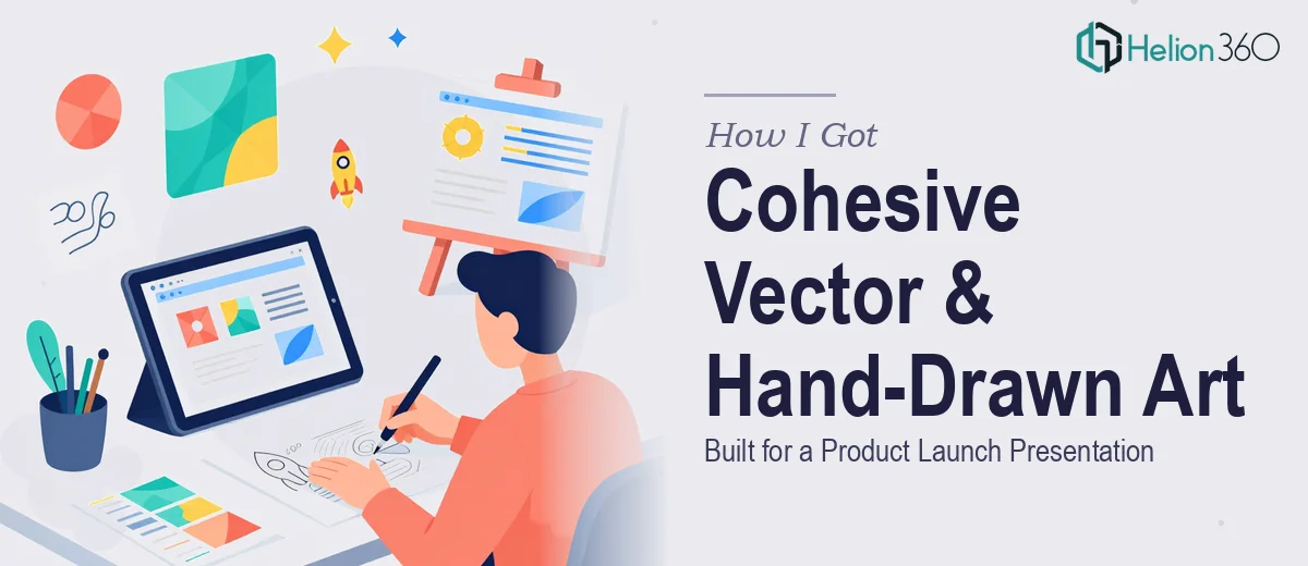
We had a product launch event on the calendar and the presentation needed to do serious work. This wasn't a routine internal update — it was the first time our audience would see the product, and the visuals had to carry the story as much as the words did. The brief was clear: a mix of vector art and hand-drawn elements, clean and modern with a touch of personality, built around icons, infographics, and larger scene illustrations tied to our key talking points.
I knew immediately this wasn't something to patch together with stock art or default slide graphics. Custom illustration for a launch presentation signals intent — it tells the audience that the product is worth the investment, that the brand sweated the details. Getting that wrong, or delivering something visually inconsistent, would undercut the entire reveal. This needed to be done properly, and I started figuring out what that actually meant.
What Doing This Well Actually Requires
Once I started mapping out what a properly illustrated product launch presentation involves, the scope became clear fast. It's not just a matter of drawing some icons and dropping them into slides. Cohesive custom illustration work requires a defined visual language before a single asset gets made — a style guide that governs stroke weights, fill treatments, color palette limits, and the relationship between vector precision and hand-drawn texture.
The mix of vector art and hand-drawn elements sounds simple, but the execution friction is real. Vector assets built in one tool need to feel stylistically connected to hand-drawn elements created in another. If the stroke weights don't match, if the color temperature drifts between pieces, or if the level of detail isn't calibrated consistently across icons versus scene illustrations, the deck looks assembled rather than designed. Three things became obvious to me: the style system had to be locked before production started, the assets had to be built at scale (multiple icons, infographic components, and full scenes), and every piece had to map to a specific slide and narrative moment. That's a substantial body of work.
What the Actual Work Involves
The foundation of custom presentation illustration is a visual language definition. Done well, this establishes a constrained palette — typically three to four brand colors plus one or two neutrals — alongside consistent stroke weights (often 1.5pt to 2pt for icon-scale assets, slightly heavier for scene elements), corner radius rules, and a clear decision on how hand-drawn texture interacts with clean vector geometry. Without this locked upfront, every asset becomes a negotiation and the final deck looks like it came from five different sources. Establishing this system properly takes focused time, and any drift during production multiplies into visible inconsistency across dozens of slides.
The icon and infographic layer is where most of the production volume lives. A product launch deck typically needs fifteen to thirty discrete icon assets covering product features, process steps, and supporting concepts — each one drawn to the same grid (commonly a 24px or 32px base unit), optically balanced, and visually distinct at small sizes. Infographic elements add another layer: flow diagrams, feature comparison visuals, and stat callouts all need to work within the illustration system without looking like they were pulled from a template library. Getting icon optical balance right across a full set is the kind of detail that takes an experienced illustrator multiple passes to resolve.
Larger scene illustrations — the kind that anchor a section opener or visualize a key product moment — require a different skill set than icon production. These pieces need compositional judgment, a clear focal point, and enough narrative specificity to communicate the intended message without text support. The hand-drawn quality that makes scenes feel warm and human is also the hardest element to calibrate consistently: too loose and it looks unfinished, too tight and the whimsy disappears. Getting three to five scene illustrations to feel like they belong in the same world, while also harmonizing with a clean vector icon set, is the piece that most underestimates itself in a brief.
Why I Brought in Helion360 to Handle It
Looking at the full scope — style system definition, icon production across a full feature set, infographic components, and multiple scene illustrations, all needing to arrive coherent and on time before the launch — I didn't spend time wondering whether I could figure this out myself. The answer was obvious. The skill set here is specialized, the asset volume is substantial, and the timeline before the launch event left no room for iteration through trial and error.
Helion360 handled the product launch presentation end-to-end: they locked the visual language system first, produced the full icon and infographic asset library, and built out the scene illustrations with the right balance of vector structure and hand-drawn warmth. The entire illustration set was delivered fast — done in days, not the weeks it would have taken to ramp up the expertise and tooling from scratch. Having a team that does this work every day, with the style judgment and production depth already in place, meant the assets arrived ready to drop into slides without a round of fixes.
The Result and What I'd Tell Anyone in the Same Position
What came back was a complete, cohesive illustration system — icons, infographic elements, and scene illustrations that looked like they were designed for this product and this launch, not assembled from disparate sources. The presentation landed the way a launch presentation should: the visuals carried weight, the story felt considered, and the audience's first impression of the product was set by design that matched the ambition of what we were revealing.
The lesson I'd pass on is straightforward. Custom illustration for a product launch presentation is a real production challenge — the style system, the asset volume, and the craft requirements are all more demanding than they appear in a brief. If you're looking at a similar scope and want it handled end-to-end without the learning curve, Helion360 is the team to engage — they delivered the full illustration set fast and brought exactly the execution depth this kind of work requires.