

The Situation and What Was at Stake
I had a tech presentation coming up that needed to do more than inform — it needed to hold attention in a room full of people who see polished decks every week. The content was strong, but raw text and generic stock icons weren't going to cut it. What the slides needed were custom vector illustrations and infographics that made complex technical concepts immediately readable.
The stakes were real. This wasn't an internal update. It was a high-visibility presentation where the visual quality would directly shape how the ideas were received. If the slides looked assembled rather than designed, the credibility of the content would take a hit before anyone read a single word.
I knew right away that producing this level of visual work required more than a few hours in PowerPoint. It needed someone with deep experience in illustration for tech contexts — and I didn't have the time or the tools to get there myself.
What I Found the Work Actually Required
When I looked seriously at what professional infographic and vector illustration work involves for a tech presentation, the scope became clear quickly.
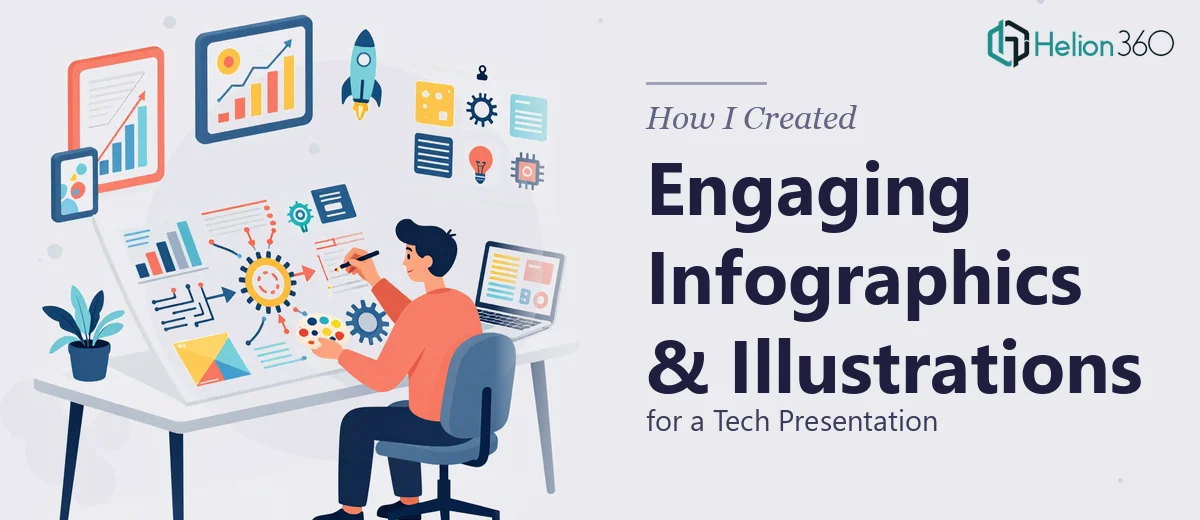
First, the illustration style has to be intentional and consistent. Tech presentations live and die by visual coherence — a set of icons that look like they came from three different style libraries signals amateur work immediately. Every element needs to share the same stroke weight, corner radius, and metaphor logic.
Second, infographics for technical content aren't just visual decoration. They carry meaning. A process flow, a system architecture diagram, or a data visualization has to accurately represent the underlying concept while remaining accessible to a non-technical audience. That balance takes real judgment, not just drawing skill.
Third, the file format and scalability requirements matter enormously in a presentation context. Vectors need to be built so they scale without artifacts across different screen sizes and projector resolutions. That's a craft-level concern most people don't think about until a shape pixelates on a 4K display.
What the Execution of This Work Actually Involves
The first dimension of the work is the visual narrative structure — deciding which concepts need illustration at all, and what form those illustrations should take. Not every slide needs a custom graphic, but identifying which moments in a tech presentation are best served by a process diagram, which by an icon set, and which by a data-driven infographic requires a clear read of the content's logic. Practitioners typically audit the full slide deck first, map where comprehension breaks down for a non-expert viewer, and assign an illustration type to each gap. That mapping pass alone takes several focused hours on a 20-slide deck.
The second dimension is the visual mechanics of building illustration systems that hold together under scrutiny. In professional vector illustration work for presentations, consistency is enforced through a defined style system: a single stroke weight (commonly 2pt for UI-style icon work), a constrained palette of no more than four brand colors plus one neutral, and a grid-anchored layout where every element sits on a defined baseline. Constructing a set of 15 to 20 custom icons that all obey these rules — and then adapting them to fit different slide layouts — is painstaking work. One inconsistency in corner radius or line cap style reads as careless to a trained eye, and those details are what separate forgettable from professional.
The third dimension is polish and cross-slide consistency — the part that trips up most people who attempt this work without a dedicated process. A tech presentation typically uses illustration elements across many slides, and every element needs to feel like it was drawn by the same hand on the same day. That means version-controlling assets, managing a master symbol library, and testing every exported graphic at multiple resolutions before it ever lands in the deck. For someone doing this outside their core workflow, the iteration cycles alone — adjusting, re-exporting, checking in context — can consume a full week.
Why I Brought in Helion360 to Handle It
I didn't attempt this work myself. After understanding what professional infographic and vector illustration execution actually involves, the decision to engage a specialized team was straightforward.
Helion360 handled the full project end-to-end. That meant the content audit and illustration brief, the custom icon and vector system build, the infographic layouts for the technical concepts, and the final integration across all slides. They delivered fast — what would have taken me weeks of learning curve and iteration was turned around in days, with a level of craft consistency I couldn't have produced without the right tooling and daily practice in this kind of work.
The speed mattered as much as the quality. The deadline wasn't flexible, and the output needed to be presentation-ready, not a first draft. Getting the full scope handled by a team that does this work every day meant no ramp-up time, no half-finished passes, and no last-minute scramble to fix inconsistencies before the presentation.
The Outcome and What I'd Tell Anyone in My Position
The final presentation looked like a cohesive, professionally produced piece. The UI presentation graphics gave the technical concepts an accessible visual language without dumbing them down. The infographics replaced the slides that previously required the most verbal explanation — the ideas landed faster because the visuals were doing real communicative work, not just filling space.
The audience response was noticeably different from previous presentations. The material was engaged with rather than endured, and the visual quality signaled that the content behind it had been taken seriously.
If you're looking at a similar problem — a tech presentation that needs custom infographics and vector illustration work delivered to a real deadline — Helion360 is the team to engage. They handled the full scope fast, and the execution depth they brought is the kind that only comes from doing this work constantly.