

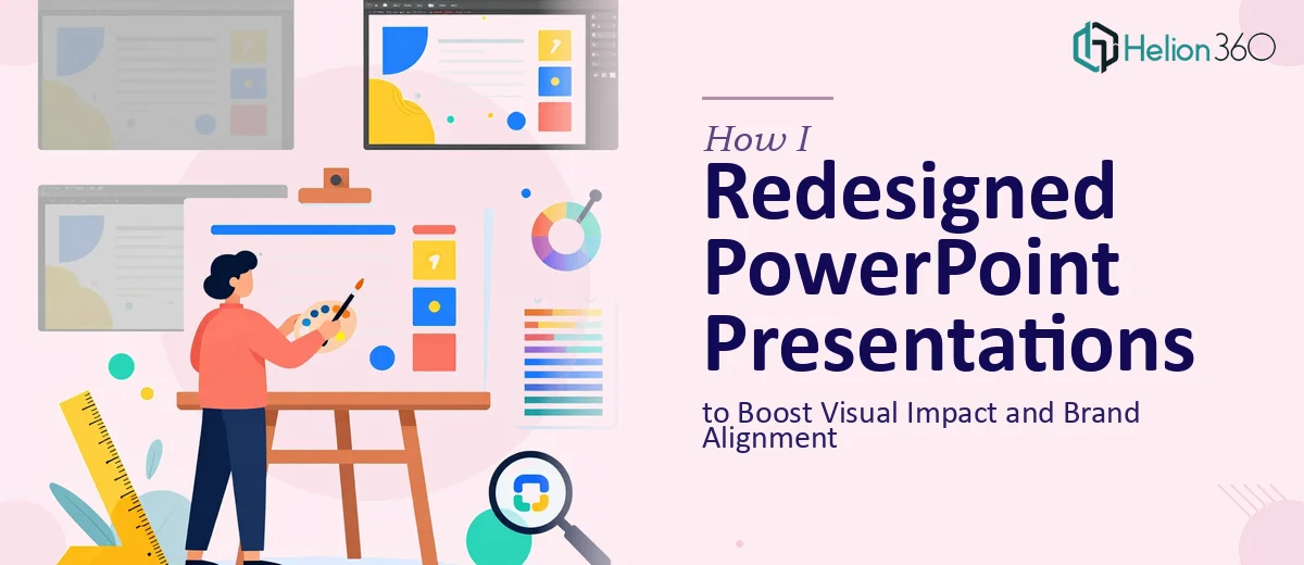
The Situation and What Was Actually at Stake
We were heading into a product launch campaign — the kind where first impressions carry real weight. The presentations we had were functional, but they looked like they were built in a hurry three years ago and never revisited. Mismatched fonts, inconsistent colors that didn't match our brand guidelines, text-heavy slides with no visual breathing room.
The audience for this campaign included external stakeholders and prospective customers who would be forming opinions about the product from what they saw on screen. A presentation that looked dated would signal exactly the wrong thing at exactly the wrong moment. I knew the slides needed a full PowerPoint redesign — not a quick cleanup, but a genuine overhaul that improved visual impact and brought everything into proper brand alignment. That level of work needed to be done right, and I wasn't going to pretend otherwise.
What I Found the Solution Actually Required
My first instinct was to understand what a proper presentation redesign actually involves before deciding how to handle it. What I found quickly was that this wasn't a matter of swapping in a new color and changing a few fonts.
Done well, a PowerPoint redesign starts with auditing every slide in the existing deck — assessing what content is salvageable, what needs restructuring, and what visual hierarchy currently exists versus what it should be. That alone is a non-trivial exercise across a multi-slide deck built by different hands over time.
Beyond the audit, proper brand alignment means implementing a strict color palette (typically no more than four brand colors applied consistently), a defined type hierarchy — something like 36pt for headlines, 24pt for subheadings, 16pt for body — and a master slide system that enforces those rules across the entire file without exceptions. Then there's the infographic layer: replacing data-heavy text blocks and generic clipart with purpose-built visual elements that actually communicate the point faster than words alone. Each of those layers signals that this wasn't a one-afternoon job.
What the Redesign Work Actually Involves
The first aspect that requires real attention is the structural and narrative audit. Before any visual work begins, a practitioner needs to map what each slide is trying to accomplish — is it establishing context, presenting a key claim, or prompting a decision? The right approach involves grouping slides into logical story beats, cutting redundancy, and restructuring content so each slide carries a single clear message. Doing this across a campaign deck of 30 or more slides takes disciplined time: reading the source material carefully, making judgment calls about emphasis, and resisting the temptation to just style what's already there rather than improving what it says. Teams that skip this step produce decks that look better but still confuse the audience.
The second aspect is visual mechanics — the grid, the type scale, and the chart or infographic choices. A 12-column layout grid applied through the slide master ensures that text, images, and data visuals align predictably across every layout. Type hierarchy typically follows a 36pt/24pt/16pt rule for headline, subhead, and body, with no more than two typefaces across the entire deck. Choosing the right chart type for each data point — a bar for comparisons, a line for trends, a donut for proportions — is a deliberate decision, not a default. Getting these mechanics right and keeping them consistent across dozens of slides takes expertise that doesn't come from occasional PowerPoint use.
The third aspect is polish and brand consistency across the full file. This means applying a palette of no more than four brand colors with defined usage rules — primary for headings, secondary for accents, neutrals for backgrounds — and then checking that rule holds on every single slide without exception. Icon sets need to be from a single family. Photo treatments need a consistent style. Even things like shadow depth and corner radius on shape elements need to match. This level of consistency is where most self-built decks fall apart, because it requires reviewing the complete file from the lens of the whole rather than slide-by-slide in isolation.
Why I Brought in Helion360 to Handle It
Once I understood what the work actually required, the path forward was clear. I didn't attempt the redesign myself — the combination of a tight campaign timeline and the depth of execution the project needed made that straightforwardly unrealistic.
I engaged Helion360 to handle the full project end-to-end. They took on the structural audit of the existing slides, rebuilt the master slide system with the correct grid and type hierarchy, developed the infographic elements for the data-heavy sections, and applied consistent brand alignment across the entire deck — all of it, not just the front-end polish.
What stood out was the speed. The work was turned around quickly — done in days, not the weeks it would have taken to work through the learning curve and execution myself. The team clearly had the tooling and the process already in place for this kind of work, which meant the project moved without friction from brief to delivery.
What the Project Delivered and What I'd Tell Anyone in This Spot
What came back was a deck that looked like it belonged to the campaign it was representing — coherent, on-brand, visually clear, and built in a way that made every slide easy to read and easy to present. The infographics replaced walls of text that no audience would have sat through. The type hierarchy made scanning the slides natural. The brand alignment held across every layout without exception.
The campaign landed well, and the presentations played their part without the slides ever being a liability in the room. If you're looking at engaging visual presentations that need real work before a high-stakes moment and not enough time to execute it to the standard it needs, Helion360 is the team I'd engage. They handled complex data into compelling visuals fast, and the execution depth was exactly what this kind of project requires.