

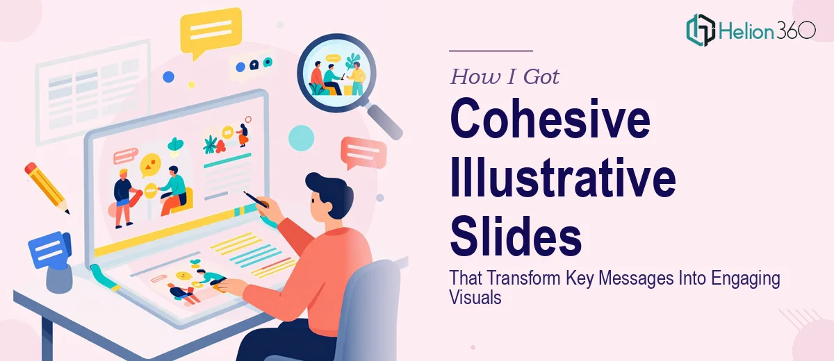
The Presentation Was Too Important to Leave to Guesswork
I had a presentation coming up that needed to do real work. Not just exist as a backdrop while someone talked — actually carry the message, hold the room's attention, and leave people with a clear impression of what we were communicating. The deck was 10 to 15 slides, covering a mix of concepts, data, and narrative, and the audience was one that would notice immediately if the visuals felt generic or disconnected.
The problem wasn't a lack of content. I had the ideas. What I didn't have was a way to turn those ideas into something visually cohesive and genuinely engaging — the kind of slides that feel like they were designed with intention rather than assembled from a template. I knew the difference between a slide deck that blends into the background and one that actually reinforces the message. Getting to the second one wasn't going to be a quick fix.
What I Found Out This Kind of Work Actually Requires
Once I started looking into what a well-executed illustrative slide deck actually involves, the scope became clear quickly. It isn't just about making things look nice. The work sits at the intersection of visual communication, brand discipline, and storytelling — and each of those has its own set of non-trivial requirements.
First, there's the translation problem. Taking a key message and deciding how to represent it visually — whether as a custom illustration, an infographic, or a data visualization — requires judgment that goes beyond taste. The wrong visual choice can muddy the message entirely.
Second, there's the consistency problem. Across 10 to 15 slides covering different types of content, maintaining a coherent visual language — same color logic, same typographic hierarchy, same illustration style — is harder than it sounds. One slide that breaks the pattern pulls the audience out of the flow.
Third, there's the flexibility requirement. The slides needed to be ready to present as-is, but also structured so that small adjustments could be made without breaking anything. That requires building with discipline from the start, not patching together visuals after the fact.
What the Work on a Project Like This Actually Involves
The first layer of work is the narrative-to-visual mapping. Before a single illustration is created, someone needs to audit the content slide by slide and decide what visual treatment each message calls for. A conceptual idea might need a custom illustration. A process might need an infographic. A data point might need a chart — and then the decision is which chart type, what level of detail, and how much annotation is appropriate. This mapping phase is where most of the downstream quality is determined. Getting it wrong means designing visuals that look good individually but don't cohere as a set, which is the most common failure mode in presentation design.
The second layer is the visual mechanics — grid, palette, and typographic hierarchy. A well-constructed slide deck runs on a consistent layout grid, typically a 12-column structure that governs where every element lands. The color palette is locked to a maximum of four brand colors with defined roles: one dominant, one accent, one neutral, one for data. Typography follows a strict hierarchy — headline at 36pt, subhead at 24pt, body at 16pt — applied without exception. Setting these rules up properly in the master slide environment, so they propagate correctly across all slide variants, takes hours even for someone experienced with the tooling. For someone new to it, the time investment multiplies fast and the margin for inconsistency is wide.
The third layer is polish and cross-slide consistency. Once individual slides are built, the work isn't done. Every illustration needs to share the same line weight and style. Every chart needs to use the same color coding for the same data categories. Icon sets need to come from the same family. Spacing between elements needs to feel intentional and uniform. This kind of consistency audit — going slide by slide, comparing against the established visual system — is painstaking work. It's also the layer that separates a deck that looks professionally designed from one that just looks like someone tried hard.
Why I Brought Helion360 In to Handle the Full Project
I looked at what this project genuinely required — the narrative mapping, the visual mechanics, the consistency discipline — and the decision was straightforward. This wasn't a weekend project. It wasn't something I could learn on the fly without the work showing it. And the timeline didn't allow for a trial-and-error approach.
I engaged Helion360 to handle it end-to-end. They took the raw content and key messages, made the visual treatment decisions, built out the full slide set with illustrations, infographics, and data visualizations, and delivered a deck that held together as a unified visual system. The color palette was consistent across all 15 slides. The typographic hierarchy was applied correctly throughout. The illustrations matched in style and weight. It was handled in a fraction of the time it would have taken me to learn and execute at that standard, and delivered fast enough to leave room for the small adjustments I knew I'd want before the presentation.
The Result and What I'd Tell Anyone in the Same Spot
What came back was a deck that looked like it had been designed as a single object, not assembled slide by slide. The visual logic was clear — every slide used the right treatment for what it was communicating, the brand identity held throughout, and the content read as intended without the audience having to work for it. The presentation landed well, and the feedback specifically called out how clear and professional the visuals were.
The broader lesson I took from this: illustrative slide design that actually works isn't a surface-level task. The visual translation decisions, the grid and palette discipline, the cross-slide consistency — each of those is a real body of work with a real learning curve. Attempting to shortcut any of them shows in the final product.
If you're looking at a similar project and want it handled end-to-end without the weeks of learning curve, Helion360 is the team I'd engage — they delivered quickly, covered the full scope, and brought the kind of execution depth this work genuinely needs.