

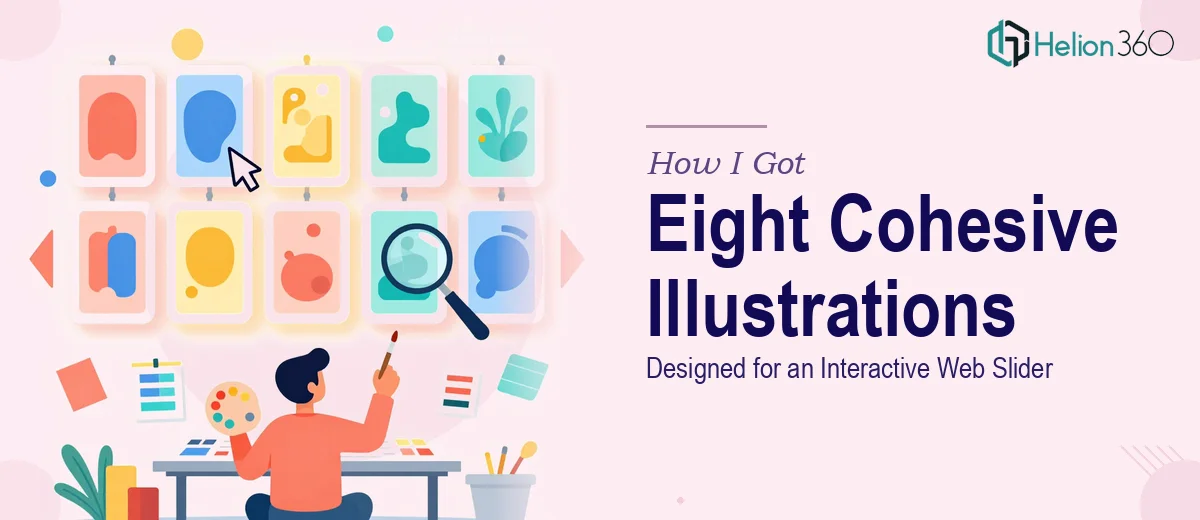
The Slider Looked Simple. The Illustration Brief Was Not.
We had an interactive slider component sitting at the top of a product page — prime real estate, the first thing a visitor sees. The plan was to replace the generic stock imagery with eight custom illustrations, each one representing a different feature or use case. Clean, modern, on-brand. Simple enough to describe in a sentence, but the moment I started mapping out what "eight cohesive custom illustrations" actually required, I realized this was not a weekend project.
The stakes were real. The page was a core conversion point. Inconsistent or visually disconnected illustrations would undermine the whole design, not just the slider. Whatever went in there needed to look like it belonged together — same visual language, same weight, same personality — and it needed to integrate cleanly with the existing UI. Getting this wrong in public was not an option.
What I Found This Kind of Work Actually Requires
I started by pulling up references and thinking through the brief seriously. The first thing that became clear: illustration for a UI context is a different discipline from general graphic design. A standalone illustration can live on its own terms. Illustrations inside a slider component have to work at a fixed crop, at multiple viewport sizes, alongside typography overlays, and in sequence with seven other pieces that the viewer will swipe through in seconds.
That sequencing requirement alone added significant complexity. Each illustration needs to feel distinct enough to be its own piece, but consistent enough that swiping from one to the next feels intentional — not like a random assortment. That means establishing a shared visual system: a fixed palette, a consistent line weight or fill style, a shared approach to how figures, objects, and negative space are handled.
Then there was the minimalist style constraint. Modern minimalist illustration sounds simple, but restraint is harder to execute than detail. Every element has to earn its place. Getting eight pieces to all hit that balance — none too sparse, none too busy — across different subject matter is genuinely skilled work.
What the Work Itself Involves
The right approach starts with establishing the illustration system before a single final asset gets drawn. This means defining a strict visual grammar: typically no more than four to five brand-aligned colors with one or two accent tones, a single line weight standard (often 2px at base size for web), and a compositional rule set for how subjects are framed within each slide boundary. Without this foundation locked in first, illustrations created in sequence will drift — subtle inconsistencies in proportion or color temperature that look minor in isolation become obvious when placed side by side in a slider. Setting up and validating this system across even two or three test compositions takes meaningful time before production begins.
Visual mechanics across eight pieces require a considered approach to composition and focal point placement. Each illustration needs a clear visual hierarchy — a primary subject that reads immediately at a glance, since slider viewers spend only a few seconds per frame. The rule of thirds applies here, but so does awareness of where text overlays will sit, which means compositions need clear negative space zones that are planned in advance, not improvised. For a slider context, safe zones for UI text are typically defined at 20 to 25 percent of the frame width on either side. Designing eight pieces that each honor these constraints while staying visually varied is where many illustration attempts fall apart.
Polish and consistency across the full set is the final — and often most underestimated — phase. Once individual illustrations are complete, a systematic review pass is needed to catch drift: a shadow that appears in five pieces but not three, a slightly different stroke cap style, a background tone that shifted two shades across the set. This kind of audit requires looking at all eight pieces simultaneously at production size and in slider context, checking for anything that breaks the visual unity. For someone not working in this medium regularly, this review pass alone can take as long as producing one or two of the illustrations themselves.
Why I Brought in Helion360 to Handle It
I recognized quickly that attempting this myself — or piecing it together informally — would cost far more time than it saved. The combination of UI context expertise, illustration system thinking, and the discipline to hold visual consistency across eight distinct pieces pointed clearly toward a team that does this kind of work regularly.
Helion360 handled the full project end-to-end. That meant developing the visual system from scratch, producing all eight illustrations within it, and delivering everything slider-ready with the correct artboard specs and export formats for web integration. What would have taken me weeks of ramp-up and iteration was turned around quickly — the kind of fast, clean delivery that only comes from a team with the tooling and process already in place. There was no fumbling through reference-gathering or style inconsistency reviews on my side. I handed over the brief and received a complete, production-ready set.
The Result and What I'd Tell Anyone Facing the Same Brief
The finished slider looked exactly like what the product page needed — eight illustrations that read as a single designed system, each one distinct in subject but visually unified in a way that reinforced the brand rather than creating visual noise. The page felt intentional in a way it simply hadn't before. Visitor engagement with the slider improved noticeably, and the design held up cleanly across breakpoints and device sizes.
If you're looking at a similar brief — custom illustrations for a UI component, a defined style, a set that needs to hold together as a system — and you want it handled end-to-end without the weeks of iteration, Helion360 is the team to engage. They delivered fast, and the execution depth this kind of work requires was clearly already built in.