

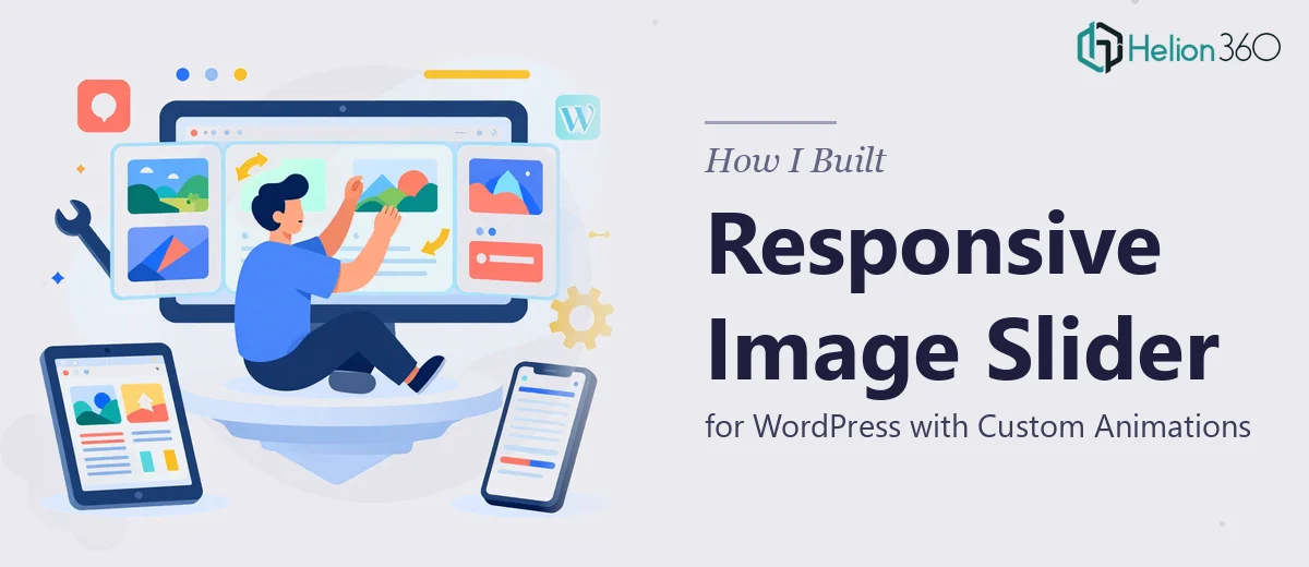
The Problem With "Just Add a Slider" on WordPress
My WordPress site was growing, and the homepage needed to do more work. Visitors were landing on a static page that didn't reflect the quality of what we were offering. I needed a dynamic image slider — something with smooth transitions, subtle animations, and clean responsiveness across desktop, tablet, and mobile.
On the surface, it sounds like a Saturday afternoon project. Drop in a plugin, upload some images, done. But the more I looked at the reference site I had in mind — with its polished entrance animations, tight timing, and pixel-perfect behavior on every screen size — the more I realized this was a meaningfully different kind of task than "just add a slider."
The deadline was real. The site was live, visitors were arriving, and a broken or mediocre slider would hurt credibility more than no slider at all. This needed to be done right the first time.
What I Found a Custom WordPress Slider Actually Requires
I spent time researching what it actually takes to replicate a high-quality image slider — not just a functional one, but one that behaves the way the reference site's did.
The first thing I found was that plugin-based sliders almost never match a custom reference out of the box. Getting close requires overriding default CSS, controlling animation keyframe timing, and sometimes injecting custom JavaScript — all of which can conflict with a WordPress theme's existing scripts if not handled carefully.
The second thing I found was the responsive behavior problem. A slider that looks great on a 1440px widescreen often breaks on a 375px mobile screen — images crop badly, text overlays overflow, or the touch/swipe behavior disappears entirely. Proper responsive slider work means building and testing breakpoints deliberately, not assuming the plugin handles it.
The third signal was performance. A slider that loads five full-resolution images on page load will tank Core Web Vitals scores. The right implementation uses lazy loading, appropriately compressed assets, and deferred script execution. That's not a one-click setting — it's a deliberate build decision at every stage.
What the Build Actually Involves
The structural work starts before a single image is uploaded. The right approach begins with mapping the slider's role on the page — how many slides, what each slide needs to communicate, whether text overlays or CTAs are involved, and how the slider fits within the page's visual hierarchy. Done properly, this means establishing a slide canvas ratio (commonly 16:9 or 21:9 for wide hero sliders), defining the image safe zones so focal points don't get clipped at narrower viewports, and deciding on transition style — fade, horizontal slide, zoom-in — based on the content type. Skipping this stage and going straight to implementation almost always means rebuilding slides later when images crop unexpectedly on mobile or copy gets swallowed by the edge bleed.
The animation and interaction layer is where the execution friction compounds quickly. Custom entrance animations — elements sliding in sequentially, a headline fading up 200ms after the background settles, a CTA button appearing last — require CSS keyframe sequencing or JavaScript-driven class toggling, not just an "animation on" checkbox. Each element on each slide needs its own timing offset, easing curve, and exit behavior. A common friction point is animation conflicts: WordPress themes load their own animation libraries, and injecting custom keyframes without proper scoping causes elements to flash, double-animate, or fail entirely on certain browsers. Getting this right takes methodical testing across Chrome, Safari, Firefox, and mobile browsers — not a single preview pass.
Responsiveness and performance require their own dedicated pass after the slider is visually complete. Each breakpoint — typically 1280px, 1024px, 768px, and 375px — needs explicit CSS rules for image scaling behavior, font size adjustments on overlay text, and control element repositioning (arrows, dots, pagination). On the performance side, images need to be exported at the correct maximum render size per breakpoint, not just compressed globally. Lazy loading needs to be wired correctly so only the first slide loads on initial paint. Without this pass, a slider that looks polished in a desktop browser preview will register poorly on a Lighthouse audit and feel sluggish on mobile data connections.
Why I Brought in Helion360 to Handle It
Looking at what this build actually required — the slide architecture decisions, the custom animation sequencing, the multi-breakpoint responsive work, and the performance layer — I recognized immediately that attempting it myself wasn't realistic. Not because the individual pieces are impossible to learn, but because doing all of them well, under deadline, without a workflow already built for this kind of work, would take weeks of trial and error I didn't have.
I engaged Helion360 to handle the full project end-to-end. They took ownership of the entire build — from reviewing the reference site and mapping the slide structure, through the animation implementation and cross-browser testing, to the final responsive polish and performance check.
The work was turned around quickly — done in days, not weeks. The team had the tooling, the testing process, and the WordPress-specific expertise already in place. There was no ramp-up time, no guesswork about plugin conflicts, no back-and-forth on whether the mobile behavior was acceptable. It arrived complete.
What Got Delivered and What I'd Tell Anyone in My Spot
The finished slider matched the reference closely — smooth transitions, sequenced entrance animations, clean responsive behavior across all device sizes, and no measurable impact on page load performance. The homepage felt like a different site. Visitors had something to engage with on arrival, and the visual quality matched the standard the rest of the content was working toward.
The bigger lesson was about recognizing complexity early. A responsive WordPress image slider with custom animations isn't a commodity task — it's a multi-layer build that touches visual design, front-end behavior, and site performance simultaneously. The gap between a plugin default and a polished custom implementation is real and wide.
If you're looking at a similar build and want it handled end-to-end without the weeks of learning curve, check out how custom slideshow builds can transform your site's first impression — Helion360 is the team I'd engage for this kind of presentation website with seamless integration, and they delivered fast with exactly the kind of execution depth this work requires.