

The Brief Sounded Simple — Until It Wasn't
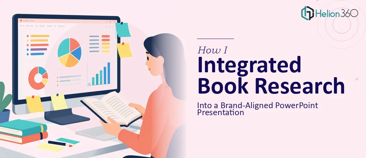
I was updating our annual report presentation and had a new book chapter ready to fold in. The chapter covered key findings from a recent research project, and my goal was straightforward: integrate that content into the existing PowerPoint deck without breaking the structure, losing the brand alignment, or making the slides feel patched together.
On paper, it sounded like a few hours of editing. In practice, it turned into something far more complicated.
Where the Work Got Complicated
The existing deck had its own visual rhythm — specific fonts, color treatments, icon styles, and layout logic that had been built up over time. The book chapter, while well-written, was dense and written for a reading context, not a presentation context. Pulling findings from it and translating them into slide-ready content meant making judgment calls about what to keep, what to compress, and what to cut entirely.
I started working through it myself. I could identify the key findings and map them to slide positions, but the moment I tried to bring in the new content, the visual consistency started to break. Some slides looked overloaded. Others felt disconnected from the surrounding context. I also realized the chapter referenced some data points that had since been updated, which added another layer of cross-checking before anything could go live.
The deeper I got into the presentation redesign, the more I could see that this wasn't just a copy-paste job. It needed someone who could simultaneously manage content logic, brand guidelines, and slide design — all at once.
Bringing in Outside Help
After a few unproductive evenings, I reached out to Helion360. I explained the situation: an existing PowerPoint deck that needed to stay brand-consistent, a chapter of research content that needed to be absorbed into it, and a two-week deadline. Their team asked the right questions upfront — what brand guidelines were in place, how many slides were involved, and where the chapter content needed to be inserted versus where it could be summarized.
That initial conversation gave me confidence that they understood both sides of the problem: the content integration challenge and the visual presentation design requirements. I handed over the files and let them take it from there.
What the Delivered Work Looked Like
Helion360 came back with a revised deck that handled the integration cleanly. The research findings from the chapter were restructured into slide-appropriate formats — some as concise text with supporting visuals, others as data-driven layouts where the numbers needed room to breathe. Outdated information in the original chapter had been flagged and replaced with current figures, which saved me a round of back-and-forth.
The brand alignment held throughout. The fonts, color palette, and layout conventions from the original deck carried forward consistently into the new slides. Nothing looked bolted on. If you didn't know the chapter had been added later, you wouldn't be able to tell where the original deck ended and the new content began.
The visual enhancement work also made a real difference. Slides that had previously been text-heavy were restructured with better hierarchy and cleaner spacing, making the research findings easier to follow for an audience that would be seeing this for the first time.
What I Took Away From This
Integrating written research content into a polished PowerPoint presentation involves more than design skills or editing skills in isolation. It requires someone who can read the content critically, understand what an audience needs from a slide versus a page, and apply brand guidelines without losing visual coherence in the process.
Doing that well — especially under deadline — is a specific kind of work. I learned pretty quickly that having domain knowledge in one area doesn't make you equally effective in all the areas the job touches.
If you're working on a similar project — updating an annual report presentation, folding in research content, or trying to keep a branded PowerPoint presentation consistent while adding new material — Helion360 is worth reaching out to. They handled the complexity that was slowing me down and delivered a presentation that was ready to use.