

When a Simple Dashboard Brief Got Complicated Fast
We were a few weeks out from launching a new online platform, and the pressure was on. My task was straightforward on paper: design an interactive PowerPoint dashboard that would help users navigate the platform intuitively. Clean layout, logical flow, easy to update. Simple enough, right?
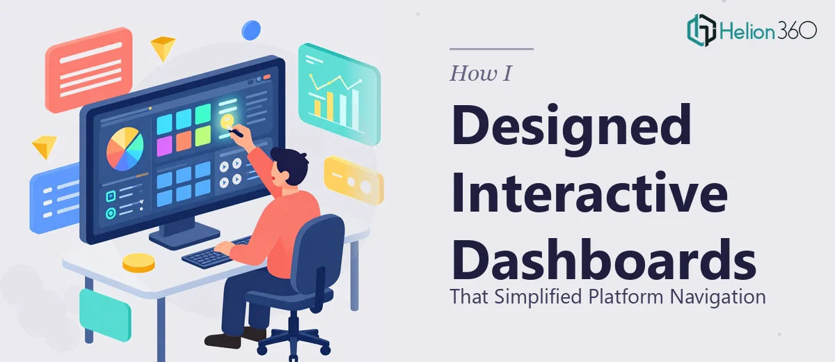
I started with what I knew. I built out the basic slide structure, set up a consistent color scheme, and began linking sections using PowerPoint's hyperlink and action button features. The early slides looked decent. But as I mapped out the full platform navigation, I realized the scope was much larger than I had anticipated.
The Problem With Building Interactive Slides at Scale
Interactive dashboards in PowerPoint are not just about good design — they require a precise logic to how every element connects. One broken link in a navigation chain, and the whole experience falls apart for the person using it.
I was dealing with multiple platform sections that each needed their own visual hierarchy, quick-access buttons, status indicators, and a return path back to the main overview slide. Every time I fixed one navigation path, something else shifted out of alignment. The slide master I had set up was inconsistent across sections. Animations I had added to give the dashboard a more app-like feel were firing in the wrong sequence.
It was not that I did not understand what needed to be done — I did. But the combination of slide architecture, interaction design, and visual polish at this scale was eating up far more time than the project timeline allowed.
Bringing in the Right Support
After hitting a wall on the third major revision, I reached out to Helion360. I explained the full scope: an interactive PowerPoint dashboard meant to simulate platform navigation for an upcoming product launch, with multiple linked sections, a consistent visual system, and smooth transitions that felt deliberate rather than decorative.
Their team asked sharp questions upfront — about the number of navigation nodes, the audience for the dashboard, whether it needed to be presenter-driven or self-navigated, and how the branding should carry across each section. That conversation alone told me they had done this kind of work before.
I handed over my existing draft along with the platform's navigation map and brand guidelines. From there, Helion360 took over.
What the Final Dashboard Actually Looked Like
The redesigned dashboard came back structured in a way I had not thought to approach it. The main overview slide functioned like a control panel — each platform section had a clearly labeled navigation zone with a consistent button style, hover-state color logic, and a visual hierarchy that guided the eye naturally.
Every sub-section had its own slide set, each one linked back to the overview through a persistent navigation bar built directly into the slide layout. The animations were subtle and purposeful — no spinning text or unnecessary transitions, just clean entrance effects that made the dashboard feel responsive.
What I found most useful was how modular the structure was. Updating a section later meant swapping out one slide cluster without breaking the rest of the navigation. That kind of future-proofing was something I had not planned for in my original build.
What This Project Taught Me About Dashboard Design
Building an interactive PowerPoint dashboard for platform navigation is genuinely different from building a standard presentation. The design has to behave more like a product interface than a slide deck. Every click, every visual cue, and every transition carries meaning for the person navigating it.
I underestimated how much of that logic needed to be planned before a single slide was designed — not during. Starting from the navigation architecture and working outward, rather than starting from the visual design, is the right sequence. I learned that the hard way.
The platform launch went ahead with the dashboard in place, and the feedback from the internal team was that it made walking through the platform significantly clearer — both for demos and for internal onboarding.
If you are working on a similar project — a platform walkthrough, an interactive sales deck, or a dashboard presentation that needs to behave like a navigable tool — Helion360 is worth reaching out to. They handled the complexity that was slowing me down and delivered something that actually worked the way it was supposed to.