

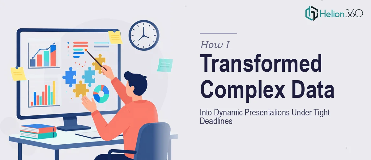
When the Data Was There But the Slides Were Not
I had a presentation due in three days. The data was solid — research findings, performance numbers, trend lines — but it was scattered across spreadsheets, reports, and a few rough draft slides that honestly looked worse than nothing. My job was to turn all of that into something a room full of stakeholders would actually pay attention to.
I figured I could handle it. I know PowerPoint reasonably well. I can build a decent chart, align a few boxes, pick a color scheme. So I sat down and started building.
Two hours in, I had six slides that looked fine on their own but felt disconnected as a deck. The data visualization was flat. The charts were technically accurate but visually dull. And I kept second-guessing every design decision — font size, layout, how much text was too much. Meanwhile, the deadline was not moving.
Where the Problem Got Real
The core challenge was not the data itself. It was translating dense, multi-layered information into something visually clear and compelling — without losing the nuance. That balance is harder than it sounds. If you simplify too much, the slide feels thin. If you include too much, people tune out.
I also realized I was spending time I did not have. Every hour I spent wrestling with slide design was an hour I was not spending on preparing the actual talking points and narrative. The presentation needed both: strong visuals and a clear story. I was only managing to do one adequately, and not particularly well.
After hitting that wall, I reached out to Helion360. I explained the situation — the data, the timeline, the audience, and what the presentation needed to accomplish. Their team asked the right questions and took it from there.
What Good PowerPoint Design Actually Looks Like
What came back was a significant step up from what I had been building. The data visualization was clean and intentional. Charts were redesigned to highlight the key insight first, not just display the numbers. Layouts were consistent but not repetitive. The visual hierarchy made it obvious what to look at and in what order.
More importantly, the slides held together as a deck. There was a clear visual thread from the opening context slide through the data-heavy middle sections and into the closing summary. That kind of cohesion is difficult to achieve when you are building slides one at a time without a design system guiding the choices.
The Helion360 team worked within the timeline without cutting corners on quality. The turnaround was fast, and the revisions were minor — mostly small content tweaks on my end, not design fixes.
What I Took Away From This
I came into this thinking the hard part was the data. It was not. The hard part was presenting complex information in a way that actually communicates — where someone looking at a slide for thirty seconds understands the point, the context, and why it matters.
PowerPoint design is a skill. Knowing which data to surface visually, how to structure information flow across slides, how to use whitespace and contrast to guide attention — these are things that take real experience to do well, especially under time pressure.
I also learned something practical: the time I spent struggling with design was time I could have spent strengthening the content. Splitting those two responsibilities made both outputs better.
If you are sitting on a engaging visual presentations that needs to communicate something important and the clock is ticking, Helion360 is worth reaching out to — they handled the design complexity I could not resolve on my own and delivered something I was genuinely confident presenting.