

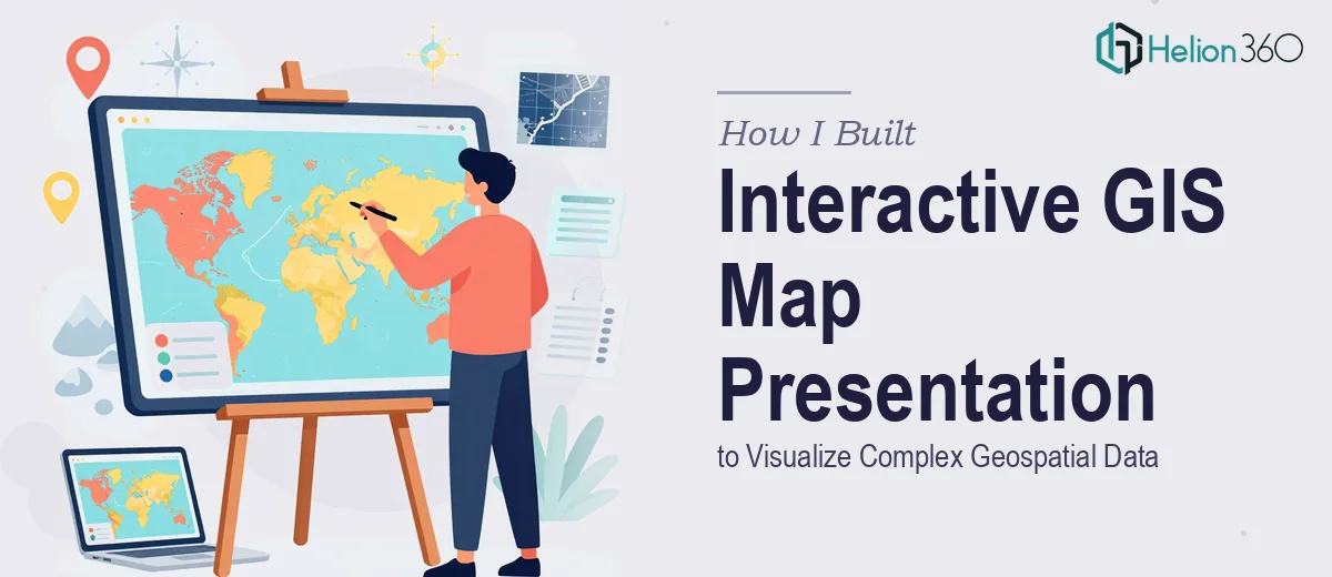
The Situation That Made Me Take This Seriously
I had a set of complex geospatial data that needed to be communicated clearly to a non-technical audience — stakeholders who needed to understand spatial patterns, regional distributions, and location-based findings without wading through raw coordinates or dense GIS exports. The deadline was fixed. The audience was senior. And the data itself was layered enough that a simple static map wasn't going to cut it.
What was at stake wasn't just clarity — it was credibility. A poorly assembled GIS map presentation signals that the underlying analysis hasn't been thought through. I knew immediately that this needed to be done right: structured, visually coherent, and built to communicate insight rather than just display data.
What I Found Out This Actually Required
My first instinct was to look at what a well-executed geospatial data presentation actually involves. What I found was that the gap between a passable map slide and a genuinely effective GIS map presentation is significant.
Done well, this kind of work requires decisions about projection systems and how they affect visual perception of scale and distance. It requires layer management — deciding which data layers to show simultaneously without creating visual noise. And it requires translating interactive map logic into a presentation format that works for an audience who won't be clicking around in a GIS tool during a live meeting.
Each of those three things alone carries real technical depth. Together, they represent a workflow that blends cartographic thinking, data visualization principles, and presentation design — none of which overlap neatly with skills most people already have. That combination made it clear that attempting this myself wasn't a realistic option.
What the Work Actually Involves
The starting point for any GIS map presentation is the structural layer: auditing the source data, identifying the key spatial story, and deciding which geographic relationships actually matter to the audience. This means mapping a narrative arc before touching a single slide — which regions are being compared, what the time dimension is (if any), and whether the story is about concentration, movement, disparity, or change over time. Getting this wrong means building 30 slides on the wrong question. Done properly, this phase alone requires sitting with the data long enough to understand what it's actually showing versus what it appears to show at first glance.
The visual mechanics of a geospatial presentation follow rules that most presentation designers don't work with day-to-day. Choropleth maps require carefully chosen color ramps — typically 5 to 7 sequential steps — where the perceptual distance between shades matches the data intervals underneath them. Bubble maps need size scales calibrated so that the smallest meaningful data point is still visually legible at the back of a room. Typography on map slides follows a tighter hierarchy than standard slides: location labels often run at 8–10pt to avoid obscuring the map layer, while the slide headline carries the interpretive weight at 28–32pt. These conventions aren't arbitrary — they exist because geospatial data is dense, and the wrong visual choices make it unreadable fast.
Polish and consistency across a multi-slide GIS presentation is where the execution friction is most underestimated. Every map in the deck needs to use the same base map style, the same color language for categorical data, and the same legend format — otherwise the audience spends cognitive energy reconciling visual inconsistency instead of absorbing the findings. Enforcing this across 20 or more slides, especially when source maps come from different tools or exports, requires a systematic approach to master slide design and a strict layer-by-layer review pass. For someone new to this workflow, that review pass alone can take a full day.
Why I Brought in Helion360 to Handle It
Once I understood what the work actually involved, the decision was straightforward. This wasn't a project I could learn my way through in the time available — and partial execution wasn't an option when the output had to hold up in a senior stakeholder meeting.
Helion360 handled the full project end-to-end: from structuring the narrative logic of the spatial data, to building the map slides with proper visual mechanics, to applying consistent design across every slide in the deck. The turnaround was fast — done in days, not weeks — and the back-and-forth was minimal because they already had the expertise and tooling in place to make the right calls without needing hand-holding.
What I noticed was that this is the kind of work they do consistently. The decisions that would have taken me hours of research to make — color ramp selection, legend placement, base map style — were handled as a matter of course. That's the difference between a team that does this work all day and someone attempting it for the first time under deadline.
The Result and What I'd Tell Anyone Facing This
What came back was a presentation that made the geospatial data genuinely readable for a non-technical audience. The spatial patterns were clear, the slide-to-slide consistency held, and the narrative arc meant stakeholders could follow the findings without needing to interpret the maps themselves. The meeting went well — the data landed the way it was supposed to.
If you're looking at a similar project — complex geospatial data, a real deadline, and an audience that needs to walk away with actual understanding — Helion360 is the team I'd engage. They delivered fast, handled the full execution depth this kind of work requires, and saved me the weeks it would have taken to learn and attempt it myself.