

When a Technical Presentation Has to Actually Land
I was staring at a brief that looked straightforward on the surface: a series of presentations for a technically sophisticated audience that needed to walk away genuinely understanding complex concepts — not just skimming slides. The stakes were real. These were product-fluent professionals who would immediately disengage if the content felt dumbed down, visually cluttered, or poorly sequenced. The presentations had to earn attention from the first slide.
What made it harder was the deadline. There was no room for a slow iteration process. The material itself was dense — layered technical logic that needed to be communicated clearly without stripping out the nuance that made it credible. I knew quickly that this wasn't something to improvise. Done poorly, it would land flat with exactly the audience that mattered most. Done well, it would do real work.
What I Found Out This Actually Requires
When I started mapping out what a properly built interactive Google Slides deck for technical professionals actually involves, the scope became clear fast.
The first signal of real complexity was the narrative architecture. Technical content doesn't sequence itself. There's a difference between information and a story that builds understanding — and for a technical audience, that distinction is especially unforgiving. Getting the logic flow right requires genuine structural thinking, not just slide-by-slide assembly.
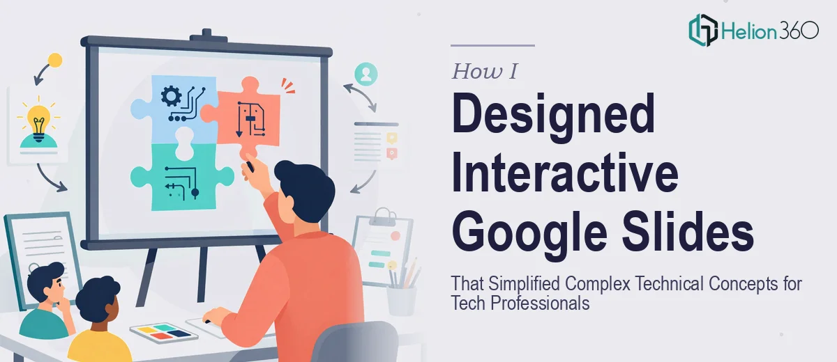
The second signal was interactivity. Google Slides supports linked navigation, dynamic section breaks, and non-linear flows — but building those cleanly so they don't break during a live presentation takes real technical familiarity with how the platform handles master slides, linked objects, and click states.
The third was visual hierarchy. Technical concepts need diagrams, annotated frameworks, and layered visuals that communicate precision — not decorative graphics. The design language has to feel credible to a technical reader, which means every visual choice is doing conceptual work.
This wasn't a weekend project. It was a discipline.
What the Work Actually Involves
The right approach to a presentation like this starts with a structural audit of all source material — technical documentation, product specs, or briefing notes — and maps it against a clear narrative arc. For a technical audience, the logic chain typically runs: problem framing, conceptual model, mechanics, implications. Deviating from that sequence without a reason causes confusion even when individual slides are well-designed. The structural work alone involves categorizing content into tiers — what the audience must understand, what supports that understanding, and what can be cut — before a single slide is touched. Getting that wrong means the deck teaches nothing, regardless of how polished it looks.
Visual mechanics for technical presentations follow specific rules that take experience to apply consistently. A 12-column layout grid keeps diagrams and text blocks aligned across slides without visual drift. Typography hierarchy — typically 36pt for section headers, 24pt for body titles, 16pt for supporting text — creates readable density without crowding. Diagrams that explain system logic, process flows, or layered concepts need annotation layers built separately from the base visual so they can be revealed progressively in a live presentation. Setting up Google Slides master slides so these annotation layers propagate correctly without breaking linked navigation takes hours even for someone experienced with the platform.
Polish and brand consistency across a multi-section technical deck is where most self-built presentations fall apart visibly. A disciplined palette — typically no more than four brand colors used with strict functional roles — keeps the deck feeling authoritative rather than assembled. Icon sets, diagram styles, and callout treatments need to match across every slide, which means establishing a component library at the start rather than designing slide-by-slide. When a deck runs twenty or more slides, retroactively fixing consistency issues doubles the production time. Doing it right from the beginning requires a system, not just good taste.
Why I Brought in Helion360 to Handle It
I recognized early that attempting this myself wasn't a realistic use of my time. The structural work, the visual mechanics, the platform-specific build — each one was a skill set, not a task. Combining all three under a deadline was a specialist job.
Helion360 handled the full project end-to-end. That meant taking the source material and doing the narrative architecture work from scratch, not just reformatting slides I'd already built. It meant building the interactive navigation properly in Google Slides so the deck could be presented without technical risk. And it meant applying visual consistency at the component level so the final deck looked like a single coherent piece of work.
What stood out was how fast it moved. The turnaround was done in days, not weeks — handled in a fraction of the time it would have taken me to work through the learning curve and execution on my own. The expertise and tooling were already in place. There was no ramp-up time on my end.
What the Deck Delivered and What I'd Tell Anyone in My Spot
The finished presentations did exactly what they needed to do. Technical professionals engaged with the content, followed the logic, and left with a clear understanding of concepts that had previously required lengthy verbal explanation. The interactive structure let the presenter move fluidly between sections based on audience questions — which, for a technical room, made a noticeable difference in how the session felt.
The visual design held up under scrutiny. Diagrams were precise, hierarchy was readable, and the brand application was consistent throughout. It looked like work that had been thought through, because it had been.
If you're looking at a similar problem — technical material, a demanding audience, and a deadline that doesn't allow for a long learning curve — Helion360 is the team to engage. They delivered end-to-end, fast, and with the kind of execution depth this work genuinely requires.
For presentations that need to make an impact, visual enhancement of presentation services can transform your material into polished, professional work. You might also explore how others tackled complex information design and interactive presentation techniques to understand the full scope of what's possible.