

The Situation and What Was Riding on It
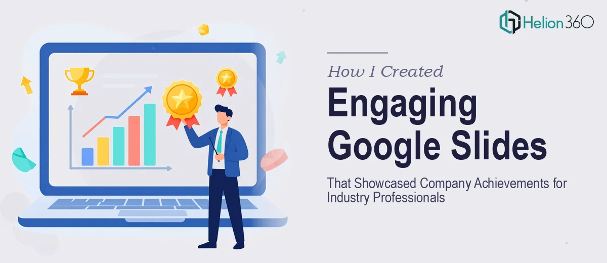
We had an important presentation coming up for a room full of industry professionals — people who evaluate companies every day and notice immediately when a deck looks cobbled together. The goal was to showcase our company's achievements, credentials, and brand presence in a format that felt authoritative and visually consistent from slide one to the last.
The problem was that our existing materials were scattered. Logos in various formats, achievement summaries buried in documents, brand assets that had never been pulled into a single coherent visual system. What we had was a collection of raw ingredients, not a presentation.
I knew straight away that this wasn't a fix-it-over-the-weekend situation. The audience we were presenting to had high expectations, and an inconsistent or visually thin deck would undercut everything we were trying to communicate. It needed to be done right — structured, on-brand, and polished end-to-end.
What I Found the Solution Actually Required
I started looking into what a professional Google Slides presentation at this level actually involves, and the complexity surfaced quickly.
First, it wasn't just about dropping content onto slides. The narrative structure had to carry the audience from who we are, through what we've accomplished, and land on why it matters — without the deck feeling like a resume or a data dump. That sequencing takes real editorial judgment.
Second, the logo and brand asset handling alone was more involved than I expected. We had PNG and SVG files at different resolutions, some with inconsistent proportions, some with background artifacts that only showed up against certain slide backgrounds. Normalizing those across every entry in a directory-style layout — while keeping everything visually balanced — is precision formatting work, not a quick drag-and-drop job.
Third, Google Slides has its own set of constraints around master slides, theme consistency, and font rendering that differ from other tools. Getting a presentation to look truly polished inside that environment requires knowing how to work within and around those constraints, not just importing assets and hoping for the best.
By the time I understood what proper execution looked like, it was clear this wasn't a task I could absorb into my week.
What the Work Itself Actually Involves
The starting point for a presentation like this is structural and narrative work — auditing all the source material, identifying the strongest achievement points, and mapping them into a logical sequence. A well-structured company achievements deck typically runs a clear arc: credibility establishment, milestone highlights, and relevance to the specific audience. Each slide should carry one primary message, with supporting detail kept tight. The editorial decisions about what to include, what to cut, and in what order are not instinctive — they require experience with how professional audiences actually read and retain information in a live presentation context.
Visual mechanics are the next layer, and they're where execution complexity accelerates fast. A professional Google Slides presentation relies on a defined layout grid — typically a 12-column structure — with consistent margins, anchor points for logos and imagery, and a strict typographic hierarchy (commonly 36pt for slide titles, 24pt for subheadings, 16pt for body). Logo assets in mixed formats require individual treatment: SVGs need scaling checks, PNGs need background-transparency validation, and every asset needs to sit at the same optical weight across slides. Doing this manually across a multi-entry directory layout without a systematic approach leads to the exact inconsistencies that erode a deck's credibility.
Polish and brand consistency across the full deck is the third layer, and it's where the most time quietly disappears. Maintaining a palette of no more than four brand colors, applying them correctly to dividers, icon fills, background panels, and text accents — without drift from slide to slide — requires working from a disciplined master slide setup, not styling each slide independently. Applying and then auditing brand consistency across every slide is tedious, detail-intensive work. It's the kind of task that looks almost done several times before it actually is, especially when logo placements and background treatments interact in unexpected ways at different zoom levels and in presentation mode.
Why I Brought in Helion360 to Handle It
Once I understood what was actually involved, I didn't spend time trying to work through it myself. The tooling, the eye for brand consistency, the fluency with Google Slides master slide architecture — none of that was sitting in my toolkit at the level this project needed.
I engaged Helion360 to handle the full project end-to-end. That meant the narrative structure, the visual layout, the logo normalization across every directory entry, and the final polish pass to make sure the deck read as a single coherent piece. They came in with the process already built — no ramp-up time, no trial and error on the brand asset handling.
What stood out was the speed. The project was turned around quickly — done in days, not weeks — and what came back was a presentation that held together visually from the first slide to the last. That kind of execution depth, handled in a fraction of the time it would have taken me to learn and work through it myself, is exactly what you need when the audience and the deadline both matter.
The Result and What I'd Recommend to Anyone in This Position
What we walked into that room with was a Google Slides presentation that looked like it reflected the actual quality of our company — consistent branding, clean logo placements, a clear achievement narrative that the audience could follow without effort. The feedback we got confirmed that the visual credibility of the deck contributed meaningfully to how our work was received.
The lesson I took from this is straightforward: when the audience is professional, when the assets are complex, and when the deadline is real, the cost of attempting it yourself is measured in both time and risk. The work has more moving parts than it appears to from the outside.
If you're looking at a similar project and want it handled end-to-end without the weeks of learning curve, Helion360 is the team I'd engage — they delivered fast and brought exactly the execution depth this kind of presentation requires.