

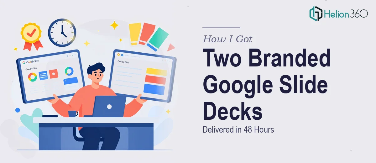
The Situation I Was Looking At
We had two presentation decks that needed to go out fast — one for an internal audience, one for an external one. Both had to look like they came from the same brand, same team, same visual language. The problem was that our existing slides were a patchwork: different font choices on different slides, logos dropped in at inconsistent sizes, color values that were close but not quite right. It wasn't a disaster, but it was the kind of thing a sharp audience notices immediately.
The stakes were real. The external deck was going in front of people who would form a first impression of our company based partly on how professionally we presented ourselves. A messy, inconsistent presentation signals a messy, inconsistent operation — even when the content is solid. I knew this couldn't be a quick cleanup job. It needed proper branding applied end-to-end across both decks, and it needed to be done quickly.
What I Found Out This Actually Involves
My first instinct was to scope this myself — how hard could it be to apply a logo and a color palette across some slides? The answer, once I looked into it properly, was: considerably harder than it looks.
The first thing I learned is that Google Slides has its own master slide system, and if the master isn't set up correctly, every manual fix you make gets overridden the moment someone edits the deck. Proper branding in Google Slides means building the logic into the theme itself, not just painting over slides one by one.
The second issue was color consistency. Brand colors in presentations aren't just hex codes dropped into a fill picker. A proper branded palette accounts for primary, secondary, and accent usage rules — which color goes on which element, what the text contrast ratios need to be for readability, and how the palette behaves on both light and dark slide backgrounds.
The third signal that this wasn't a weekend project was the cross-deck consistency requirement. Two decks, same brand, different purposes — that means the visual system has to be designed to flex without breaking. That's a design systems problem, not just a formatting problem.
What the Work Actually Entails
The right approach to a project like this starts with a structural audit of both decks. A practitioner reviews each presentation for narrative flow, identifies where slide types repeat (title slides, section dividers, content slides, data slides), and maps those types to a master layout system. In Google Slides, this means building out custom slide masters and layouts — typically eight to twelve layout variants for a complete deck — so every new slide inherits the correct brand treatment automatically. Getting this architecture right before touching a single piece of content is what separates a durable branded deck from one that falls apart the moment someone edits it. Skipping this step is the single most common mistake, and it costs hours in rework.
Visual mechanics are where the detail work lives. A properly branded presentation operates on a defined typographic hierarchy — commonly 36pt for display headings, 24pt for section titles, and 16pt for body text — and a layout grid, typically a 12-column structure, that controls how elements align and breathe on each slide. Logo placement follows specific rules: minimum clear space equal to the height of the logo mark on all sides, consistent anchoring to a corner or footer zone across every layout. Color application isn't freeform — a max of four brand colors are in active use at any time, with defined rules for when each appears. Setting all of this up correctly in Google Slides' theme editor, and testing it across every layout variant, takes disciplined execution time that compounds fast.
Polish and cross-deck consistency is the final layer, and it's where most DIY attempts visibly break down. When two decks share a brand system, every repeated element — divider lines, icon styles, callout boxes, data table formatting — needs to behave identically across both files. This means a systematic pass through every slide in both decks, checking alignment to the pixel, verifying that font weights haven't drifted, confirming that any imagery or iconography sits within the same visual register. For two full decks, this consistency audit alone is a multi-hour process even for someone who does it regularly.
Why I Brought Helion360 In to Handle the Full Project
Once I understood what the work actually required, the decision was straightforward. I didn't have the hours to build a proper master slide system from scratch, and I certainly didn't have the design systems experience to make two separate decks feel like one coherent brand expression. Attempting it myself would have meant days of learning curve before producing anything worth showing.
Helion360 handled the full project end-to-end — master slide architecture for both decks, brand palette application with proper contrast and usage rules, logo placement across every layout, and the full consistency audit across both files. The whole thing was turned around in under 48 hours. That's not a timeline I could have come close to on my own, even setting aside the quality gap. What would have taken me the better part of two weeks — if I'd gotten it right at all — was done in days by a team that builds these systems regularly and has the tooling already in place.
What I'd Tell Anyone Looking at the Same Problem
The decks that came back were exactly what I needed — clean, consistent, properly structured, and ready to present without any last-minute scrambling. The external deck held up in the room. No one commented on the design because there was nothing to comment on; it simply looked right, which is the goal.
If you're staring at two decks that need to work together visually and you've started to realize how much is actually involved in doing that properly, don't spend a week figuring it out yourself. The team to engage knows how to build a visual brand identity that scales — and they deliver with the kind of execution depth that only comes from doing this work day in and day out.
For similar challenges, explore how others have tackled brand-consistent presentations across departments, or learn what goes into customizable PowerPoint and Word templates that enforce brand consistency.