

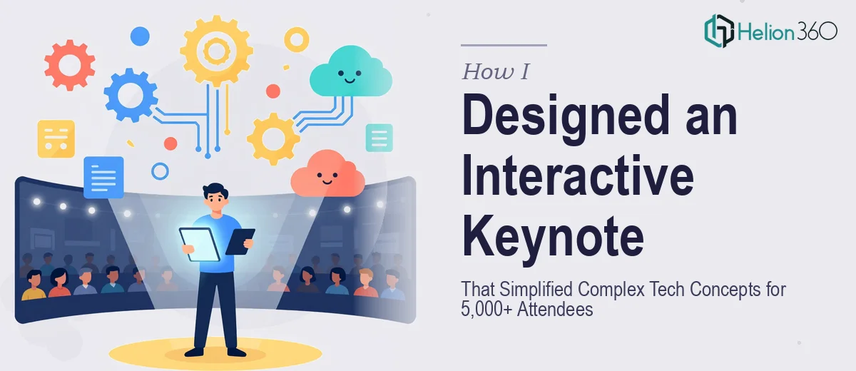
The Brief Looked Simple Enough — Until It Wasn't
I was tasked with building a keynote presentation for an upcoming tech conference with an audience of over five thousand people. The scope covered five major topics: recent breakthroughs in artificial intelligence, emerging technologies in cybersecurity, advancements in cloud computing, blockchain's impact on business operations, and future predictions for data analytics.
On paper, it sounded like a manageable design project. In practice, it was one of the most layered briefs I had ever taken on.
The challenge was not just about making slides look good. Each topic carried dense, technical content that needed to land clearly for both seasoned professionals and people just entering the industry. The deck had to hold attention in a large auditorium, scale properly across projection screens and smaller devices, and include interactive elements — animations, transitions, and clickable navigation paths — that made the flow feel deliberate rather than linear and flat.
Where the Complexity Started Stacking Up
I started with what I knew: building a visual structure, mapping out the narrative arc, and roughing out layouts in Adobe Illustrator. The high-fidelity mockups came together reasonably well in the early stages. I had a visual language that felt right for the subject matter — clean, technical, but still accessible.
The problem showed up when I moved into the interactive layer. Designing slide transitions that reinforced the story rather than distracted from it took far more iteration than I expected. Clickable links needed to behave consistently across different playback environments. Animations had to feel smooth without slowing down the cognitive load on a slide that was already carrying complex data.
On top of that, ensuring every visual element was optimized for various screen sizes — from the main stage display to tablets used backstage — added another dimension of technical constraint I was not fully equipped to manage on my own within the timeline.
Bringing in a Team That Could Handle the Depth
After hitting a wall with the interactive components and realizing the timeline was tightening faster than my revision cycles, I reached out to Helion360. I walked them through the brief, shared the draft assets I had built, and explained where the gaps were.
Their team picked it up cleanly. They understood exactly what a high-stakes keynote presentation design required — not just polished visuals, but a functional, interactive slide deck that could perform reliably in a live conference environment.
What stood out was how they handled the technical content. Translating complex topics like AI breakthroughs and blockchain's operational impact into visuals that felt clear without being reductive is a specific skill. They built infographic-style layouts that gave each concept visual breathing room, used data visualization graphs thoughtfully where numbers needed context, and designed the interactive elements so the presenter could navigate non-linearly if needed during the live session.
What the Final Deck Looked Like
By the time the presentation was finalized, it was a genuinely polished keynote — consistent branding throughout, smooth animated transitions between topic sections, and a visual hierarchy that guided the audience without overwhelming them.
The five topic sections each had their own visual identity within a shared design system, which made the deck feel cohesive while signaling clearly when the subject shifted. Charts and data points were rendered in ways that made comparisons immediate and readable from a distance. The interactive elements worked exactly as intended across the tested devices.
From where I started — a rough draft with solid bones but unresolved complexity — to the finished product, the gap was significant. And the part that closed that gap was having the right team handle what I could not resolve alone in the time available.
What I Took Away From This
Keynote presentation design at a conference scale is not just a design job — it is part design, part UX thinking, part technical execution, and part audience psychology. Knowing where your own bandwidth ends is part of doing the work well.
If you are working on a similar project — a large-scale keynote, an interactive deck covering complex technical content, or any presentation where the visual and functional stakes are both high — Helion360 is worth a conversation. They handled the depth of this project without needing to be walked through every detail, and the result spoke for itself on the day of the conference.