

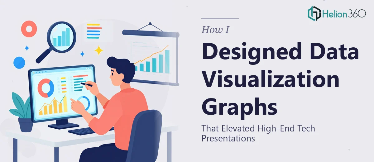
When the Data Was Strong but the Visuals Were Falling Flat
I was working on a series of business presentations for a tech-sector marketing campaign, and the data we had was genuinely impressive. Growth metrics, competitive benchmarks, product adoption curves — the kind of numbers that should stop a room cold. But every time I built the slides, the charts looked functional at best. Bar graphs with default colors, pie charts that nobody wanted to read, and line graphs that communicated nothing at a glance.
For a high-end audience, that simply was not going to work.
The Problem With DIY Chart Design in Professional Presentations
I tried to push through it on my own. I adjusted chart colors in PowerPoint, experimented with custom layouts, and even pulled in some third-party templates. The results were inconsistent. Some slides looked polished, others looked like they came from a different deck entirely. Brand consistency was the first casualty.
Our brand guidelines had specific typography and a defined color system. Mapping those accurately onto charts — especially when each slide had a different type of data visualization — required more precision than I could manage while also handling the content and structure side of the presentation. Getting the graphs to work at both screen resolution and print quality added another layer of complexity I had not anticipated.
The deadline was also pressing. I did not have the runway to iterate my way to a professional result.
Bringing in a Team That Specializes in Presentation Graph Design
After hitting a wall with the third round of revisions, I came across Helion360. I explained what we needed: fully customized charts and data visualization graphs built to match our brand guidelines, designed to work across digital and print formats, and delivered quickly enough to meet our project timeline.
Their team asked the right questions from the start. They wanted to understand the story behind each data set, not just the numbers. They asked about the audience, the context in which each chart would be presented, and which metrics needed to lead visually. That level of detail told me they were thinking about the charts as communication tools, not just design assets.
What the Final Graphs Actually Looked Like
The difference between what I had built and what came back was significant. Every chart used our brand color palette precisely, with visual hierarchy built in so the most important data point was immediately obvious. The typography matched the rest of the deck. Axis labels were clean and readable. The graphs were consistent in style across every slide, which is something I had completely failed to achieve on my own.
Beyond the aesthetics, the data visualization choices themselves were better. Where I had defaulted to a standard bar chart, the team used a structure that made the comparison clearer. Trend data was shown in a way that emphasized direction rather than just numbers. Each chart was doing actual communication work.
The deliverables were also formatted for both screen and high-resolution print, which meant I did not have to go back and reformat anything for different output contexts.
What I Took Away From This Process
Graph design for professional presentations is a more specialized skill than most people realize. It sits at the intersection of data interpretation, visual design, and brand communication. Getting one of those right is manageable. Getting all three right, consistently, across a full deck, under a tight deadline, is a different challenge entirely.
I also learned that the brief matters as much as the execution. The questions Helion360 asked at the start shaped everything that came back. Having clear answers about audience, context, and the story the data needs to tell is what separates a polished chart from a generic one.
If you are working on business presentations where the data needs to carry weight visually, Helion360 is worth reaching out to — they stepped in at exactly the right point and delivered work that I could not have produced on that timeline or at that quality level.