

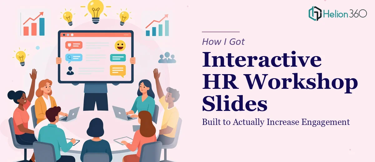
The Workshop Was Coming Up and the Slides Were Not Working
I was preparing materials for a multi-session HR workshop — the kind where participants cycle through modules, absorb data-heavy content, and need to stay mentally present for hours at a time. The existing slides were static, dense, and doing nothing to hold attention. Charts were flat images. Data was buried in bullet points. There was no way someone was going to retain anything meaningful from what we had.
The stakes were real. This wasn't an internal catch-up call — it was a structured learning program with measurable outcomes. Facilitators needed slides they could navigate dynamically, and participants needed something that invited interaction rather than passive scrolling. I knew immediately that the solution wasn't a visual refresh. What was needed was a rebuild using interactive PowerPoint design — clickable navigation, animated chart reveals, and structured visual storytelling that matched how adults actually learn.
This needed to be done right, and it needed to be done before the first session date.
What I Found Out This Kind of Work Actually Requires
Once I started researching what proper interactive PowerPoint design looks like for a workshop context, it became clear quickly that this was not a weekend formatting job. The work sits at the intersection of instructional design logic, data visualization principles, and advanced PowerPoint mechanics — and getting any one of those wrong undermines the whole thing.
Clickable elements in PowerPoint, for example, aren't just buttons dropped onto a slide. They rely on hyperlink triggers, action settings, and carefully structured slide groups — and when the deck runs across 40 or 50 slides, a single broken link cascades into a broken learner experience mid-session. That's a facilitator's nightmare.
On top of that, animated chart reveals — where data appears progressively to guide a viewer through an insight — require per-element animation sequencing with precise timing and trigger logic. Done poorly, they feel chaotic. Done well, they guide attention exactly where it needs to go.
I also realized quickly that workshop slides have a specific visual language. The 36pt/24pt/16pt type hierarchy that works in a boardroom deck doesn't hold up when participants are seated at varying distances and processing information under time pressure. Adapting the visual system for that context is its own skill. That combination of factors told me this was specialist work, not something to attempt in spare hours.
What the Work That Needs to Happen Actually Looks Like
The first thing proper interactive presentation design requires is a structural audit of the source content and a rebuilt narrative architecture. For a workshop, that means mapping each module's learning objective to a slide flow — deciding which data points warrant a progressive chart reveal, which sections need branching navigation so facilitators can skip or revisit, and where interactive elements will actually serve comprehension rather than just look impressive. The audit alone typically surfaces significant problems: slides trying to do too much at once, data presented before the context that makes it meaningful, and sections with no clear visual hierarchy to guide a viewer's eye. Fixing those structural issues before any design work begins is what separates a workshop deck that works from one that just looks better.
The visual mechanics layer is where the real technical depth lives. Interactive PowerPoint charts built for a learning environment use animation triggers set to "on click" or "with previous" at the object level — not at the slide level — so individual bars, lines, or data callouts appear in a controlled sequence. A well-built chart reveal might have six to eight separately animated elements on a single slide, each timed to support a narrated point. The layout underneath uses a consistent grid — typically a 12-column base — so that charts, labels, and supporting text align predictably across every module. Getting that grid to propagate correctly through PowerPoint's slide master system, and then building interactive elements on top of it that don't break when content is edited, takes significant hands-on experience.
Polish and consistency across a multi-module deck is the last layer, and it's where amateur attempts most visibly fall apart. A workshop deck might span four or five distinct modules, each with different data sets and facilitator needs, but the visual system — palette (maximum four brand colors with defined usage rules), iconography style, chart labeling conventions, and interactive button design — has to read as one coherent program. Inconsistency in something as small as button placement or color usage for "active" versus "inactive" states breaks participant trust in the material. Applying that discipline across 50-plus slides, while also managing animation states and link integrity, is time-consuming work that compounds quickly if not handled methodically from the start.
Why I Brought Helion360 In to Handle the Full Project
I looked at the scope — structural rebuild, interactive chart design, animation sequencing, brand consistency across multiple modules — and made the call quickly. There was no version of this where I was going to learn PowerPoint's trigger logic, rebuild the slide master, and produce polished interactive charts in the time available. That path leads to a half-finished deck the night before a workshop.
Helion360 handled the full project end-to-end: the content audit and narrative restructuring, the interactive chart builds with per-element animation sequencing, and the brand-consistent visual system applied across every module. The deck was turned around quickly — done in days, not the weeks it would have taken me to attempt the same work from scratch. The team came in with the tooling, the methodology, and the pattern library already in place. There was no ramp-up, no back-and-forth on basics. The brief went in and a fully functional, professionally designed interactive deck came out.
The Result and What I'd Tell Anyone Looking at the Same Problem
What came back was a deck that facilitators could actually use — branching navigation that let them move between modules without hunting through slide numbers, chart reveals that supported the spoken narrative rather than competing with it, and a visual system consistent enough that participants could orient themselves instantly in any section. Feedback from the first session confirmed what good interactive design is supposed to do: people stayed engaged, the data landed, and the facilitators felt in control of the room.
If you're looking at a workshop or training program where the current slides aren't doing the job — and you can see that rebuilding them the right way involves more than a formatting pass — Helion360 is the team to engage. They handle this kind of work end-to-end and deliver fast, without the weeks of learning curve that come with attempting it yourself.