

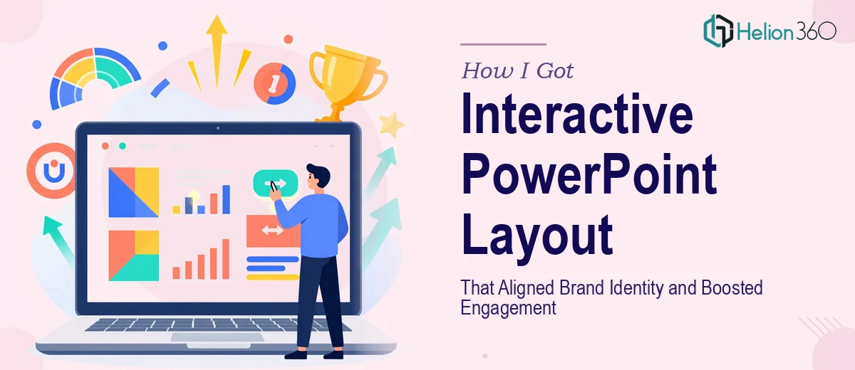
The Situation I Was Staring Down
I had just launched my e-commerce business and the marketing presentation I was using to introduce the brand felt flat. The slides were functional, but they didn't reflect who we were. Colors were inconsistent, the layout shifted unpredictably from slide to slide, and nothing guided the viewer's eye in a purposeful way. There was no interactivity — no clickable navigation, no layered reveals, nothing that made the experience feel like it belonged to a brand that cared about visual engagement.
The stakes were real. These materials were going to customers, potential partners, and early collaborators who would form their first impression of the business from what they saw on screen. A generic, misaligned presentation wasn't just a cosmetic problem — it was a credibility problem. I knew immediately that a surface-level cleanup wasn't going to cut it. This needed a proper PowerPoint layout redesign, done to a standard that matched what the brand was actually building toward.
What I Realized the Work Actually Required
Before I engaged anyone, I spent time understanding what a proper interactive PowerPoint layout modification actually involves. The more I looked into it, the more I understood why this isn't a weekend project.
First, brand alignment in a presentation isn't just swapping in logo colors. It means building a consistent visual system — master slides, slide layouts, font hierarchies, and color palettes — that propagates correctly across every single slide so nothing breaks when content is added or reordered.
Second, interactivity in PowerPoint is its own discipline. Clickable buttons, hyperlinked navigation menus, trigger-based animations, and layered content reveals all require intentional planning and precise execution. One misconfigured trigger or broken hyperlink and the whole interactive experience falls apart in front of your audience.
Third, visual storytelling at the slide level requires more than nice visuals. It means understanding what each slide is supposed to accomplish narratively and designing the layout to support that moment — not just filling a template. That combination of brand systems thinking, interactive mechanics, and narrative design made it obvious this was not something to attempt piecemeal.
What the Work Actually Involves
The right approach to an interactive PowerPoint layout redesign starts at the structural level. Before a single slide is touched visually, the master slide system needs to be audited and rebuilt. This means defining a parent master with a strict 12-column layout grid, then creating child layouts that cover every use case — full-bleed image slides, split content slides, data slides, and section dividers — so the grid governs every layout automatically. Typography must follow a deliberate hierarchy: typically 36pt for headlines, 24pt for subheadings, and 16pt for body text, applied globally through the master so it never drifts. Getting this foundation right across a full deck of even 20 slides requires methodical work that takes far longer than it looks from the outside.
Visual brand application is the second layer, and it's where inconsistency most commonly creeps in. The right approach limits the palette to no more than four brand colors — a primary, a secondary, a neutral, and an accent — and maps each to specific use cases across the system: headline backgrounds, icon fills, data labels, divider lines. Every graphic asset, icon set, and image treatment needs to match the same visual language so nothing looks imported from a different universe. The execution friction here is real: even a single slide where a designer eyeballed a color instead of sampling from the brand swatch can cascade into a noticeable inconsistency at scale.
Interactivity is the third layer, and it's the one most often underestimated. A well-built interactive PowerPoint uses hyperlinked navigation buttons tied to named slide sections, trigger-based animations that reveal content in controlled sequences, and occasionally action buttons that simulate a menu-driven experience. Each interactive element needs to be tested across both Presenter View and standard playback to confirm it behaves identically. Broken links and misfiring triggers are common when this work is rushed — and in a live presentation context, they're immediately visible to the audience.
Why I Brought Helion360 in to Handle the Full Project
Once I understood what a proper interactive PowerPoint layout modification required, the decision was straightforward. I wasn't going to spend two weeks reverse-engineering master slide systems and interactive trigger logic while also running a new business. I needed someone who already had the process, the tooling, and the eye for it.
I engaged Helion360 to handle the project end-to-end. They took on the full scope: rebuilding the master slide architecture for brand consistency, applying the complete visual identity system across every layout, and engineering the interactive navigation and content reveals. The whole thing was turned around quickly — done in days, not the weeks it would have taken me to work through the learning curve alone. What I received back wasn't a patched-up version of what I had. It was a rebuilt presentation system that looked and behaved like it was built for the brand from day one.
The Result and What I'd Tell Anyone in the Same Spot
The delivered presentation held together visually in a way the original never did. Brand colors, typography, and layout were consistent across every slide. The interactive navigation made it genuinely easy for viewers to move through the deck on their own terms — something that immediately changed how the material was received. Collaborators who had seen the earlier version noticed the difference without being prompted. The presentation finally looked like it belonged to a business that had thought carefully about how it showed up.
If you're looking at a similar gap — a PowerPoint that doesn't reflect your brand or engage your audience the way it should — and you want it handled end-to-end without the weeks of learning curve, the team I'd engage knows how to deliver results. They handled the full depth of execution this kind of work requires. For similar transformations, explore brand-aligned PowerPoint template design and learn how visual presentations aligned with brand identity drive real audience impact.