

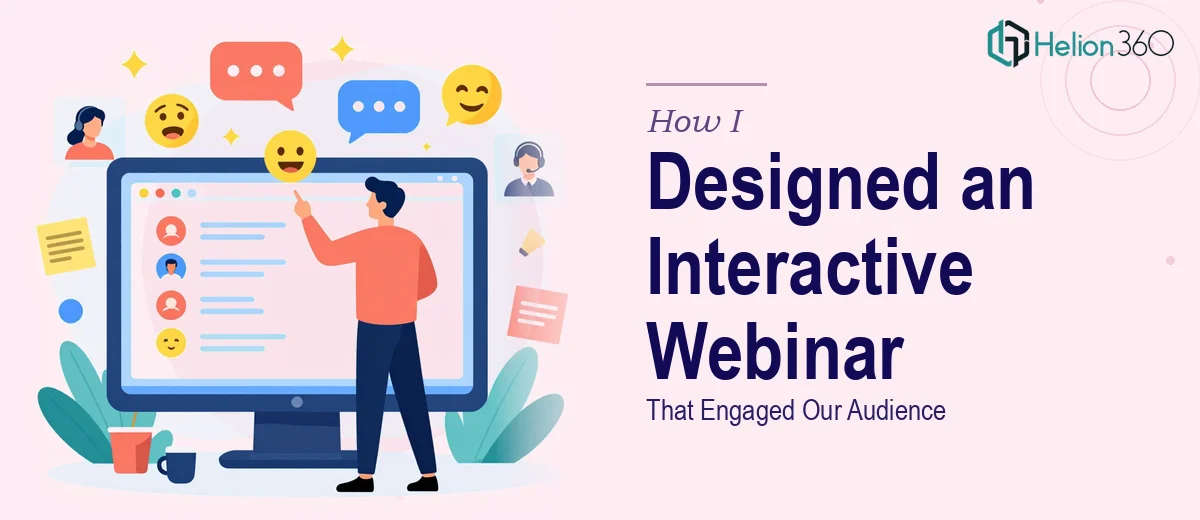
The Webinar Was Set. The Slide Deck Was Not.
We had a webinar locked in — date confirmed, audience invited, content outlined. What we didn't have was a slide deck that could hold up in front of that audience. The content covered our company history, recent industry developments, and our goals for the session itself. On paper, it sounded manageable. In practice, turning that into a polished, on-brand, interactive PowerPoint webinar presentation was a different problem entirely.
The stakes were real. Webinar audiences are notoriously easy to lose. One cluttered slide, one jarring transition, one off-brand color choice and attention drops. I knew immediately this wasn't something to rough out over a weekend. It needed to be done properly — clean structure, consistent design, multimedia elements that actually worked — and it needed to be ready in time to go through an internal review round before the session.
What I Found Out a Webinar Deck Actually Requires
I spent some time researching what separates a presentation that holds an online audience from one that quietly loses them. The gap is larger than most people expect.
First, webinar-specific slide design follows different rules than a boardroom deck. Slide layouts need to account for lower screen resolution, varied viewer setups, and the fact that no one is in the same room reading the room with you. Typography hierarchies — typically 36pt for headers, 24pt for subheads, 16pt for body — have to be enforced consistently so viewers can follow along without straining.
Second, interactivity in PowerPoint isn't just dropping in a poll graphic and calling it done. Embedding video, syncing animated elements to a presenter's talking points, and building in quiz or engagement moments each requires its own layer of technical setup inside the file itself.
Third, brand consistency across 30 or 40 slides is genuinely hard to maintain manually. Colors drift. Font weights slip. Logo placement varies. What looks fine at slide 5 looks inconsistent by slide 25 if there's no disciplined master slide structure holding everything together.
What the Work on a Project Like This Actually Looks Like
The first thing that has to happen on an interactive webinar deck is a structural audit and narrative mapping. The source content — company history, industry context, session goals — needs to be sequenced so each section earns attention before the next one begins. A well-structured webinar deck typically opens with a strong scene-setter, moves through content in chunks of no more than five to seven slides per topic, and builds toward a clear close. Getting that architecture right before a single visual is placed is the difference between a deck that flows and one that meanders. Practitioners who do this well will flag content that doesn't serve the narrative and suggest restructuring — that editorial judgment takes experience and isn't something a template solves.
The visual mechanics layer is where webinar decks diverge sharply from standard presentation work. Slide layout grids — commonly a 12-column system — need to be set at the master level so every element snaps to a consistent structure across all slides. Embedded video requires correct compression and codec settings so it plays without lag inside the file. Infographic slides need custom-built visual elements, not stock icon dumps. Animations and transitions, when done well, follow a deliberate logic: entrance animations at 0.5 seconds or less keep energy up without distracting. Getting all of this technically right, while keeping the file size manageable and the interactivity functional, is a multi-hour process for someone who hasn't built this type of deck before.
Polish and brand consistency is the final layer, and it's the one most likely to unravel under time pressure. A disciplined webinar deck holds to a maximum of four brand colors, applies them to a defined role — primary, secondary, accent, neutral — and never deviates across the full deck. Font pairing needs to be locked in the slide master so it doesn't drift when content is edited. Every visual asset — icons, charts, photos — needs to follow the same treatment style. Reviewing 40 slides for consistency, correcting alignment down to a few pixels, and ensuring the file renders identically across different versions of PowerPoint takes time that most people simply don't have sitting available.
Why I Brought Helion360 in to Handle the Full Project
I looked at what this work actually required and made the call quickly. The structural work, the visual mechanics, the brand application, the interactivity setup — each of those is a skill set on its own. Stacking them, on a deadline, for a presentation that would be seen live by our entire webinar audience, was not a place to learn on the job.
Helion360 handled the project end-to-end through our complete deck presentation service. That meant taking the raw content outline and building the full narrative structure, designing every slide from master setup through final polish, and embedding the multimedia and interactive elements so everything functioned cleanly inside the file. The deck came back fast — turned around in days, not weeks — which gave us real time for an internal review round before the session went live. The team already had the tooling, the design system, and the technical depth in place. There was no ramp-up time, no back-and-forth over fundamentals.
What the Presentation Delivered and What I'd Tell Anyone in This Spot
The finished deck was exactly what the webinar needed. The structure held the audience's attention across the full session. The interactive elements — embedded video, animated data points, infographic slides — worked cleanly without technical hiccups. Feedback from colleagues during the review round was the kind that means the design is doing its job: no one was commenting on slide mechanics, they were commenting on the content itself.
If you're looking at a polished 30-slide PowerPoint for investor and partner meetings, or need a modern PowerPoint presentation that unified company vision, Helion360 is the team to engage. They delivered the full execution fast, and the depth of work showed in every slide.