

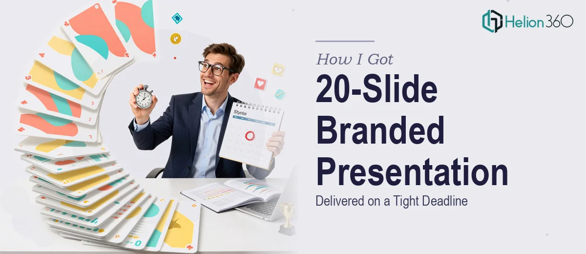
The Deadline Was Real and the Stakes Were Higher Than I Expected
I had an education company presentation that needed to be done — 20 slides, fully interactive, brand-consistent, and ready for a live stakeholder session in under two weeks. The deck wasn't decorative. It had to walk a mixed audience through curriculum frameworks, outcome data, and program positioning in a way that felt cohesive and professional from the first slide to the last.
The briefing documents and research were already prepared. That part was done. What wasn't done was the translation of all that material into a presentation that actually communicated clearly, held attention, and held together visually across every single slide. I knew from the start that this wasn't a "clean it up over the weekend" situation. Getting it wrong in front of this audience wasn't an option.
What I Found Out This Kind of Work Actually Requires
Before I made any decisions, I spent time understanding what a well-executed interactive branded presentation actually involves. What I found made it immediately clear this was a specialized project.
First, interactive presentations aren't just slides with hyperlinks dropped in. Done properly, they use structured navigation logic — clickable menus, conditional pathways, and return anchors — that have to be mapped before a single slide is built. Getting that architecture wrong means the whole flow breaks mid-presentation.
Second, brand consistency across 20 slides is harder than it sounds. It's not just using the right logo and hex codes. It means a locked master slide system, a disciplined typographic hierarchy applied at every level, and visual rules that hold up even on the edge-case slides — the data-heavy ones, the transitional ones, the ones where content doesn't fit the standard template.
Third, the source material — research documents and briefings — doesn't arrive in presentation-ready form. Converting dense educational content into slide-length thinking, without losing substance, is its own editorial discipline. That alone would have taken me days to do properly.
What the Execution of a Project Like This Actually Involves
The first thing that needs to happen is a content audit and narrative architecture pass. That means going through every briefing document, identifying the core argument each section needs to make, and mapping the 20-slide flow before any visual work begins. A proper slide structure uses a clear hierarchy — typically no more than one key message per slide, supported by no more than three supporting points — and the transitions between sections have to be deliberate, not just chronological. For a 20-slide deck covering curriculum content and outcome data, that structural pass alone can take a full day when done carefully, and skipping it produces a deck that feels disjointed even if it looks polished.
Visual mechanics come next, and this is where inexperience shows up fast. A presentation built for brand consistency needs a master slide system with locked layout grids — a standard approach uses a 12-column underlying grid to govern element placement — along with a typographic scale (typically 36pt for titles, 24pt for subheads, 16pt for body) applied without exception across all 20 slides. Color discipline means no more than four brand colors used purposefully, with a defined role for each. Building this system correctly in PowerPoint or a comparable tool, so it propagates without breaking across interactive and data slides, requires hands-on experience with the software's master and layout architecture. Someone new to this will spend hours troubleshooting inconsistencies that an experienced practitioner avoids by default.
Interactivity adds another layer that most people underestimate. Proper interactive navigation in a 20-slide educational presentation involves building a clickable chapter menu, assigning return-to-menu anchors on each section's final slide, and testing every pathway before the file is finalized. The interaction logic has to be mapped first — ideally in a simple flowchart — because adding it retroactively after slides are built creates broken links and misaligned triggers. Testing all navigation paths in presenter mode, not edit mode, is a non-negotiable final step that still gets skipped, causing live failures at the worst possible moment.
Why I Brought in Helion360 to Handle It
Once I understood what the project actually required, I didn't spend time attempting it myself. The combination of structural editing, master slide architecture, visual system building, and interactive navigation testing represented weeks of work for someone without the tooling and pattern recognition already in place.
I engaged Helion360 to take the full project from briefing documents to finished deck. They handled the narrative architecture pass — deciding how the educational content mapped across 20 slides — the visual system build, the interactive navigation layer, and the final consistency review. The deck was turned around quickly, in a fraction of the time it would have taken me to work through even the structural phase on my own. What made it workable was that Helion360 does this kind of project routinely. The slide master system, the grid discipline, the interaction logic — that's not something they're figuring out on the fly. It's already built into how they work.
The Result and What I'd Tell Anyone Facing the Same Situation
What came back was a 20-slide interactive presentation that held together visually from cover to close, with navigation that worked cleanly in presenter mode and brand application that was consistent on every slide — including the data-heavy ones. The stakeholder session went without a hitch. The audience could follow the structure, the material landed clearly, and the deck didn't look like it was assembled under pressure.
If you're looking at a similar project — source material in hand, a real deadline, and a presentation that needs to work both visually and structurally — Helion360 is the team I'd engage. They delivered fast, handled the full execution end-to-end, and brought the kind of depth this work requires without the weeks of learning curve.