

The Situation and What Was Actually at Stake
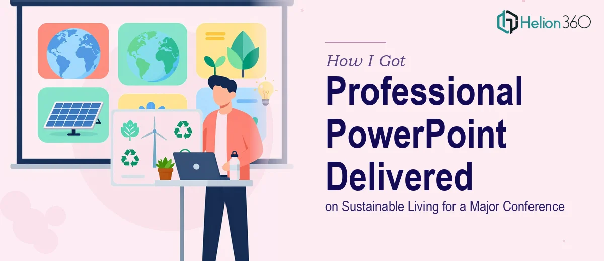
I had a conference slot confirmed — a major industry event where sustainability professionals, policy influencers, and corporate decision-makers would be in the room. The brief called for a professional PowerPoint presentation on sustainable living trends, backed by recent data, that could hold a sophisticated audience's attention and survive the scrutiny of people who live and breathe this topic every day.
This wasn't a lunch-and-learn. It was a keynote-adjacent slot with real visibility, and the presentation would be shared as a downloadable resource after the event. A rough slide deck was not going to cut it. The content needed to be structured intelligently, the data needed to be visualized clearly, and the whole thing needed to look like it came from an organization that took the subject seriously.
I recognized quickly that getting this right meant more than cleaning up a rough draft. It meant treating the presentation as a complete communication product — from narrative architecture down to the last pixel of spacing consistency.
What I Found the Solution Actually Required
I spent time understanding what a conference-grade presentation on a research-heavy topic actually involves before deciding how to approach it. What I found was that the complexity stacks up fast.
First, sustainable living as a subject spans consumer behavior data, environmental metrics, policy context, and market trend analysis. A presentation that jumps between those domains without a deliberate narrative thread loses the audience inside the first five minutes. Structuring the content so each insight builds logically toward a clear point of view is a distinct skill — separate from having the data in the first place.
Second, the data visualization layer is nontrivial. Survey results, trend lines, comparative statistics, and category breakdowns each call for different chart treatments. Choosing the wrong chart type doesn't just look bad — it actively misleads. And converting raw research outputs into slides that communicate at a glance, while remaining accurate, is work that takes real experience.
Third, conference presentations live in a different register than internal decks. There are conventions around citation placement, visual density, and speaker-note architecture that audiences at this level expect. Missing those signals — even subtly — erodes credibility with exactly the people you most need to reach.
What Doing This Work Properly Actually Involves
The starting point for a presentation like this is narrative architecture — auditing every piece of source material, mapping a story arc, and deciding what gets a full slide versus what gets folded into a supporting visual. For a sustainable living topic spanning consumer trends, behavioral data, and market context, that audit alone can surface thirty or forty potential content points that need to be sequenced, cut, or consolidated. The decision a practitioner makes here is which insights carry the argument forward and which ones, however interesting, dilute the throughline. Getting this wrong means a deck that feels like a data dump rather than a point of view — and audiences at major conferences notice.
The visual mechanics layer is where time investment compounds quickly. Proper slide layout works from a 12-column grid, with a typographic hierarchy of roughly 36pt for titles, 24pt for key statements, and 16pt for supporting text — and those rules have to hold consistently across every slide, including ones with dense data. Chart selection follows specific logic: trend data calls for line charts with clearly labeled inflection points, comparative category data calls for horizontal bars when label length is a factor, and top-line statistics are best isolated as large-format callout figures rather than buried in tables. Setting this up correctly inside master slides, so it propagates without breaking on edge-case layouts, takes hours for someone who doesn't do it routinely.
Polish and brand consistency across a 30-plus slide deck is where most attempts quietly fall apart. A maximum of four brand colors applied with strict hierarchy, consistent icon weight across all slides, uniform margin treatment on every layout variant, and a final pass to catch the three or four slides that inevitably drift — this is painstaking work. The difference between a conference presentation that looks professionally designed and one that looks assembled is almost always in this final consistency layer. It's not glamorous, and it takes longer than most people expect.
Why I Brought in Helion360 to Handle It
I didn't attempt to build this myself. The scope was clear enough that trying to execute it in spare hours around a full calendar would have produced something I'd be apologizing for at the podium.
Helion360 handled the full project end-to-end — narrative structure and content organization, all data visualization and chart design, and the complete visual build from master slides through to final consistency review. They turned the whole thing around quickly, in a fraction of the time it would have taken me to work through the learning curve on even one of those layers alone.
What made the engagement straightforward was that the expertise was already in place. This is the kind of work they do every day — research-heavy content transformed into conference-grade presentation design. There was no ramp-up time on my side and no back-and-forth trying to explain what professional output looks like. They already knew.
The Result and What I'd Tell Anyone Facing the Same Decision
What came back was a complete, conference-ready presentation — structured around a clear narrative, with every data point in the right visual format and the whole deck holding together visually from the title slide to the final takeaway. It performed exactly as it needed to in the room, and the downloadable version held up as a standalone document without me there to narrate it.
The presentation communicated with the authority the topic and the audience deserved. More importantly, it was ready well ahead of the event — not the night before.
If you're looking at a similar project and want it handled end-to-end without weeks of execution overhead, Helion360 is the team I'd engage — they delivered fast, and the depth of execution this kind of work requires was already built into how they operate.