

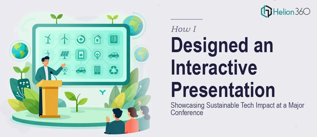
The Situation I Was Staring Down
I had a conference slot locked in — a real one, in front of an audience that included investors, policy people, and sector peers who actually knew their stuff. The topic was sustainable technology impact, and the pressure to make it land was real. A generic deck with bullet points and stock gradients wasn't going to cut it. The audience expected something that felt as credible as the work behind it.
The stakes weren't abstract. This was a visibility moment — the kind where a strong presentation opens doors and a weak one quietly closes them. I knew the content cold. What I didn't have was the design depth to turn that content into something that would hold a room's attention for forty minutes and still look sharp in the follow-up PDF sent to attendees afterward. That gap was the problem, and I knew immediately it needed to be solved properly.
What I Found the Work Actually Required
I started looking into what a conference-grade interactive presentation for a technical sustainability topic actually involves. The answer was more layered than I expected.
First, it wasn't just design — it was narrative architecture. The content had data, timelines, case studies, and impact metrics that all needed to connect logically and emotionally for an audience with varying levels of domain familiarity. Getting that structure right before a single slide gets built is a project in itself.
Second, the interactive elements — live-clickable navigation, branching flows for Q&A sections, embedded data visuals — each carry their own technical requirements inside the presentation software. These aren't drag-and-drop features. They require deliberate setup that holds up under live-presentation conditions.
Third, sustainability presentations specifically carry visual credibility expectations. Charts showing emissions data, lifecycle comparisons, or adoption curves need to be accurate, clearly labeled, and defensible. An investor in the room who knows the space will spot a sloppy axis or a misleading scale immediately. That signaled to me that this wasn't something to wing.
The Work That Needs to Happen
The starting point for a presentation like this is narrative and structural work — auditing every piece of source content, deciding what the through-line is, and mapping a slide-by-slide story arc before any visual work begins. For a sustainable tech impact topic, that means deciding which data points carry the argument, what order the evidence appears in, and where the audience needs a conceptual pause before the next layer of complexity arrives. Skipping this stage produces a deck that looks polished but doesn't actually persuade anyone. Getting it right typically takes a full working day of structured thinking, even with the content already in hand.
Visual mechanics are the second layer. A conference presentation at this level uses a disciplined layout system — typically a 12-column grid with consistent margin rules — so that every slide feels like part of the same designed object rather than a collection of individually styled pages. Typography hierarchy follows specific rules: a title level around 36pt, supporting headers around 24pt, and body text no smaller than 18pt for readability at projection scale. Color palette discipline matters too — sustainability presentations conventionally work within a restrained four-color system that signals seriousness without looking like a recycled template. Building this system correctly in the master slide environment, so it propagates across 40-plus slides without breaking, takes real tool fluency and hours of careful setup.
Data visualization is where the execution friction is highest. Impact metrics — carbon offset figures, adoption curves, efficiency comparisons — need chart types that match the data relationship, not just whatever looks interesting. A bar chart and a connected dot plot are not interchangeable; the choice shapes what the audience concludes. Axis scaling, source attribution, and annotation placement each require judgment calls that a practitioner makes based on the specific dataset and the argument being made. For an investor-aware audience, every chart needs to hold up under scrutiny, which means building each one deliberately rather than pulling from a library and hoping it fits.
Why I Brought in Helion360 to Handle It
I looked at what the work actually required — the structural thinking, the visual system build, the data visualization precision, the interactive navigation setup — and made a straightforward call. I didn't have the weeks it would take to develop that execution depth myself, and the conference date wasn't moving.
Helion360 handled the full project end-to-end. That meant taking the raw content and source data, building the narrative architecture, designing the full visual system from the master slides out, and producing all the data charts with proper annotation and sourcing. The interactive navigation elements — section jumps, a live agenda slide, the Q&A branching flow — were built and tested as part of the same deliverable, not bolted on at the end.
What I valued most was the speed. The full deck was turned around in a fraction of the time it would have taken me to learn and execute it myself. A team that does this work every day, with the tooling and process already in place, operates at a pace that's simply not replicable when you're starting from scratch.
What the Project Delivered and What I'd Tell Anyone Here
The delivered presentation held up in the room. The narrative flow worked — the audience tracked the argument across the full forty minutes without getting lost. The data slides read clearly from the back of the room, and the interactive navigation made the Q&A section feel controlled rather than chaotic. The follow-up PDF that went to attendees afterward looked like it came from an organization that took its work seriously, because visually it did.
The post-conference response confirmed that the investment in getting the presentation right was worth it. Conversations that might have started with a polite nod instead started with specific questions — about the data, about the methodology, about next steps. That's the difference a investor pitch deck makes in a room full of people who know what they're looking at.
If you're looking at a similar problem — a high-stakes conference presentation that needs real design depth, working data visuals, and interactive build quality — and you want it handled end-to-end without the weeks of learning curve, consider bringing in a team with proven execution depth. The investment in compelling investor presentation work is worth it when the stakes are real.