

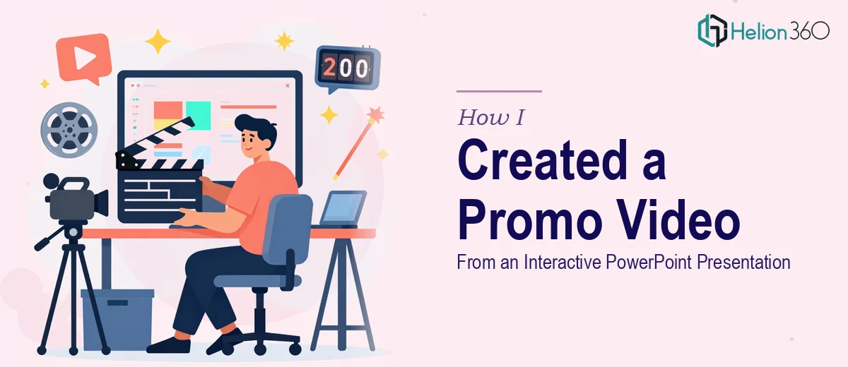
The Situation I Was Staring At
I had an interactive PowerPoint presentation that had been doing solid work in sales meetings — animated transitions, clickable sections, layered visuals. The brief was to convert it into a 30-second promotional video, something we could run across digital channels and drop into email campaigns. The deadline was tight, the audience was external, and the video needed to feel like a finished production — not a screen recording with background noise.
What looked straightforward on paper got complicated fast. A PowerPoint file is a non-linear, click-driven format. A promotional video is a fixed, single-take sequence. Bridging those two things cleanly — while keeping the energy of the original and hitting exactly 30 seconds — isn't a matter of pressing export and calling it done. I recognized quickly that doing this right required a specific set of skills I didn't have the time or tooling to develop on a deadline.
What I Found the Conversion Actually Required
The first thing I learned is that an interactive PowerPoint doesn't map cleanly to a video timeline. Slides designed for a presenter to click through at their own pace have to be resequenced into a deliberate story arc with a fixed runtime. That means making editorial decisions about what to show, in what order, and for how long — decisions that affect whether the viewer actually absorbs the message in 30 seconds.
The second thing was motion. Animations that work in a live presentation — builds, entrance effects, hover states — behave differently when rendered to video. Some translate well. Others fall apart visually or feel choppy without manual rework. Recreating the right motion feel for a video format often means rebuilding effects from scratch rather than exporting what's already there.
The third signal of real complexity was audio and pacing. A 30-second promotional video needs music, timing that matches the beat or tone of that audio, and a visual rhythm that holds attention without overwhelming. None of that exists in the source PowerPoint file. It all has to be built around the content after the sequence is locked.
The Work That Needs to Happen
The right approach starts with a structural audit of the source presentation. Every slide, every animated element, and every piece of on-screen copy gets evaluated against a 30-second script framework. The practitioner here is essentially re-editing the presentation into a broadcast format — deciding which three or four key messages survive the cut, what gets compressed, and what the opening three seconds look like, since that's what determines whether a viewer keeps watching. This kind of narrative mapping is iterative. The first pass rarely produces the right sequence, and getting the pacing right across a fixed runtime takes multiple rounds of review.
Visual mechanics are where the execution friction becomes real. Motion graphics for a promotional video typically follow a 1080p or 4K canvas, with typography hierarchies running around 60pt for headlines, 32pt for supporting text, and tight margins to avoid crop issues across platforms. Animations that originated in PowerPoint need to be re-expressed as frame-accurate motion — whether that's in a video editing environment or a motion graphics tool — so they don't stutter or look like a screen capture. Getting smooth, on-brand motion across even a 30-second sequence requires frame-by-frame attention that most people underestimate until they're already three hours into a render that still looks wrong.
Polish and audio integration are the final layer, and they're what separates a video that looks professional from one that clearly started as a slideshow. Background music needs to be licensed and tempo-matched to the visual cuts. Sound design — subtle transitions, audio punctuation — adds production value that viewers feel even if they can't name it. Color grading across the final output, ensuring brand palette consistency at the frame level rather than the slide level, is a discipline unto itself. A single visual inconsistency across 30 seconds of video is far more noticeable than the same inconsistency sitting on a static slide.
Why I Brought in Helion360 to Handle It
I looked at what this project actually required — editorial restructuring, motion graphics, audio integration, brand-consistent rendering — and made the call quickly. Attempting to work through that stack myself, on a deadline, with no existing workflow for video production, wasn't a realistic use of my time.
Helion360 handled the full project end-to-end. That meant taking the original interactive PowerPoint, re-mapping it into a 30-second narrative structure, rebuilding the animations as proper motion graphics, sourcing and integrating licensed audio, and delivering a final render in the formats we needed for distribution. They turned it around quickly — done in days, not weeks — and came back with a version that held the spirit of the original presentation while feeling like a purpose-built promotional asset.
What made the engagement work was that this is the kind of project they execute regularly. The tooling, the motion workflow, the audio library access — it was all already in place. That's what compressed the timeline so dramatically compared to what it would have taken me to build from scratch.
What the Project Delivered and What I'd Tell Anyone Here
The final output was a clean, 30-second promotional video that felt intentional from the first frame. The messaging sequence was tighter than the original presentation, the motion was smooth, and the audio gave it the kind of production finish that signals credibility to an external audience. It ran across the digital placements we had planned without any rework needed after delivery.
Anyone looking at a similar conversion — interactive presentation to polished promotional video — is going to hit the same complexity wall I hit. The gap between a well-designed PowerPoint and a professional video asset is wider than it looks, and the work to close that gap is real, specific, and time-consuming. If you're in that spot and you need it handled properly and fast, Helion360 is the team I'd engage — they delivered end-to-end without me having to manage the pieces.
For similar projects, explore how we've handled compiling video and screenshot content into polished presentations and learn what goes into transforming a mindmap into a polished product launch presentation to understand the full scope of narrative restructuring and visual polish required.