

The Starting Point: A Flat Document That Needed to Do More
We had a working Tawasul presentation — slides with text, a few logos, and some basic formatting. It communicated the core services well enough, but it did not leave any impression. The audience would nod, close the file, and move on. That was the problem I kept coming back to.
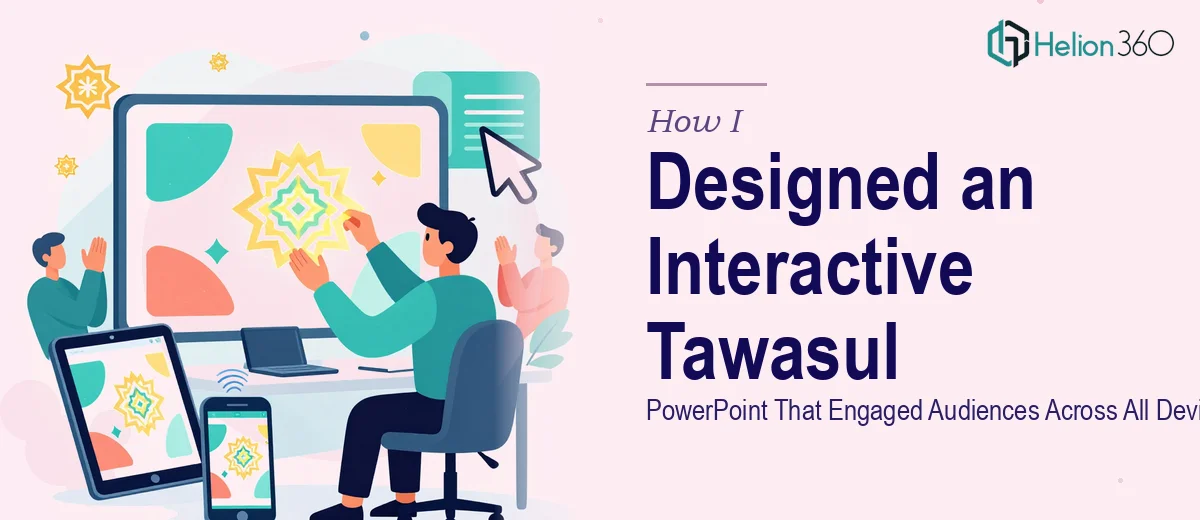
The goal was straightforward on paper: turn a flat, document-style deck into an interactive PowerPoint presentation that highlighted our services, told the story of how we had helped clients, and held attention from the first slide to the last. The tricky part was doing all of that while making sure it worked cleanly on laptops, tablets, and projected screens.
I started by outlining the structure myself. I mapped out which slides needed to carry the most weight, identified where we could use client success stories, and sketched out a rough flow. That part went well. The problems started when I moved into actual execution.
Where It Got Complicated
Adding animations in PowerPoint sounds simple until you need them to feel intentional rather than distracting. Every time I tried to layer entrance effects with chart builds and embedded video, something broke. The timing was off, the transitions looked clunky, or the file size ballooned to the point where it stuttered on older machines.
Responsiveness was another wall. A layout that looked polished on a 1920x1080 monitor looked cramped and misaligned on a tablet. Adjusting for different aspect ratios without rebuilding every slide manually was more time-consuming than I had budgeted for. And writing a navigation guide for the team — something clear enough that someone unfamiliar with PowerPoint could move through the deck confidently — was a separate task on top of everything else.
I was not lacking the vision. The work itself had just grown into something that needed more than one person juggling design decisions, technical fixes, and deadline pressure at the same time.
Bringing in the Right Support
After hitting that wall, I reached out to Helion360. I walked them through the existing deck, the audience expectations, and the specific problems I had run into — the animation timing, the cross-device rendering issues, and the need for an accessible navigation guide. Their team asked the right questions upfront and took it from there.
What impressed me early on was how they approached the slide structure. Rather than simply polishing what existed, they rebuilt the layout with a clear visual hierarchy so each slide contributed to a larger narrative. The Tawasul services were not just listed — they were framed around real client outcomes, which made each section feel purposeful rather than promotional.
What the Final Interactive PowerPoint Included
The version Helion360 delivered handled everything I had struggled with and several things I had not thought to ask for. The animated PowerPoint slides were subtle and purposeful — entrance effects that guided the eye rather than competing for attention. Charts built progressively during presentations, which made data feel like a story unfolding rather than a static graphic. Embedded video was integrated without inflating the file size beyond a manageable threshold.
Layout consistency across screen sizes was solved through careful use of PowerPoint's built-in slide sizing and anchor settings, something I had not applied systematically before. The deck looked equally clean on a 13-inch laptop, a conference room projector, and a tablet in portrait mode.
The navigation guide they provided was practical and straightforward — a short PDF walkthrough covering how to enter presentation mode, how to use the interactive elements, and how to move between sections without disrupting the flow. Our team picked it up quickly, which saved time during internal run-throughs.
What I Took Away From the Process
The biggest lesson was that interactive PowerPoint design is not just about knowing the software. It is about making deliberate choices — which animation serves the message, which chart format communicates the data fastest, how the layout holds up outside ideal viewing conditions. Those decisions compound quickly, and getting them right across a full deck takes focused expertise.
The Tawasul presentation now opens conversations rather than closing them. Audiences engage with it, ask questions mid-presentation, and remember specific sections afterward. That was the original goal, and it took a combination of clear planning on my end and skilled execution from a team that knew exactly what they were doing.
If you are working on a presentation that has outgrown what you can reasonably manage alone, consider Business Presentation Design Services — they stepped in where the work got genuinely complex and delivered something that held up in real use.