

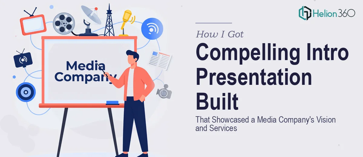
The Presentation Had One Job: Make the Right First Impression
We were preparing to introduce our company to a new tier of potential partners and clients — the kind of audience that forms an opinion in the first two minutes and moves on if nothing lands. The presentation had to communicate who we are, what we do, and why it matters, all while looking like it came from a company that had its act together.
The stakes were real. A weak or inconsistent deck would signal immaturity at exactly the wrong moment. We had a brand — colors, fonts, a logo, a general tone — but nothing that had been pulled into a coherent, presentation-ready system. The slides we had were functional at best and embarrassing at worst.
I knew immediately this wasn't a weekend project. Getting it right would require more than cleaning up a few slides.
What I Found a Branded Presentation Actually Requires
When I started looking into what a professionally designed, brand-aligned introduction presentation actually involves, the scope became clear quickly. This isn't just about making slides look prettier. It's about building a visual system that holds together across every slide, from the opening title to the final contact page.
Three things stood out as signals of real complexity. First, brand application at the presentation level isn't automatic — it requires translating logo files, hex codes, and font families into a working slide master with correct margin rules, color tokens, and type hierarchy. Second, the content itself has to be structured narratively. A company introduction deck that simply lists services in bullet points doesn't communicate vision — it has to be sequenced like a story. Third, every visual element — icons, dividers, image treatments, section headers — has to behave consistently, or the deck reads as assembled rather than designed. None of that happens by accident.
What the Work Itself Actually Looks Like
The structural work starts before a single slide is touched. The right approach involves auditing all existing brand assets, identifying what's usable in a slide environment, and mapping out a narrative arc that moves from company context to service offering to call to action. For an introduction deck, the sequence typically runs: positioning statement, company background, core services, proof points, and next steps. Each section needs a purpose, and the transitions between them need to feel intentional. Getting this architecture right takes several rounds of review because it's easy to front-load services before the audience understands why they should care. That sequencing error is one of the most common in self-built decks, and it's invisible until a reader points it out.
The visual mechanics of a properly built slide system are more demanding than most people expect. A well-structured slide master uses a 12-column layout grid, enforces consistent safe zones on all four sides, and locks in a three-level type hierarchy — typically around 36pt for slide titles, 24pt for subheadings, and 16-18pt for body text. Brand colors are applied with restraint: one primary, one secondary, one neutral, and one accent, with defined rules for when each appears. Setting this up so it propagates correctly across all slide layouts — including section dividers, content slides, and the closing page — takes several hours even for someone who builds these systems regularly. For someone doing it once, the time cost multiplies fast.
Polish and consistency across the full deck is where many projects fall apart in the final stretch. Every icon set needs to come from a single family and render at a consistent optical weight. Image treatments — whether that's a color overlay, a crop style, or a border rule — need to be identical across all slides that use photography. Even small inconsistencies in padding, alignment, or drop shadow depth are noticed subconsciously by a professional audience. Enforcing this level of discipline across twenty or thirty slides requires a systematic review pass with a checklist, not a quick scroll. Most non-designers skip this step entirely, and it shows.
Why I Brought in Helion360 to Handle It
I didn't attempt the build myself. After understanding what the work actually required, it was obvious that engaging a team that does this every day was the right call.
Helion360 handled the full project end-to-end — brand translation into a working slide master, narrative structuring of the full deck, and visual execution across every slide including the service pages, the company background section, and the contact layout. They turned it around quickly, delivered in days rather than weeks, and handled the kind of execution depth that would have taken me far longer to work through on my own.
The team came in with the tooling already in place. There was no learning curve on their end, no back-and-forth about what a slide master even is. They understood the brief, asked the right clarifying questions, and delivered a system that was consistent, brand-accurate, and ready to present.
What the Deck Delivered and What I'd Tell Anyone in My Spot
The final presentation held together in a way our previous materials never had. The opening slides established context and tone immediately. The service pages were clear without being cluttered. The visual system was consistent from the first slide to the last, and it looked like it came from a company that knew exactly who it was.
More practically, we walked into that first partner conversation with something we were confident handing over. The deck did the job it was built for — it communicated our vision and services to the right audience in a way that felt credible and considered.
If you're looking at a similar situation — an introduction presentation that needs to reflect a real brand and land with a professional audience — and you want it handled end-to-end without spending weeks on it yourself, work with a team experienced in brand story presentation design services. The right partner can deliver exactly what this project needs, fast. Learn more from how others tackled similar challenges: one client discovered what a compelling brand story presentation requires to drive business growth, while another found success by turning raw business content into compelling presentation stories that actually drive action.