

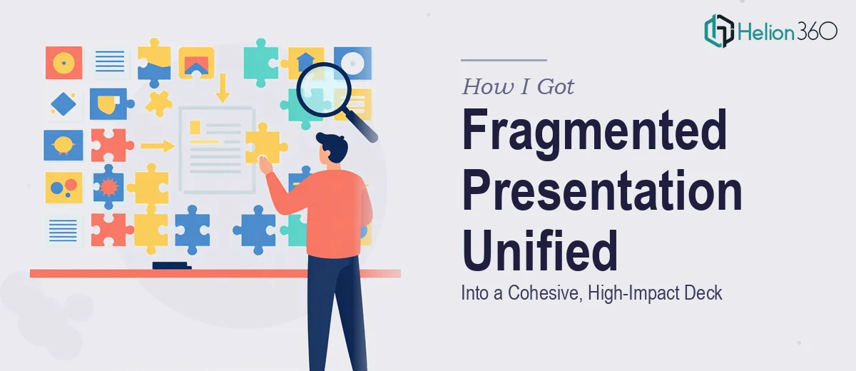
The Problem With a Presentation That Looks Like Five Different People Made It
I had a digital content project that had grown organically over time — which is a polite way of saying different sections had been built by different people at different moments, with no shared visual system holding them together. The result was a deck that felt inconsistent: fonts shifted between slides, spacing was arbitrary, color usage was all over the place, and the overall impression it left was scattered rather than confident.
The stakes were real. This content represented our brand to an audience that would form an impression in the first few seconds of viewing. A fragmented visual experience signals disorganization, and that's the last message we wanted to send. I knew immediately that patching a slide here and a font there wasn't going to cut it. The entire presentation design needed to be audited, unified, and elevated — properly.
What I Found Out This Kind of Work Actually Requires
Before doing anything, I spent time understanding what a proper presentation redesign actually involves. What I found was that this isn't a cosmetic task — it's a systems problem.
First, there's the brand consistency layer. Unifying a presentation means defining a strict visual language — a primary palette of no more than four brand colors, a type hierarchy (typically title at 36pt, heading at 24pt, body at 16pt), and a set of layout rules that apply uniformly across every slide. Without those rules codified first, any "fixes" just introduce new inconsistencies.
Second, there's the master slide architecture. Proper unification doesn't happen slide by slide — it happens at the template level. If the slide master isn't rebuilt correctly, every manual fix risks breaking when the file is edited later.
Third, there's the visual modernization layer. Beyond consistency, the content needed a fresh, polished look — which means understanding current design conventions, knowing how to use whitespace intentionally, and making layout decisions that serve readability rather than just filling space.
All of that signaled clearly: this was not a weekend project.
What the Work to Fix This Actually Looks Like
The right approach starts with a full structural audit. Every slide needs to be reviewed against a consistent framework — what's the hierarchy of information, what's the visual weight of each element, and where does the current design break the intended brand language. In a presentation with significant visual drift, this audit alone surfaces dozens of conflicts: mismatched font families, inconsistent margin widths, placeholder colors that were never updated. Rebuilding from that audit means making intentional decisions about what stays, what gets stripped, and what gets redesigned from scratch. That diagnostic phase takes real time and judgment.
Visual mechanics are where the actual rebuild happens. A 12-column layout grid, applied consistently across every slide master, is the backbone of a unified presentation. Type hierarchy needs to be locked — 36pt for slide titles, 24pt for subheadings, 16pt for body copy — and applied through paragraph styles rather than manual formatting, so every slide inherits the same rules. Color application follows a strict palette: typically one dominant brand color, one accent, one neutral, and one text color. When those rules aren't set at the master level and propagated through styles, the same formatting decisions have to be made manually on every single slide, which is both time-consuming and prone to drift.
Polish and consistency work is the final layer, and it's where most DIY attempts fall apart. Even after the grid and type rules are in place, there are hundreds of micro-decisions: icon stroke weights need to match across slides, image treatments need a consistent style, callout boxes need uniform corner radii and padding. A presentation that feels cohesive isn't just one where the colors match — it's one where every visual element has been evaluated against the same set of rules. Getting that level of consistency across a full deck, especially one that started in a fragmented state, requires a practiced eye and the patience to work through every detail systematically.
Why I Brought in Helion360 to Handle It
Once I understood the scope of what proper unification and enhancement actually required, the decision to engage the right team was straightforward. Rebuilding a slide master system, enforcing a full design language, and polishing every slide to a consistent standard — that's not something I had the time or the specialized tooling to execute well on my own timeline.
Helion360 handled the full project end-to-end and delivered fast. They audited the existing content, rebuilt the slide master architecture from scratch, applied the brand system consistently across the entire presentation, and modernized the visual treatment throughout. What would have taken me weeks of learning curve and iteration was turned around in a fraction of that time. The expertise was already in place — they do this work continuously, which means the decision-making that takes a non-specialist hours happens quickly in the hands of a practiced team.
The Result and What I'd Tell Anyone Looking at the Same Problem
What came back was a presentation that finally looked like it was made by one team with a clear point of view. The visual language was consistent from the first slide to the last — the type hierarchy was clean, the color usage was disciplined, and the layout felt intentional rather than assembled. The modernized design elements gave the content a current, confident look that matched the quality of the ideas it was presenting.
The business outcome was exactly what I needed: a piece of content I could share confidently, knowing the first impression it made was the right one.
If you're looking at a presentation in the same state — inconsistent, visually fragmented, not matching the standard your audience expects — and you want it handled properly without spending weeks on the learning curve yourself, PowerPoint Redesign Services is the approach I'd recommend. I've seen firsthand how merging two PowerPoint files and refining copy, design, and messaging can transform a fragmented deck, and there are real benefits to bringing in a team with deep expertise. For complex unification work, consider how consolidating multiple PowerPoint slides into a unified brand template delivers results that DIY efforts typically can't match. They handled the full scope fast, and the execution depth they brought was exactly what this kind of project demands.