

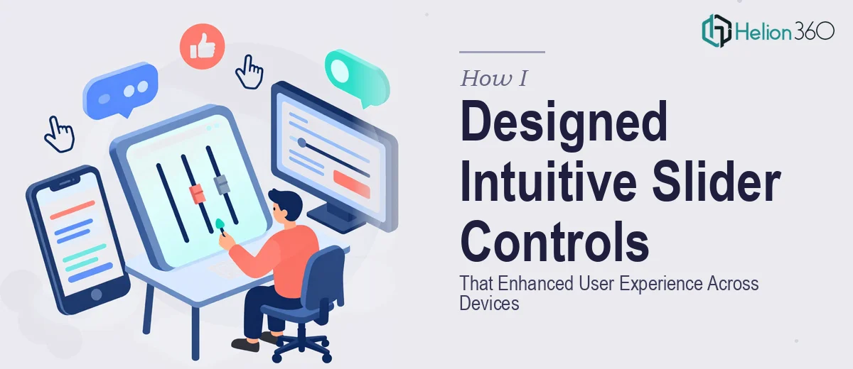
The Problem With Our Slider Controls Was Bigger Than It Looked
We were building a web application where slider controls weren't a decorative detail — they were core functionality. Users needed to interact with them repeatedly, across desktop browsers, tablets, and mobile devices, often in contexts where small input errors would affect outcomes downstream.
The sliders looked fine in early wireframes. But as soon as we tested on different screen sizes and tried them with a keyboard or screen reader, the cracks appeared fast. Touch targets were too small on mobile. The visual feedback on drag was inconsistent. Assistive technology couldn't interpret the control state reliably. What felt like a minor UI component was actually a multi-layered UX problem.
I knew this had to be resolved properly before the product went anywhere near users. Getting it wrong wasn't a visual inconvenience — it was a functionality failure that would erode trust in the product from the first session.
What I Found Slider UI/UX Design Actually Required
My first instinct was to look at what a well-designed slider control system actually involves, and what I found made it clear this wasn't something to approximate.
Proper slider UI/UX design for web and mobile starts with a clear interaction model — how the control behaves on mouse drag, touch swipe, keyboard arrow keys, and programmatic input all need to be explicitly designed, not assumed. Each input method has different precision tolerances and different failure modes.
Beyond that, accessibility isn't a checkbox — it's a constraint that shapes every visual and behavioral decision. WCAG 2.1 guidelines specify minimum touch target sizes of 44x44 CSS pixels, require visible focus states with sufficient contrast ratios (at least 3:1 for UI components), and demand ARIA role and value attributes so screen readers can announce the slider's current state meaningfully.
Then there's responsiveness. A slider that renders well at 1440px wide needs to degrade gracefully at 375px without losing affordance clarity or becoming unreliable to operate. That's a design system problem, not just a sizing problem. I could see pretty quickly that this was going to take someone who lives in this space.
What the Design Work Itself Involves
The structural and interaction design layer is where the real complexity begins. A well-designed slider control requires mapping every possible state — resting, hover, active drag, keyboard focus, disabled, and error — with distinct visual treatments for each. Done properly, this means a component specification that documents exact pixel dimensions, state transitions, and behavioral rules for at least six discrete states. Practitioners working at this level typically maintain a component library where each state is defined in a master design file, and changes propagate consistently rather than being patched slide by slide or screen by screen. Getting that foundation wrong means every downstream implementation inherits the inconsistency.
The visual mechanics of slider design involve more precision than most people expect. Touch target sizing, track height, thumb diameter, and label placement all follow rules grounded in human factors research — not personal taste. A typical mobile-optimized slider uses a thumb diameter of at least 44px, a track height between 4px and 6px for visual clarity, and label typography set no smaller than 12px to remain legible under zoom. Contrast ratios between the filled track and the background must meet WCAG 2.1 AA standards for UI components. Getting these numbers right and then applying them consistently across light mode, dark mode, and high-contrast variants is painstaking work. One miscalibrated value ripples through every screen the component appears on.
Accessibility and cross-device consistency form the third layer, and it's where most self-directed attempts break down. Proper ARIA implementation means the slider element carries role="slider", aria-valuenow, aria-valuemin, and aria-valuemax attributes that update dynamically on interaction — so screen readers announce the current value as a user drags. Keyboard navigation requires arrow key increments to be defined, and focus ring visibility must hold at 200% browser zoom without layout collapse. Testing across real device breakpoints — not just simulated viewport widths — routinely surfaces rendering issues that can't be caught in a desktop design tool alone. This phase alone adds significant hours for anyone who hasn't built the testing workflow before.
Why I Brought in Helion360 to Handle It
After mapping out what proper slider UI/UX design actually required, it was immediately clear that attempting this in-house wasn't the right call. We didn't have the time, and we didn't have the component-level design expertise already in place. The accessible, responsive, multi-state slider system we needed was a full design engagement — not an afternoon task.
I engaged Helion360 to handle the project end-to-end, and they turned it around quickly. The team came in with the process already built — component state mapping, accessibility specification, responsive behavior rules, and visual QA across device profiles. What would have taken weeks of learning, iteration, and rework on our side was handled in a fraction of that time.
Specifically, Helion360 covered the full interaction design across all input modalities, the complete visual specification including all component states and contrast-compliant styling, and the accessibility layer including ARIA attribute documentation and keyboard navigation rules. The output was a properly structured design system component, not a one-off screen.
The Outcome and What I'd Tell Anyone in My Spot
What we received was a slider control system that held up across every device profile we tested, passed accessibility audits without remediation, and gave the development team a specification clear enough to implement without ambiguity. More importantly, the controls felt right to users in early testing — intuitive, responsive, and consistent regardless of how they were interacting with the product.
The business outcome was straightforward: a core piece of functionality that works correctly from the first release, without the technical debt that comes from shipping something under-designed and patching it post-launch.
If you're looking at a similar problem — a UI component that seems simple on the surface but carries real complexity underneath — and you need it done right without the weeks of ramp-up, Helion360 is the team I'd engage. They delivered fast, handled the full depth of the work, and freed us to focus on everything else the product needed.