

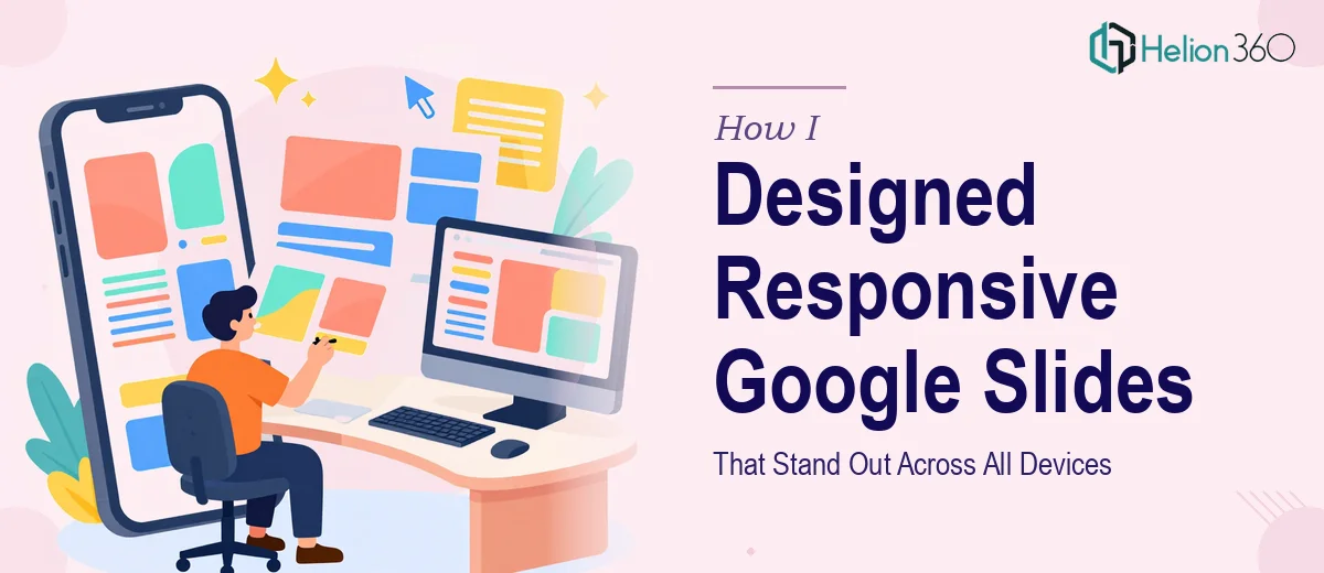
The Brief Sounded Simple Enough
I had a set of presentations that needed to work well everywhere — on a laptop in a boardroom, on a tablet during a client walkthrough, and on a phone screen for a quick reference. The content was ready. The message was clear. What I needed was a Google Slides presentation that looked polished, felt professional, and actually held up visually across different screen sizes and display environments.
I figured I could handle it myself. I had used Google Slides plenty of times before. How hard could it be to make something that looked good and worked responsively?
Harder than I expected, as it turned out.
Where I Hit the Wall
The moment I started building slides beyond a basic template, I ran into a cascade of small but frustrating issues. Fonts that looked crisp on my monitor became hard to read on a projected screen. Layouts I carefully aligned on a widescreen setup broke apart when someone opened the deck on a tablet. Custom graphics I added looked pixelated or misaligned depending on the device.
I also struggled with maintaining visual consistency. When you are designing a multi-section Google Slides presentation, keeping spacing, font sizing, color application, and icon usage coherent across 30-plus slides is genuinely difficult — especially without a solid design system to anchor everything.
I spent hours adjusting and re-adjusting, only to find new issues each time I previewed the deck on a different screen. The presentation was not bad, but it was not the polished, device-responsive slideshow I had in mind. I needed it to look like it had been designed intentionally, not assembled slide by slide.
Bringing in the Right Team
After hitting a wall with my own attempts, I came across Helion360. I explained what I was working on — the need for a visually engaging Google Slides presentation that scaled cleanly across devices, maintained consistent branding, and genuinely held the audience's attention from the first slide to the last.
Their team asked the right questions from the start. What was the context of the presentation? Who was the audience? What tone did the visual design need to carry? They were not just executing a task — they were trying to understand what the slides needed to do.
From there, they took over the design process completely.
What the Final Deck Looked Like
The difference between what I had built and what came back was significant. The slides had a clear visual hierarchy — every element had a reason for being where it was. Typography was handled in a way that stayed legible whether you were sitting two feet from a laptop or ten feet from a conference room display. Custom icons and layout grids were used consistently, so the deck felt like a single designed object rather than a collection of individual slides.
The responsive aspect was handled properly too. The team structured the layouts so that when the deck was opened on different devices or screen ratios, nothing collapsed or overlapped. Content blocks, image placements, and text areas were all positioned with display flexibility in mind — something that takes real working knowledge of Google Slides' behavior across environments.
The presentation also had pacing built into it. Slides were not overloaded. Each one communicated one idea clearly, which made the overall flow feel intentional and easy to follow.
What I Took Away From This
Designing a Google Slides presentation that genuinely works — visually, technically, and across devices — is more involved than most people realize going in. It is not just about making things look nice. It requires understanding layout behavior, typography at scale, visual consistency, and how audiences actually read slides in real environments.
I came away with a presentation I was confident showing in any setting, and a much clearer understanding of what separates a functional slide deck from a truly well-designed one.
If you are in a similar position — content ready, deadline approaching, but the design not quite where it needs to be — Helion360 is worth reaching out to. They took a messy, inconsistent deck and turned it into something that worked on every screen and held the room's attention throughout.