

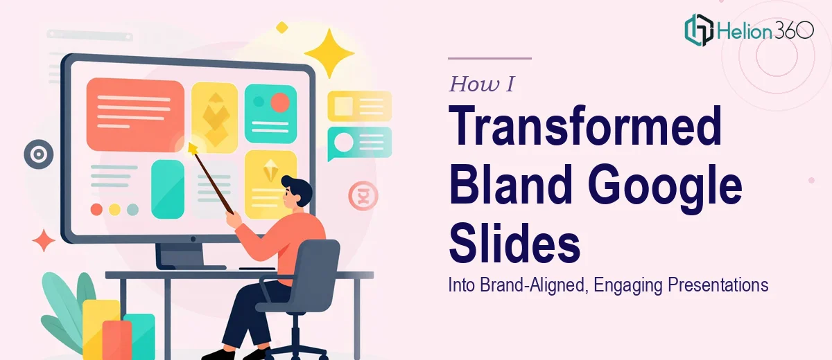
When Your Google Slides Stop Reflecting Your Brand
We had a problem that most growing startups run into sooner or later: our Google Slides decks were functional but completely forgettable. The content was solid — the story we were trying to tell was clear in our heads — but the slides themselves looked like they had been assembled in a hurry, which, honestly, most of them had been.
Mismatched fonts, inconsistent colors, no visual hierarchy, and transitions that belonged in 2009. Every time we opened a deck before a meeting, there was this quiet sense of embarrassment. These slides were representing our brand, and they were doing a poor job of it.
What I Tried to Fix on My Own
I figured I could handle a Google Slides redesign myself. I spent a weekend going through our master deck — adjusting colors to match our brand palette, swapping fonts, trying to create a consistent layout across slides. I watched a few tutorials, experimented with custom themes, and even tried importing some design elements to make things feel more polished.
The result was better than where I started, but it still did not feel cohesive. Some slides looked good in isolation but clashed with the ones before or after them. The typography was not quite right. The overall visual flow that you see in professionally designed presentations — that sense of rhythm and intention — was missing. It was clear the problem was not about effort. It was about the gap between knowing what looks good and knowing how to systematically build it across a full deck.
Reformatting Google Slides is one thing. Redesigning them to actually carry brand identity through every visual decision is a different skill entirely.
Bringing In a Team That Knew What It Was Doing
After hitting that wall, I came across Helion360. I explained the situation — multiple Google Slides decks that needed to be rebuilt visually, with consistent branding, modern layouts, and the kind of polish that makes a presentation feel intentional rather than improvised.
Their team asked the right questions upfront. What were our brand colors, fonts, and tone? What was the primary audience for each deck? Were there any slides we felt were already close to the mark? That kind of structured intake told me they were not going to just make things look pretty — they were going to make sure the redesign actually served a purpose.
I handed over the existing files along with our brand guidelines, and they took it from there.
What the Redesigned Google Slides Actually Looked Like
The turnaround was faster than I expected. When the redesigned decks came back, the difference was immediately visible — not just in how individual slides looked, but in how the whole presentation moved. Every slide had a clear visual hierarchy. The typography was consistent and readable. The color usage followed our brand palette without feeling rigid or flat.
What stood out most was the slide-to-slide coherence. When you flipped through the deck, it felt like it was built by one hand with a clear plan, not assembled piece by piece over several months. The transitions were subtle and purposeful. The layouts gave the content room to breathe without leaving slides feeling empty.
This is what professional Google Slides redesign looks like when it is done with attention to both design and communication goals.
What This Experience Taught Me About Presentation Redesign
I came out of this with a clearer understanding of what Google Slides redesign actually involves. It is not just aesthetic cleanup. It is about building a visual system — a set of decisions about layout, color, type, and spacing that holds together across every slide, every deck, every use case. That kind of consistency is what separates a branded presentation from a collection of formatted slides.
If your presentations are not reflecting your brand the way they should, or if you have tried to fix them yourself and hit the same wall I did, consider visual enhancement of presentation. They took a set of disconnected, uninspired decks and returned something that actually represented what we were building.