

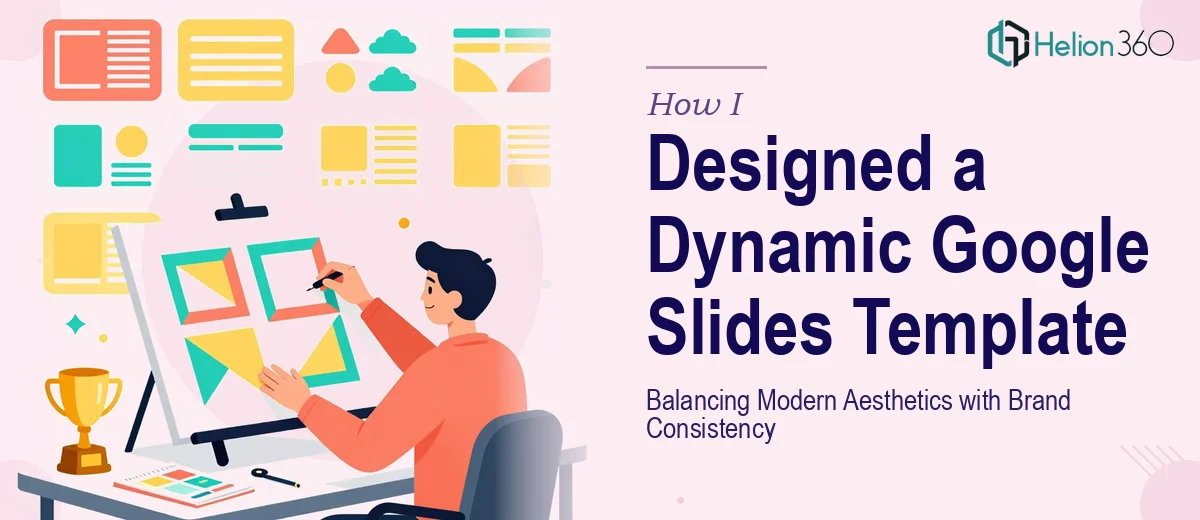
The Brief Sounded Simple — It Wasn't
When our team decided it was time to build a proper Google Slides presentation template, I figured I could handle it. We had brand guidelines, a rough visual direction, and a clear goal: a professional, reusable template that would work across internal updates, client decks, and sales presentations — all while staying visually consistent and on-brand.
I opened Google Slides, set up a master layout, and got started. The first few slides looked decent. Then things started falling apart.
Where the Complexity Crept In
The challenge with building a solid Google Slides template isn't just design — it's system design. Every layout has to work independently but also feel like part of the same family. Font hierarchy, color usage, spacing, icon style, text box behavior — all of it has to be intentional from the ground up.
I was spending hours adjusting individual slides instead of building a coherent system. My title layouts didn't match the energy of my content slides. The divider pages felt disconnected. And whenever I tried to add subtle animation and transitions to make the deck feel more engaging, something always broke the visual flow.
Brand consistency was the biggest problem. I kept drifting off-brand without noticing until I compared slides side by side. The colors were technically correct, but the tone wasn't. The layouts felt inconsistent even when using the same typeface.
I also realized I had no real structure for how someone else on the team would use this template. It needed to be intuitive — someone unfamiliar with design should be able to drop in content without accidentally breaking the look.
Bringing in the Right Help
After a couple of weeks of iteration with results I wasn't confident in, I reached out to Helion360. I explained the goal: a clean, modern Google Slides template that reflected our branding, included a full set of flexible layouts, and was easy for anyone on the team to use without design knowledge.
Their team asked the right questions from the start — about our brand colors, font stack, the types of slides we use most often, and the kinds of presentations this template would serve. That level of scoping made me realize how much I had been treating the project as a single design task rather than a structured system.
What a Professionally Built Template Actually Looks Like
Helion360 came back with a template that was notably different from what I had been building on my own. The slide master was set up properly, which meant edits to global elements updated everywhere automatically. No more fixing the same footer on twenty individual slides.
The layout library covered everything our team needed — title slides, agenda layouts, section dividers, full-bleed image slides, text-heavy content slides, data and chart placeholders, and a clean closing format. Each layout was designed to stand alone but clearly belonged to the same visual system.
The use of animation was restrained and purposeful. Subtle entrance effects on key elements made the slides feel polished without being distracting. That balance — modern without being flashy, professional without being stiff — was exactly what we had been aiming for.
Most importantly, the template was built to be used. Placeholder text was instructional. Color and font choices were locked where they needed to be, and flexible where they didn't. A non-designer on our team picked it up and built a full presentation within an hour.
What I Took Away From This
Building a Google Slides template that truly works — one that holds up across different users, different content types, and different contexts — is a lot more involved than it looks. The design decisions stack quickly, and without a systems-level approach, the whole thing becomes inconsistent and hard to maintain.
The experience also clarified something for me: a good template isn't just about how it looks on the first slide. It's about how every slide behaves when real content is added, how it scales, and how confidently someone who didn't design it can use it.
If you're in the same position — trying to build a professional presentation template but hitting a wall with consistency or structure — Helion360's design approach is worth reaching out to. They took a scattered brief and turned it into something our team actually uses every week.