

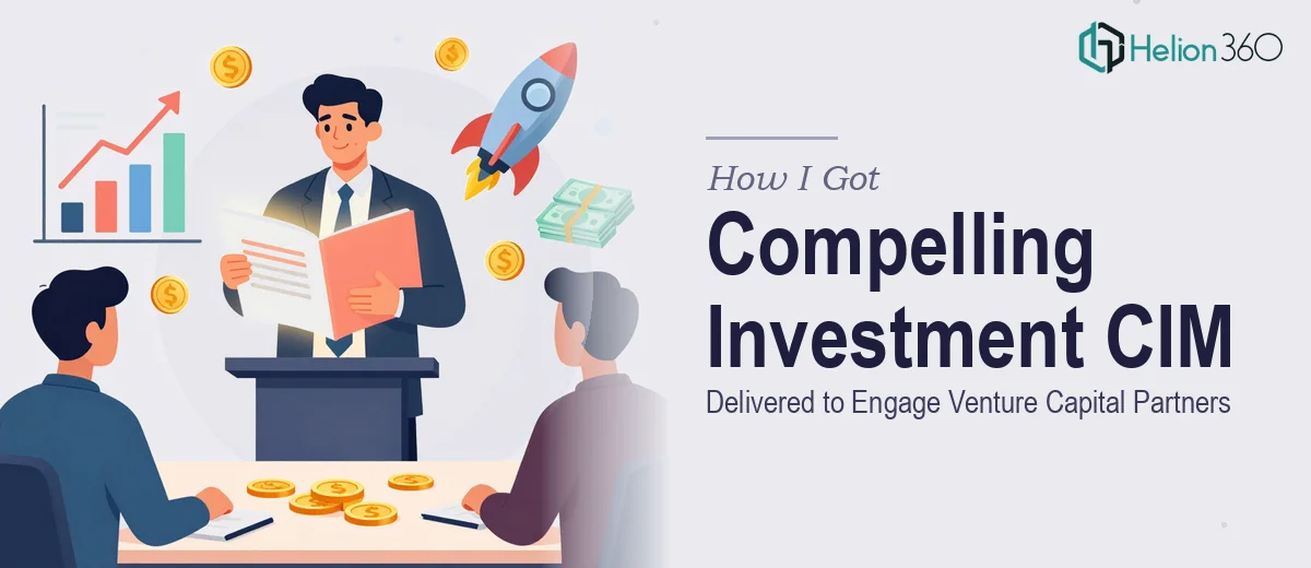
The Moment I Realized This Presentation Had to Be Right
We were preparing to go in front of a room of venture capital partners with a Confidential Information Memorandum presentation, and the stakes were about as high as they get. This wasn't an internal update or a sales kickoff deck. It was the document that would shape how serious investors perceived our business, our traction, and our leadership team in the first fifteen minutes of a conversation.
The source material was solid — financials, market sizing, competitive positioning, growth narrative. But raw content sitting in a document is not a CIM presentation. The gap between what we had and what needed to be in front of those partners was significant. I knew immediately that this needed to be executed properly, not assembled over a weekend by someone learning the format as they went.
What I Discovered a Strong Investment Presentation Actually Requires
I spent time understanding what separates a CIM presentation that gets a follow-up meeting from one that gets politely set aside. A few things stood out immediately.
First, the narrative architecture matters enormously. Investors see dozens of these. The sequence of information — how you move from market opportunity to business model to financials to ask — has to follow a logic that feels inevitable, not assembled. Every section has to earn its place and set up the next one.
Second, the data presentation has to be precise and clean. Financial charts, unit economics visuals, and market sizing frameworks have specific conventions in the investment world. A bar chart that's formatted like a marketing infographic signals to a sophisticated audience that the team doesn't fully understand the context they're operating in.
Third, visual consistency at a professional level requires discipline that goes beyond picking a color palette. Typography hierarchy, spacing, alignment, and the way brand elements behave across twenty-plus slides — all of it has to be coherent. Any slide that looks out of place breaks the reader's confidence in the whole document.
What the Actual Work Involves
The structural and narrative work in a CIM presentation is where most of the strategic weight sits. The right approach starts with auditing all source material — financials, market data, competitive analysis, team bios — and mapping it against a clear story arc. That arc typically follows a problem-solution-traction-model-ask sequence, but the exact flow depends on what the business's strongest proof points are and where investor skepticism is most likely to land. Deciding which arguments to lead with, which to support visually, and which to subordinate to an appendix is a judgment call that requires both presentation expertise and fluency with how investment audiences process information. Getting this wrong means the deck feels like a data dump rather than a case.
The visual mechanics of a professional investment presentation operate within strict conventions. Chart types matter: waterfall charts for cash flow, clustered bars for cohort comparisons, clean line charts for growth trajectories — each follows formatting norms that signal credibility to a financial audience. Typography hierarchy runs on a clear scale, typically 36pt for section headers, 24pt for slide titles, and 16pt for body content, with consistent line spacing throughout. A 12-column layout grid anchors every element so that margins, text blocks, and data visuals align predictably across the full deck. Deviating from these conventions — even subtly — reads as amateurish to an experienced investor, and that perception is hard to recover from once it forms.
Polish and consistency across the full document is where execution friction tends to compound. A CIM presentation often spans 25 to 40 slides, and maintaining palette discipline — typically a maximum of four brand colors applied according to a defined hierarchy — across that many slides is painstaking work. Master slide configuration has to be done correctly from the start, because retroactive corrections across a large deck eat hours. Font substitutions, misaligned text boxes, slightly off-brand color values, and inconsistent icon weights are the kinds of details that seem minor in isolation but collectively signal a lack of rigor. Doing this at a professional standard, at speed, requires both the right tooling and the experience to catch every edge case before the file goes out.
Why I Brought Helion360 In to Handle the Full Project
I looked at what this project actually required — narrative architecture, financial data visualization, and 30-plus slides of brand-consistent design — and the math on attempting it internally was obvious. The learning curve alone on investment presentation conventions would have cost more time than the deadline allowed.
Helion360 handled the full project end-to-end. That meant taking the source material and structuring the narrative from scratch, building out the visual system, formatting every chart and data slide to investment-standard conventions, and delivering a presentation that was polished across every slide. They turned the full project around quickly — done in days, not weeks — which mattered because the partner meeting had a fixed date and there was no buffer for iteration cycles.
The value wasn't just the output. It was having a team that already understood investment presentation conventions, had the tooling in place, and could execute at that level without a ramp-up period.
What Was Delivered and What I'd Tell Anyone Facing the Same Situation
What came back was a CIM presentation that looked like it belonged in front of a serious investment audience — structured clearly, visually consistent, and with financial data presented in a way that communicated confidence rather than creating noise. The partner meeting went well. The deck did the job it needed to do: it established credibility quickly and let the conversation focus on the business, not on parsing confusing slides.
Anyone who is looking at a similar situation — real source material, a high-stakes investor audience, and a deadline that doesn't leave room for learning a new craft — should think carefully about where their time is best spent. If you want the work handled end-to-end and delivered fast, Helion360 is the team I'd engage — they brought the expertise and execution depth this kind of presentation demands.