

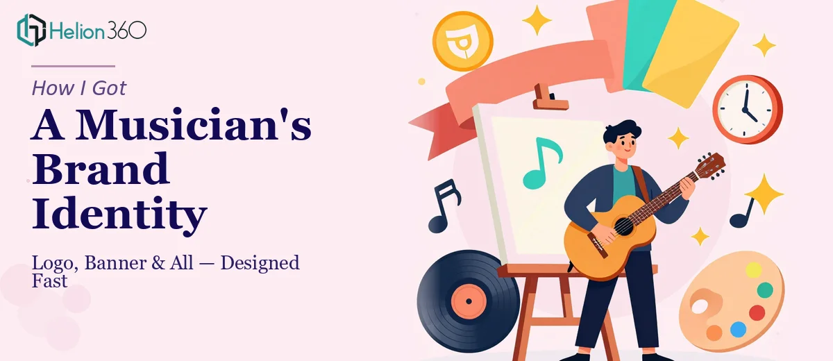
The Problem With a Profile That Looks Like an Afterthought
A close friend of mine — a genuinely talented musician — had been building their SoundCloud presence for months. The music was there. The uploads were consistent. But the profile itself looked like it had been thrown together in twenty minutes, because it had been. A blurry placeholder logo, a banner that was just a stretched photo with no real composition or intent behind it.
The problem wasn't just aesthetics. When someone lands on a music profile for the first time, the visual identity is the first signal they get about whether the artist is serious. A weak logo and a forgettable banner communicate the wrong thing before a single track plays. With a release coming up that we wanted to push properly, the profile needed to look the part. I knew straight away this wasn't something to patch together — it needed to be done properly.
What I Found Out This Actually Requires
I started doing some research into what professional musician branding actually involves, and it became clear fast that this wasn't a simple graphic job. A logo for a musician isn't just a text treatment — it has to communicate genre, tone, and personality in a single mark that works at multiple sizes, from a tiny profile circle to a large banner crop.
The banner itself has its own set of constraints. SoundCloud's header displays differently across devices, which means a design that looks sharp on desktop can get awkwardly cropped on mobile. The safe zone for key visual elements is narrower than most people realise — roughly the central 60% of the canvas — and anything important placed outside that zone risks being cut off.
Beyond the technical specs, there's the question of visual consistency. The logo and banner aren't independent assets — they need to feel like they belong to the same visual world. Getting the colour palette, typography, and graphic language to work cohesively across both pieces is where most non-designers run into trouble. That coordination work is harder than it looks.
What the Design Work Actually Involves
The work starts with establishing the visual direction — what genre conventions are in play, what mood the artist wants to project, and what visual references feel right. This isn't a quick conversation. Done properly, it involves mapping the artist's existing influences against design precedents in the genre, then identifying where there's room to differentiate. The brief for a lo-fi bedroom producer looks completely different from the brief for an electronic artist or a singer-songwriter. Getting this foundation wrong means every design decision downstream is built on a shaky premise, and the revisions multiply.
Logo construction for a musician involves decisions that have real technical weight. A professional logo is typically delivered in vector format — meaning it scales infinitely without quality loss — and built using a consistent type hierarchy and a controlled colour system, usually no more than three primary brand colours with defined hex values. The mark itself needs to work in full colour, single colour, and reversed (white on dark) without losing its readability. Testing all three versions, making sure the negative space reads correctly at icon size, and ensuring the wordmark remains legible below 32px — these are non-trivial steps that take time and trained judgment to execute correctly.
The banner requires its own layer of production work on top of the logo. The canvas for a SoundCloud header is 2480 × 520 pixels, and the composition has to account for the profile image overlay that sits in the lower-left corner on desktop, covering roughly 160 × 160 pixels of the banner. Typography placed in that region disappears. Beyond safe-zone discipline, the banner needs to carry a visual mood that's distinct enough to be memorable without competing with the logo for attention. Balancing those two elements — making the banner feel rich while keeping the logo as the anchor — is a compositional challenge that takes real design experience to land correctly.
Why I Brought in Helion360 to Handle It
Once I understood what the work actually required, I didn't spend time trying to figure out whether I could pull it off myself. The answer was clearly no — not at the quality level the project needed, and not in the time we had before the release push. I brought Helion360 in to handle the full project end-to-end.
What they took off my plate completely: the visual direction and brief development, the logo design including all format variants, and the full banner production sized and composed correctly for SoundCloud's specs. The whole thing was turned around quickly — done in days, not the weeks it would have taken me to work through the learning curve alone.
The team clearly does this kind of work regularly. They came in with the genre references already in mind, asked the right questions upfront, and moved fast. There was no back-and-forth about technical specs or file formats — it was all handled as part of the process.
The Result and What I'd Tell Anyone Facing the Same Call
The profile looks like a real artist's presence now. The logo is clean, scalable, and reads clearly even at the small sizes SoundCloud uses for track thumbnails. The banner fills the header with something that actually communicates the right mood without looking cluttered. When the release went out and we started sharing the profile link, the first thing people commented on was how professional the page looked — which meant the music got a fair hearing instead of being undermined by weak visuals before anyone hit play.
If you're in the same position — looking at a musician's profile that needs real branding work and recognising that doing it properly is more involved than it appears — consider engaging a Brand Identity Design Services partner like Helion360. They handled the full project fast and brought the kind of execution depth this work actually needs.
For more context on how comprehensive visual identity work plays out in practice, see how I approached a complete brand identity for a tech startup, or review the brand identity system built for a digital rebrand — both projects required the same level of systematic thinking and technical execution.