

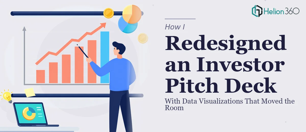
The Deck Was Solid on Paper — But It Wasn't Landing
We had a real business. The model worked, the numbers were defensible, and the team had been through the story dozens of times. But every time we put the deck in front of investors, we were watching eyes glaze over by slide four. The financials were buried in tables. The projections looked like they came out of an accounting report. The value proposition — which was genuinely compelling — was getting lost in a wall of text and mismatched charts.
The stakes weren't abstract. We had a funding round in motion, and the deck was the first thing any serious investor would sit with before agreeing to a deeper conversation. A presentation that confuses or bores before it persuades doesn't get a second meeting. I knew this needed to be done properly — not patched, not tweaked, but redesigned with the kind of visual clarity that makes financial data feel like a story worth hearing.
What I Found Out a Real Investor Pitch Deck Redesign Actually Takes
I started researching what a proper investor pitch deck redesign involves, and the complexity surfaced quickly. This isn't a job where you swap in a nicer color palette and call it done.
The first thing that became clear: the visual redesign and the narrative architecture are inseparable. Investors read a deck in a specific sequence — problem, solution, market, model, traction, team, ask — and the layout has to reinforce that sequence slide by slide. If the visual hierarchy doesn't match the information hierarchy, even a beautiful deck fails to persuade.
The second complexity was the financial data itself. Revenue projections, unit economics, burn rate, CAC/LTV ratios — these numbers need to be shown, not just stated. The chart type, the axis scaling, the way the data is annotated — all of it signals to an investor whether you understand your own numbers or are just presenting them hopefully.
The third was consistency at scale. A 20-slide deck with multiple data-heavy slides has dozens of places where inconsistency breaks trust — misaligned text boxes, inconsistent font sizing, charts that use different grid spacing. Fixing all of that while maintaining a coherent visual identity across every slide is painstaking work.
What the Work Actually Involves
The right approach to an investor pitch deck redesign starts with a full structural audit. Done well, this means mapping every slide against the investor narrative arc — problem, solution, market sizing, business model, traction, financials, team, ask — and identifying where the current deck buries a key point, presents information in the wrong sequence, or conflates two distinct ideas on one slide. A typical 18-to-22 slide deck will have four to six slides that need significant restructuring before any visual work begins. That audit and remapping phase alone can take a full day for someone experienced in investor storytelling, and longer for someone working through the logic for the first time.
Visual mechanics for a financial pitch deck follow a specific discipline. Charts should observe a strict typographic hierarchy — slide titles at 28–32pt, body callouts at 18–22pt, data labels at 12–14pt — and financial projections typically use a combination of bar charts for absolute figures and line overlays for growth rate, not stacked area charts, which obscure the underlying data. Color usage for data visualization should be limited to four brand-aligned values: one primary, one secondary, one accent for highlights, and a neutral for baseline or background data. Getting these rules right across every chart in the deck, and making sure each chart tells exactly one story per slide, is the kind of precision work that trips up anyone without a background in financial presentation design.
Polish and consistency across a full deck is where the hours compound. Every slide needs to sit on a properly anchored layout grid — typically a 12-column structure with consistent margins — and every element from icon sizing to slide numbering to logo placement needs to follow the same rules on every page. In a 20-slide deck with ten or more data-heavy slides, that's hundreds of individual elements to audit, align, and lock. Master slide architecture in PowerPoint helps, but only if it's set up correctly from the start; retrofitting a master slide structure into an existing file without breaking existing content is a job in itself, and most non-specialists underestimate how long it takes to do without introducing new inconsistencies.
Why I Brought Helion360 in to Handle the Full Project
I didn't spend time attempting this myself. One look at the scope — structural remapping, financial data visualizations for charts, full consistency audit across 20 slides — and it was obvious this wasn't a weekend job. It was a specialist job, and the timeline didn't leave room for a learning curve.
Helion360 handled the entire project end-to-end. That meant the narrative audit and slide restructuring, the full visual redesign including every financial chart and projection slide, and the final polish pass to make sure every element was consistent and brand-aligned. They turned the project around quickly — done in days, not the weeks it would have taken me to work through each layer myself.
What made the difference was that this is the kind of work they do constantly. The financial visualization conventions, the investor narrative structure, the layout discipline — that expertise was already in place. There was no ramp-up time, no back-and-forth on basics.
What We Got Back — and What I'd Tell Anyone in the Same Position
The redesigned deck was a different object entirely. The financial projections were readable at a glance. The value proposition landed on slide two and was reinforced visually through the rest of the deck. The charts were clean, consistent, and each one made a single clear argument. When we put it back in front of investors, the conversations were different — longer, more specific, more forward-looking.
The business case for the funding round hadn't changed. What changed was whether an investor could see it clearly in the first five minutes of looking at the deck. That's what a proper investor pitch deck redesign actually delivers — and it's not something you cobble together in PowerPoint over a few evenings.
If you're looking at the same situation — a solid deck that isn't converting the room the way it should — Helion360 is the team to engage. They handled the full scope fast, with the financial presentation expertise and design discipline the work actually requires.