

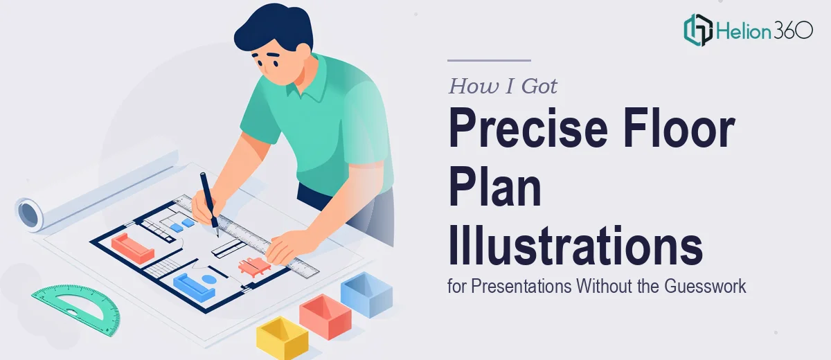
The Problem With Presenting a Space Nobody Has Seen Yet
We were launching a new line of business that required us to present residential and commercial space layouts to prospective clients before a single wall had been built. The floor plans weren't just reference documents — they were the centerpiece of the presentation. Clients needed to look at them and immediately understand the vision: where the rooms sat, how the flow worked, what was structural versus flexible.
The stakes were clear. A blurry sketch or an inconsistently scaled diagram would undercut the entire pitch. If the illustrations looked unprofessional, the business would look unprofessional. We had a presentation window coming up and no margin to experiment our way to something polished. I knew straight away this needed to be handled properly — by people who knew exactly what precise, presentation-ready floor plan illustration actually involves.
What I Found Out This Kind of Work Actually Requires
I did enough research to understand the scope before making any decisions, and it was immediately clear that this was not a simple drawing task.
Floor plan illustration for presentation purposes sits at an intersection of technical drafting and visual communication. The plans need to be dimensionally accurate — drawn to a defined scale, typically 1:50 or 1:100 for residential spaces — while simultaneously being readable at the slide sizes and aspect ratios a presentation demands. Those are two different disciplines pulling in different directions.
Beyond scale accuracy, proper presentation floor plans require consistent line weight hierarchies: structural walls render heavier than partition walls, which render heavier than furniture outlines. Doorway swings, window recesses, and ceiling features each follow drafting conventions that trained illustrators know intuitively but that take considerable time to learn and apply correctly. Add custom annotations, labeled room names, and any client-specified design elements, and the work compounds quickly. I recognized this wasn't a weekend project — it was a precision job.
What the Work Involves at Every Stage
The foundation of professional floor plan illustration is structural accuracy paired with a properly defined scale system. A presentation-ready plan typically works at 1:50 or 1:100 for residential and 1:100 or 1:200 for larger commercial footprints. Every element — wall thickness, door swing radius, window recess depth — must be derived from that scale consistently, not approximated. Getting this right across multiple floor plans in a single deck requires a systematic approach from the first file setup. The execution friction here is that even a small inconsistency in wall thickness between plans reads immediately to trained eyes, and correcting it late in the process means rebuilding, not patching.
Visual hierarchy and annotation discipline are the layer that makes a technically accurate plan readable in a presentation context. The right approach uses a minimum of three line weights — heavy for load-bearing walls, medium for partitions, light for fixtures and furniture — paired with a clean sans-serif label hierarchy at consistent sizes, typically 10pt for room names and 8pt for dimensions and annotations. Maintaining this across residential and commercial plans with different room counts and spatial complexity is genuinely time-consuming. It's the kind of consistency that looks effortless in the final output but requires methodical quality checking at every revision pass.
The third layer is visual polish and slide integration — making the floor plan illustrations work as presentation assets, not just as technical drawings. That means adjusting background fill, applying brand-aligned color coding for different room types or use zones, and ensuring the illustrations sit correctly within the slide layout grid without crowding title areas or call-out text. Done well, each plan feels like it belongs in the deck rather than being dropped in as an afterthought. The challenge is that this integration step requires both design judgment and fluency with presentation software, which is a combination that technical drafters often don't have and slide designers often don't need until a project like this one.
Why I Brought Helion360 In to Handle It
I didn't attempt any of this myself. Once I understood what the work actually required — scale-accurate drafting, annotation discipline, and full slide integration — it was obvious that trying to produce custom illustration design from scratch, without the right tools and experience already in place, would cost far more in time than it was worth.
Helion360 handled the full project end-to-end. That meant taking our space specifications and producing dimensionally accurate floor plans for both the residential and commercial layouts, applying consistent line weight hierarchies and labeling throughout, and integrating every illustration into the presentation with the correct visual treatment. The turnaround was fast — done in days, not the weeks it would have taken to work through the learning curve alone. The team came with the tooling, the drafting conventions, and the presentation design judgment already built in. There was no back-and-forth about what scale to use or how to render a doorway. It was handled.
The Result and What I'd Tell Anyone Looking at the Same Problem
The delivered presentation contained clean, precisely scaled floor plan illustrations across every space — residential units and commercial layouts alike — with consistent annotation, clear room labeling, and visual integration that made the deck look considered and authoritative. Clients could follow the layouts without explanation. The vision read clearly. That outcome would have been genuinely difficult to reach without a team that does this work regularly.
The lesson for anyone in a similar position is straightforward: floor plan illustration for a professional presentation is a compound skill set. It's not just drafting and it's not just slide design — it's both, applied with discipline. Attempting it without that combination in place produces work that looks like an attempt. If you're facing the same situation and need brand-aligned presentation design handled end-to-end and delivered fast, Helion360 is the team I'd engage — they brought exactly the depth this project required. For similar work requiring rapid turnaround without extensive revision cycles, consider also how investor presentation design follows the same precision-first methodology.