

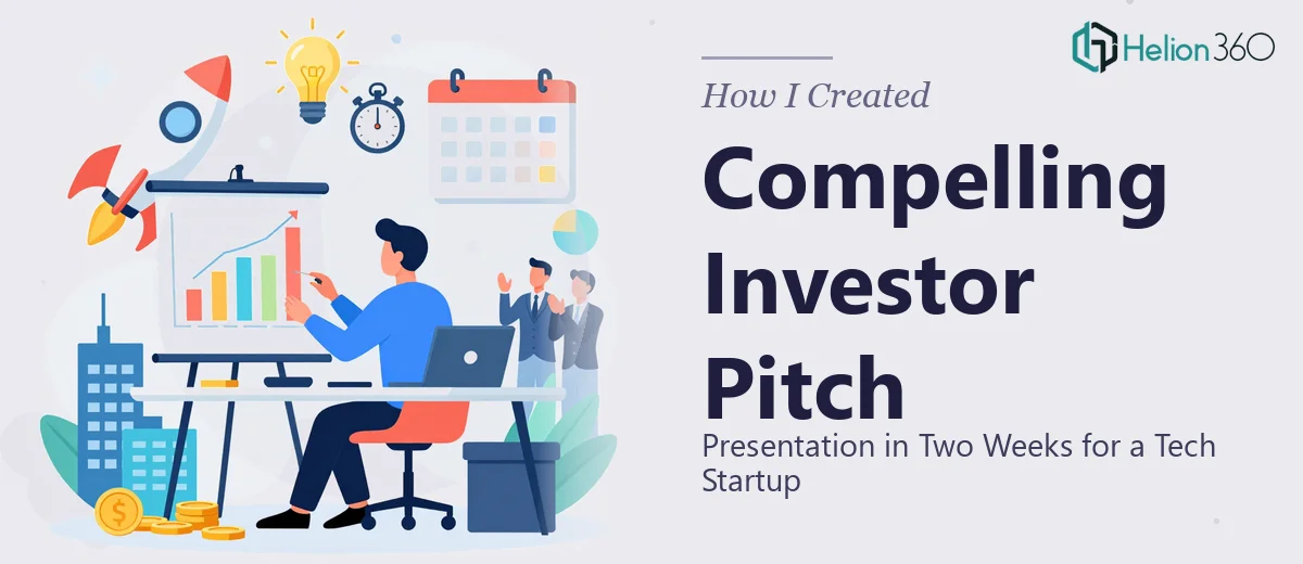
The Problem We Were Staring Down
We had a deadline, a live webpage packed with solid company information, and a meeting with investors on the calendar. The task sounded straightforward enough: take what was on the site and turn it into a presentation that could hold the room. But the moment I actually looked at the webpage content side by side with what a credible investor pitch presentation needs to look like, the gap was immediately obvious.
This wasn't a copy-paste job. The content was written for web consumption — scrollable, non-linear, and built around a visitor who self-directs. A presentation for investors is the exact opposite: it needs a single, controlled narrative arc, visual hierarchy that guides attention, and brand consistency that signals professionalism from the first slide to the last. The stakes were real. A poorly structured deck in front of the wrong audience doesn't just fail to impress — it actively raises doubt. I knew this needed to be done properly.
What I Found the Solution Actually Required
I started researching what a proper webpage-to-presentation conversion actually involves, and it quickly became clear this was not a simple reformatting task. Three things stood out immediately.
First, the content architecture is completely different. A webpage is built for exploration. A pitch presentation is built for persuasion — it has a beginning, a middle, and an end, and every slide earns its place in that sequence. Restructuring web content into a slide narrative means making editorial decisions about what stays, what gets cut, what gets combined, and what order drives the right emotional and logical progression.
Second, brand application in a slide environment is its own discipline. Brand guidelines that work on a website — color palettes, typography scales, logo placement — behave differently across slide masters, aspect ratios, and dark or light background contexts. Getting this consistent across twenty or more slides takes more than good taste; it takes fluency with how presentation tools handle master slides and style inheritance.
Third, an investor pitch has specific conventions that a general presentation doesn't. Audiences at that level expect certain sections in a certain order, with visual and tonal signals that communicate competence. Getting those conventions right isn't instinctive — it comes from having built a lot of them.
The Work That Actually Goes Into Getting This Right
The right approach to this kind of project starts with a full content audit and narrative restructuring. Every piece of text on the source webpage has to be evaluated for its role in the investor story — problem, solution, market, traction, team. Web copy is often written to inform; pitch copy has to persuade and build momentum. A practitioner working through this maps a slide-by-slide story arc before a single design element is touched, typically working from a content hierarchy where no slide carries more than one core idea and supporting text stays under thirty words per visual block. The editorial work alone — deciding what makes the cut and how to sequence it — takes several hours even for someone experienced with pitch deck structure.
Visual mechanics come next, and this is where the execution friction becomes significant. A well-built presentation uses a consistent layout grid — typically a 12-column structure — that governs where text blocks, visuals, and white space sit on every slide. Typography runs on a defined scale: primary headers at 36pt, section labels at 24pt, body at 16pt, with no deviations. Brand colors are applied to a strict palette of four or fewer values, with defined usage rules for backgrounds, headings, accents, and data highlights. Setting all of this up properly inside a slide tool's master and layout system, so it propagates reliably across every new slide, is non-trivial. A mistake in the master propagates everywhere, and fixing it manually across twenty slides is exactly the kind of time trap that derails an internal effort.
Polish and consistency across the full deck is the final layer, and it's the one most people underestimate. Every icon set, every image treatment, every transition rule, every text box margin has to match. Inconsistencies that seem minor in isolation — a logo that's two pixels off-center on three slides, a heading that's bold on some slides and regular on others — register subconsciously with a professional audience as lack of attention to detail. Running a full consistency pass on a presentation deck, checking alignment, spacing, color values, and font weights, is a systematic process that takes time and a trained eye.
Why I Brought Helion360 in to Handle It
I recognized early that attempting this internally wasn't a realistic option. The combination of editorial restructuring, visual system setup, and brand-consistent execution across a full deck — under a tight deadline — wasn't something I could absorb into an already full week.
Helion360 handled the full project end-to-end: content restructuring from the source webpage into a coherent pitch narrative, visual system build including master slides and brand application, and final polish across every slide. They turned it around quickly — done in days, not weeks — and the depth of execution they brought to each layer of the work was exactly what this kind of presentation requires. The team does this work constantly, which means the tooling, the templates, and the judgment calls are already in place. There's no learning curve being paid for on my timeline.
The Outcome and What I'd Tell Anyone in My Spot
What came back was a presentation that actually looked like it belonged in front of investors — structured, on-brand, visually clean, and built with the kind of consistency that signals a serious company. The content that had been scattered across a webpage now had a clear through-line, and the visual execution held up under scrutiny.
If you're sitting on a webpage full of solid content and a presentation deadline that's closer than you'd like, the gap between what you have and what you need is real — and it's not just a design problem. It's an editorial, structural, and execution problem all at once.
If you're in that spot and want it handled properly without losing weeks to the learning curve, Helion360 is the team I'd engage — they delivered fast, covered every layer of the work, and the result spoke for itself.