

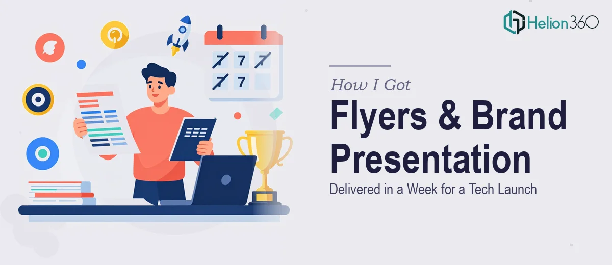
The Problem I Was Staring Down
I was a few weeks out from launching a small tech business and needed two things fast: a set of marketing flyers and a presentation that could clearly communicate what we do and why anyone should choose us over the alternatives. These weren't internal documents — they were going out to real audiences, being printed and distributed as part of an active marketing campaign.
The stakes were concrete. First impressions in a new market matter, and materials that look rough or communicate vaguely do damage that's hard to undo. I had some design drafts already, but they weren't polished enough to reflect the brand identity I wanted to build. The copy needed work too — not just words on a page, but a clear value proposition that actually landed with a skeptical audience. I had maybe a week. I knew this needed to be done properly.
What I Found the Solution Actually Required
I started doing my research on what good flyer and presentation design actually involves for a new brand, and it became clear quickly that this wasn't a simple polish job.
The copy and the design aren't separate workstreams — they're deeply interdependent. The headline hierarchy on a flyer, for instance, drives the layout. If the value proposition copy changes, the visual balance of the whole piece shifts. Getting that interplay right requires someone who can hold both in mind simultaneously, not treat them as two disconnected tasks.
Then there was the brand consistency question. Across flyers and presentation slides, the visual language needs to stay coherent — color usage, font pairing, spacing rules, and the way the logo is treated all have to behave the same way across materials. Without a proper brand system applied consistently, even individually decent-looking pieces feel disjointed when seen together. That's the kind of thing that signals a new company hasn't figured itself out yet.
Finally, the presentation wasn't just a designed document — it was an argument. It needed a narrative arc: here's the problem, here's what we do, here's why we're different, here's what you should do next. That structure doesn't emerge automatically from a set of talking points.
What the Work Actually Involves
The first layer of work is structural and narrative. A strong marketing presentation design services for a new business starts with an audit of the source material — what the brand actually does, who it's for, and what the competitor landscape looks like. From that, a practitioner maps a logical story arc: a defined problem statement, a clearly positioned solution, a differentiation argument, and a call to action that doesn't feel like an afterthought. For a flyer, the same thinking applies but compressed — a single headline must do the work of an entire opening slide. Getting that compression right without losing meaning is a genuine editorial skill, and it takes multiple drafts and structured review rounds to land correctly.
The second layer is visual mechanics. A well-executed presentation operates on a consistent layout grid — typically a 12-column system — with a type scale that follows a clear hierarchy: primary headings around 36pt, subheadings around 24pt, body copy no smaller than 16pt for readability. Flyers use similar rules but with more aggressive visual contrast because the reader isn't captive. Color application follows a strict palette: a primary brand color, one accent, and a neutral — anything beyond four colors typically creates visual noise rather than clarity. Setting these rules up correctly across master slides and flyer templates, and then applying them without drift across every element, takes far longer than most people expect the first time they do it.
The third layer is polish and brand consistency across materials. When a flyer and a presentation deck need to feel like they came from the same brand, every touchpoint has to be audited: margins, icon style, photo treatment, logo placement and clearspace, button or callout styling. The practical execution friction here is that inconsistencies hide in places that are easy to miss — a slightly different shade of the brand color between files, a heading that's 2pt off from the standard, a logo that's been scaled without maintaining its proportions. Catching and correcting all of it across two or more distinct asset types requires a systematic review pass that most people doing this for the first time don't budget time for.
Why I Brought in Helion360 to Handle It
I didn't attempt this myself. Looking at what the work actually required — narrative structuring, copy development, visual system setup, and consistent execution across multiple asset types — it was clear that doing it properly in a week wasn't realistic without a team that already had the process, tooling, and expertise in place.
Helion360 handled the full project end-to-end: the copy development and value proposition framing, the visual design across both the flyers and the presentation, and the brand consistency audit across all materials. They turned it around quickly — within the week I had, not stretched beyond it. That speed wasn't luck; it came from a team that does this kind of work every day and doesn't have to learn the mechanics while executing. The presentation came back with a clear narrative structure I hadn't managed to produce on my own. The flyers came back print-ready. Nothing needed to be rebuilt from scratch.
The Outcome and What I'd Tell Anyone in My Spot
What I got back was a set of materials that actually looked like a real business had made them — coherent across the flyer and the presentation, clearly written, and visually confident without being overdone. The campaign launched on schedule. The presentation communicated the value proposition clearly enough that I didn't have to over-explain the business every time I used it.
The lesson I'd pass on is simple: the gap between rough design drafts and professional-quality marketing materials is bigger than it looks, especially when copy and design need to work together and brand consistency has to hold across multiple formats. That gap takes real expertise and time to close.
If you're looking at a similar situation and need it handled end-to-end without spending weeks figuring out the process yourself, Helion360 is the team to engage — they delivered fast and covered the full depth of work this kind of project actually requires.