

The Situation We Were In and What Was on the Line
We had an upcoming round of conversations with potential investors — a mix of conference presentations and one-on-one pitches — and the deck we were working with wasn't ready for that room. The content existed: financial projections, growth trajectory, market sizing, product vision. But it was scattered across documents, spreadsheets, and slide drafts that had been built by different people at different times. Nothing told a coherent story, and nothing looked like it belonged together.
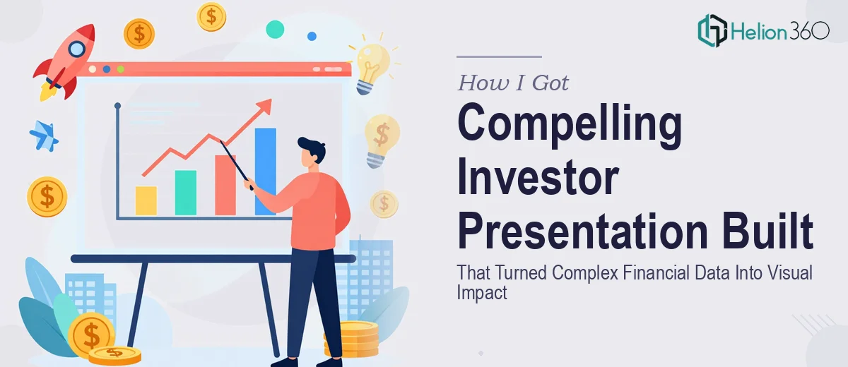
The stakes were straightforward. Investors see dozens of decks. If ours looked rough or required too much mental effort to follow, we'd lose the room before the conversation even started. I knew immediately that getting this right wasn't a matter of cleaning up a few slides — it was a full investor presentation design problem, and it needed to be handled properly.
What I Found This Kind of Work Actually Requires
Before I made any moves, I spent time understanding what a professionally executed investor presentation actually involves. What I found stopped me from attempting it myself.
First, an investor presentation isn't just a designed document — it's a structured argument. The narrative has to move in a specific sequence: market problem, solution, traction, business model, financials, ask. Every slide earns its place in that sequence, and the transitions between them have to feel inevitable, not random.
Second, financial data visualization in this context is a discipline on its own. Revenue forecasts, unit economics, and market size data each require chart types that are appropriate for the claim being made — a waterfall chart reads differently from a line trend, and choosing the wrong one undermines credibility with a sophisticated audience.
Third, the visual standard investors expect is high. Inconsistent typography, misaligned elements, or colors that drift slide to slide signal that the team behind the deck isn't detail-oriented. That perception transfers directly to how they assess you as an operator. This wasn't a weekend project.
What Professional Investor Presentation Design Actually Involves
The work starts with narrative architecture. A proper investor presentation follows a logical progression — problem, solution, market opportunity, traction, business model, financials, team, and ask — where each section is sized to match the weight it carries in the investor's decision process. The problem and solution slides typically anchor the first third, with traction and financials doing the heaviest lifting in the second. Getting that proportion right requires reading the deck as an investor would, not as someone who built the company. For someone without that perspective, it's easy to over-index on product detail and under-invest in the market sizing story — a common error that experienced designers and strategists catch immediately.
Visual mechanics for financial data visualization require a specific level of precision. Investor-grade data visualization means selecting chart types that match the nature of each claim: compound growth reads as a line chart, cost structure reads as a stacked bar, and fundraise use-of-proceeds reads as a horizontal bar or proportional breakdown. Typography hierarchy across these slides typically follows a 36pt headline, 20–24pt supporting data label, 14–16pt body convention — tight enough to fit the data, large enough to read in a conference room projection. Setting up a master slide system that enforces these rules consistently across 15–25 slides takes hours of template work even for an experienced practitioner, and breaks quickly without proper slide master discipline.
Polish and brand consistency across a full deck is where most self-built presentations fall apart. A professional investor pitch deck operates with a maximum of four brand colors — typically a dominant neutral, a primary accent, a secondary accent, and an alert or highlight color — and every chart, icon, and background element maps to that palette without exception. Alignment grids, consistent icon weights, and uniform margin rules (typically a 32–40pt safe zone from all edges) need to be enforced slide by slide. When a deck runs 20-plus slides, maintaining that discipline manually is tedious and error-prone. A single off-brand slide in the middle of a pitch reads as carelessness to an investor who notices these things.
Why I Brought Helion360 In to Handle the Full Project
I recognized quickly that attempting this myself — even with extra time — wasn't the right call. The combination of narrative strategy, financial data visualization, and design execution at investor-grade quality required a team that does this work every day, with the systems already in place to do it fast.
Helion360 handled the full project end-to-end. That meant auditing all the source content and restructuring it into a coherent narrative arc, building the visual system from scratch — slide masters, color palette, typography hierarchy — and executing every data visualization slide with the right chart logic for each financial claim. They turned it around quickly, delivering a presentation-ready deck in a fraction of the time it would have taken me to learn and execute each of those layers myself. The speed mattered as much as the quality — we had a hard conference deadline, and the work was done in days, not weeks.
The Result and What I'd Tell Anyone Looking at the Same Problem
What came back was a deck that held together as a single, confident argument. The financial slides were clean and immediately legible. The narrative moved the way a well-structured investor story should. The visual consistency across every slide reinforced the impression that the team behind it was serious and detail-oriented — which is exactly the signal you need to send before you've said a word.
The conference presentations landed well. The one-on-one pitch conversations started at a different level because the deck had already done significant work before we opened our mouths.
If you're looking at a similar problem — scattered content, complex financial data to visualize, and a real deadline — Helion360 is the team I'd engage. They handled everything end-to-end and delivered fast, which is exactly what investor presentation design at this level demands.